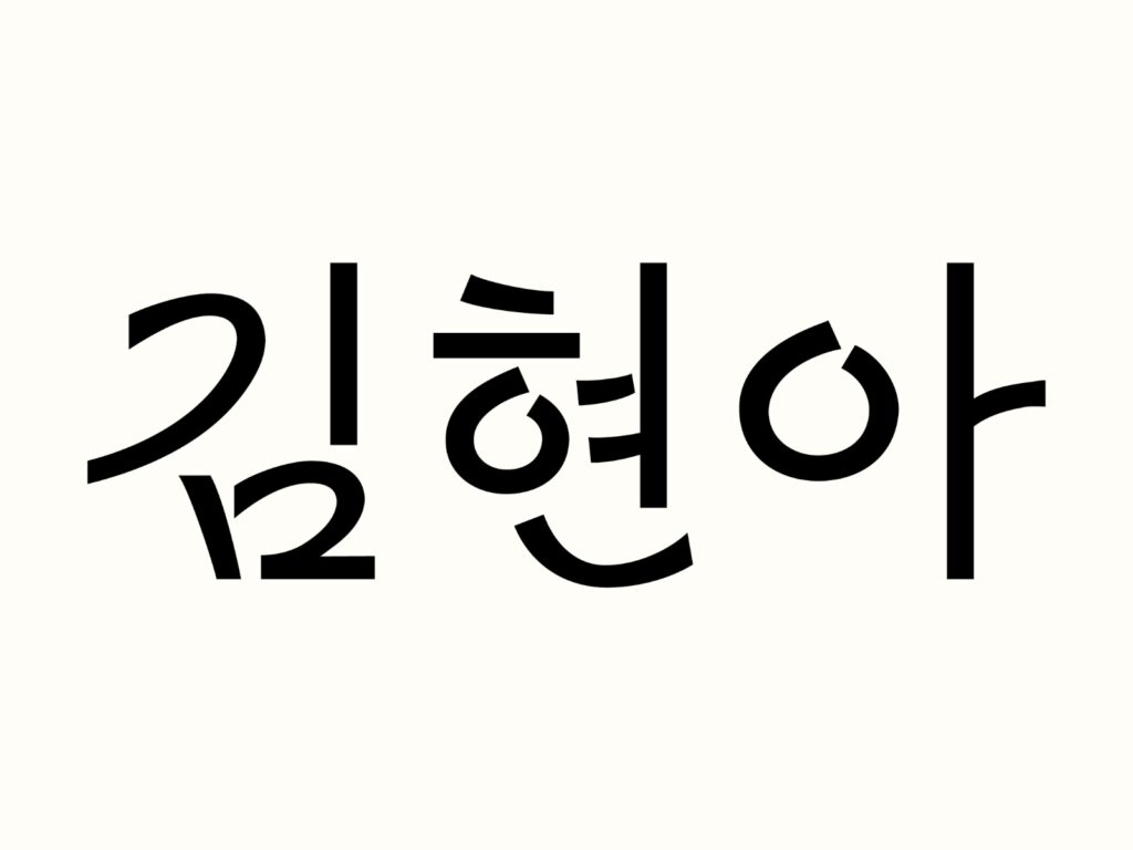
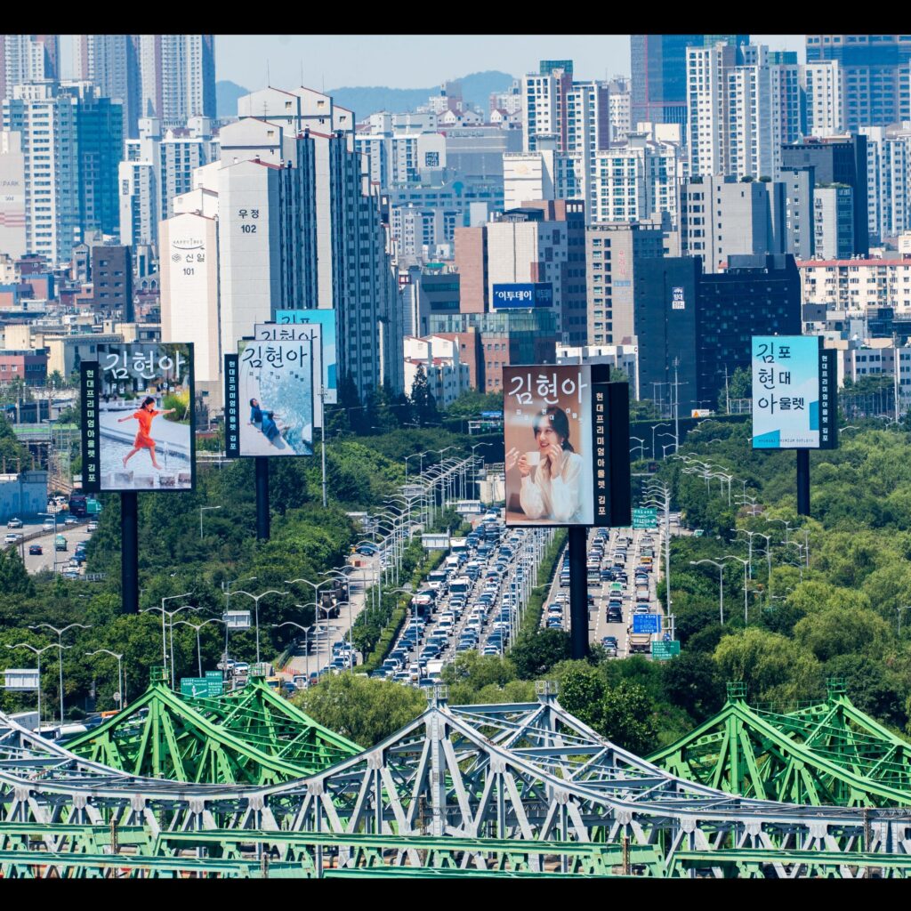
Gimpo Hyundai Premium Outlets has expanded its friendly nickname, "Kimhyun-ah," into a visual language. "Kimhyun-ah," a shortened name for Gimpo Hyundai Outlets, is an expression that has naturally taken root among users. This project was initiated to develop this nickname beyond a mere pet name into a unique voice representing the space.
The new exclusive font was created in collaboration with designer Chae Hee-jun. Known for his delicate handling of letter structure and impression, Chae has captured both the brand's refined atmosphere and everyday friendliness in this font.
The Kim Hyun-ah exclusive font is based on the neat and sophisticated impression of the Hyundai Department Store exclusive font. However, it does not remain merely cold and orderly like existing corporate typefaces. By adding a comfortable, handwritten rhythm, it expresses the relaxed and friendly atmosphere of the Gimpo Hyundai Premium Outlets.
The form of the letters is neat but not overly rigid. The flow of the strokes captures a natural movement like handwriting, and the impression between the letters is soft and light. Thanks to this, the sense of everyday life and spoken language inherent in the name 'Kim Hyun-ah' is clearly revealed visually.
This font demonstrates how aliases can become brand assets in spatial branding. It is significant in that it focuses on the names people actually use rather than official names, and creates a dedicated font for them. It is also impressive that the font originated from words created by users, rather than a language unilaterally determined by the brand.

More and Sources