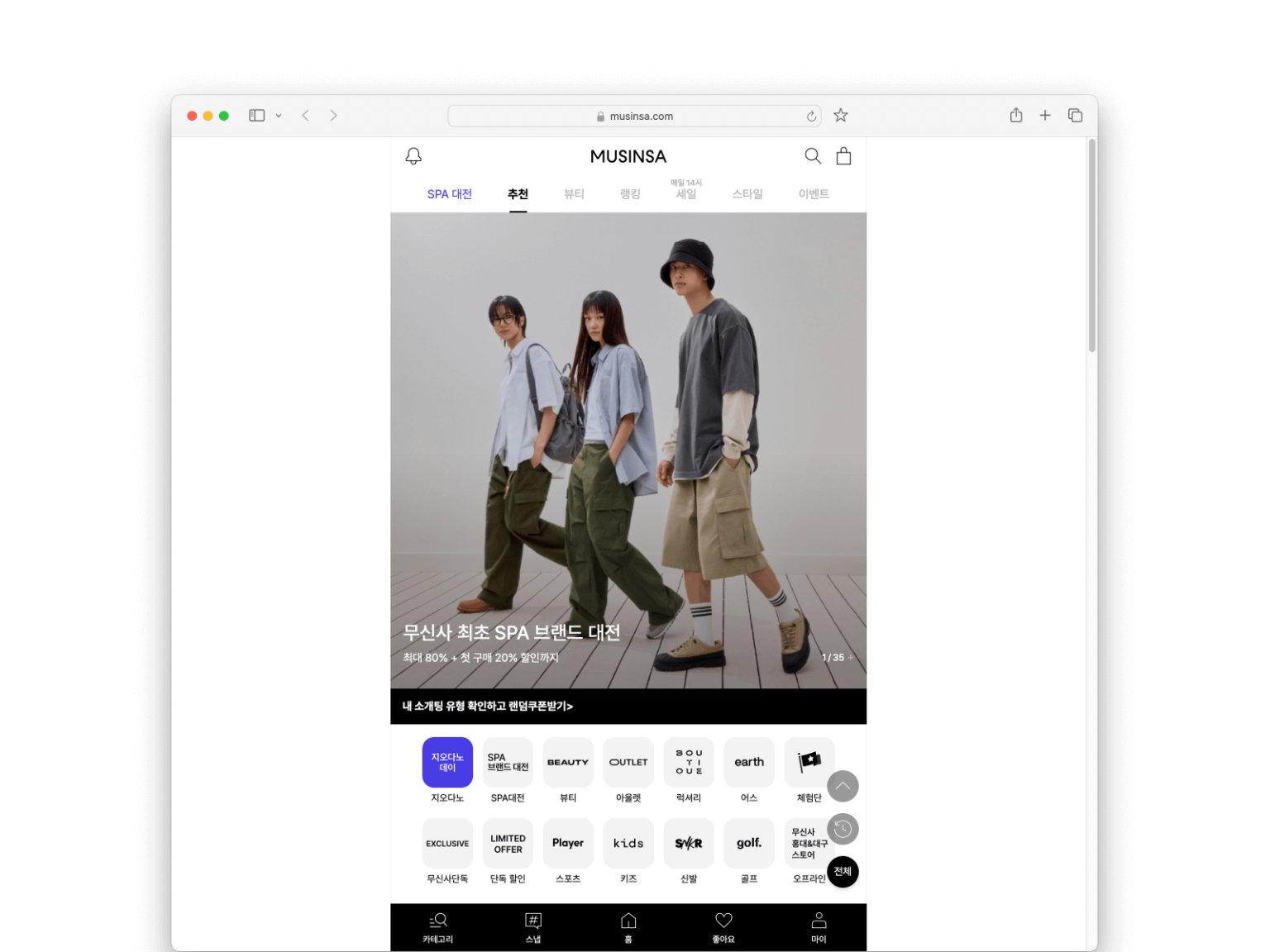

It has been a month since Musinsa desktop web was shut down. In early June, Musinsa changed the desktop web page service to the same form as the mobile web service. In order to unify the experience regardless of the platform, the existing desktop experience was completely removed and the mobile screen was duplicated. The expert shop, community, and personalized recommendations that were only available on mobile can now be experienced on the desktop.

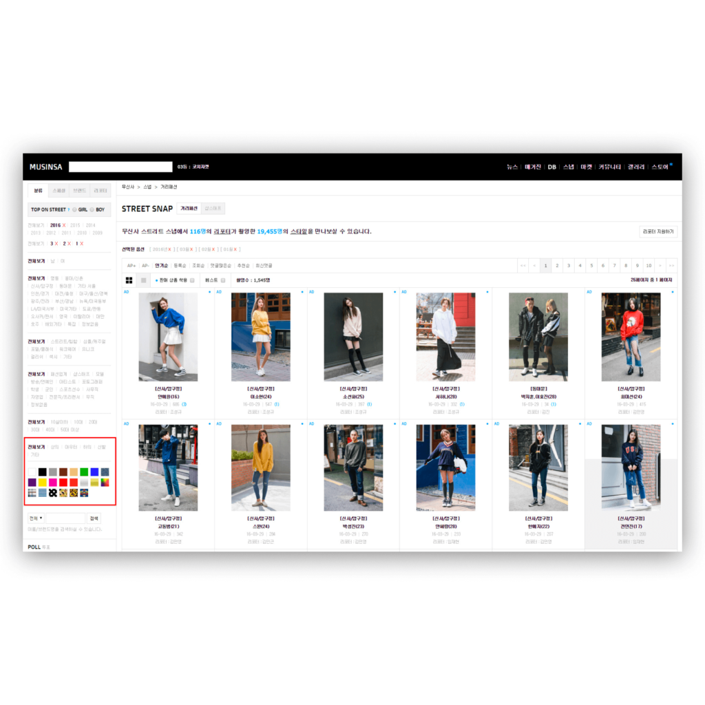
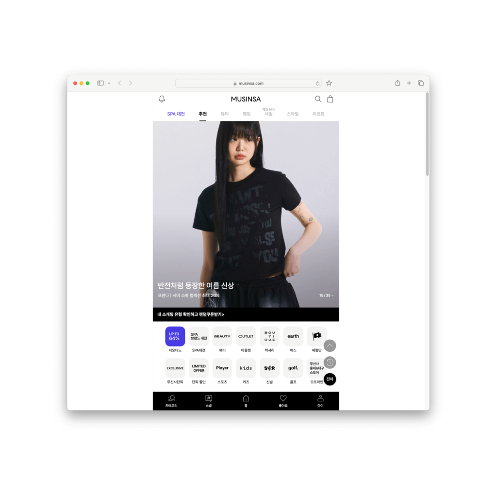

The most shocking thing was that the ranking and snapshots on the first screen representing community commerce disappeared and were replaced with promotional banners and quick links. Musinsa said that they unified it to create a seamless experience without any seams. It may be useful when you are using the Musinsa app and then the Musinsa website, but when you are using another website and then the mobile mirrored website, the seams feel big. If you keep clicking with the mouse, you will end up using the mobile. It is a form that encourages mobile use rather than using the service on multiple platforms.
Some say that it is a reasonable choice from the company's perspective. It is a core function that can increase sales, so it can attract customers. In addition, it can reduce costs. It seems like a natural choice for a company that has just started to focus on survival. However, Musinsa, which has achieved overwhelming operating profits as the industry leader, could have made a smoother transition.

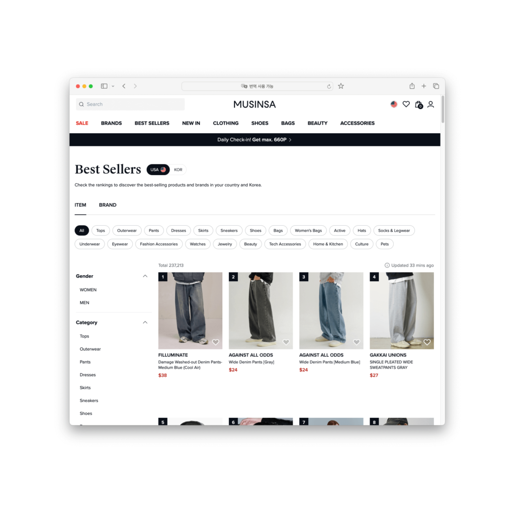
This change is like going bankrupt because you can't pay back the debt that has snowballed. Costs don't disappear from the market. Someone in the market, whether it's a customer, a company, or a partner, has to pay the cost. Even within a company, various organizations each bear the cost. If you don't have enough people and time to pay the cost right away, the debt in that area will pile up.
The Musinsa desktop was a collection of debts. Numerous menus and promotions were tangled, creating a complex information structure, and the product description area was overflowing with information. PHP, a previously widely used development language, was not compatible with Java and React, which were mainly used in apps, and the management cost was increasing day by day. Design and development debt reached its limit and went bankrupt, and users who used the desktop now lost the experience.
You can see the company's philosophy and attitude in what it protects in times of crisis. Musinsa has recently been focusing on fun promotions like festivals and unique offline space experiences. It has also continuously invested in platforms to grow the ecosystem. As long as there are no problems with the quality and delivery of clothing, which are its core values, there will be no major impact right away.
Compared to that, it seems like they are relatively lacking in product investment. It is natural to focus on mobile. However, they could have designed a more mobile-centric desktop experience like Kurly, X, and Instagram. What kind of debt will they accumulate in the future? I wonder how it will affect the product strategy of their affiliate, 29CM.

