

The design system for US federal government online services has been updated. It has now reached 3.0. This system makes it easier to build accessible and mobile-friendly government websites. USWDS is a vibrant open source community of government engineers, content experts, and designers. Contributors inside and outside of government support dozens of organizations and nearly 200 sites.
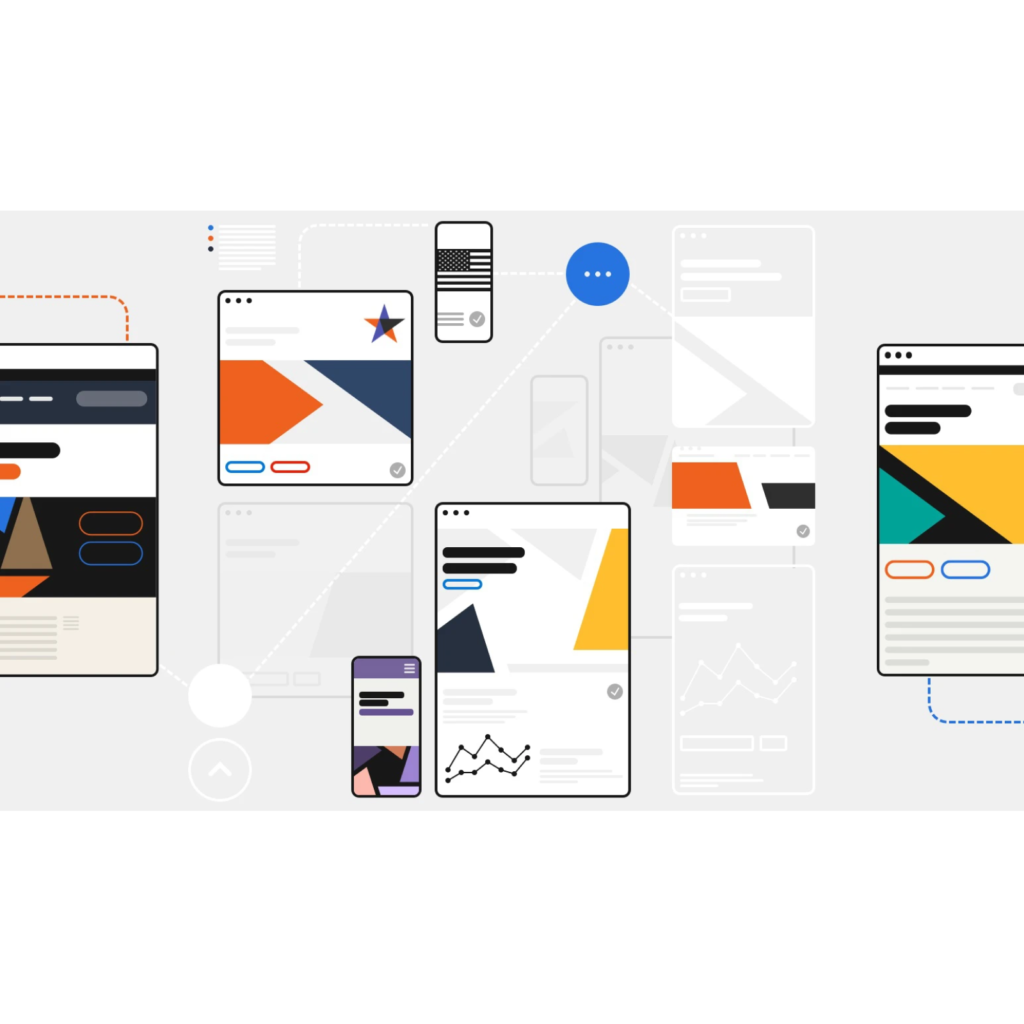
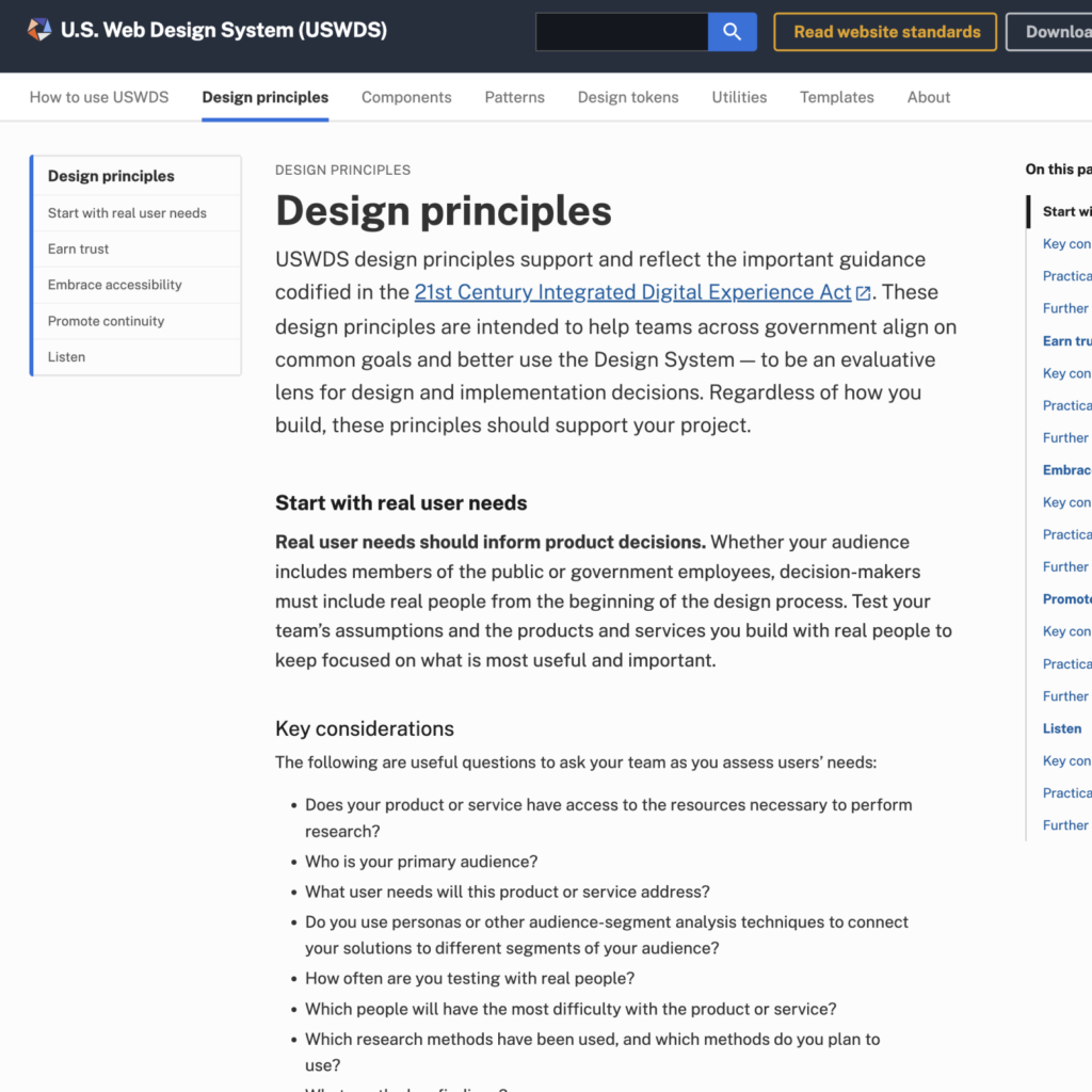
The American web design system has customer-centricity, trust, accessibility, continuity, and listening as important design principles.
Ask who writes and what needs are met, and who will struggle the most. And it suggests practically actionable actions. We also provide a variety of reading material to help you study more deeply.
The Components tab provides various design components used on the web. It offers accordions, banners, buttons, cards, check boxes, date pickers, and more. Instructions for use and development code are provided for each item, and the latest update history is also included.

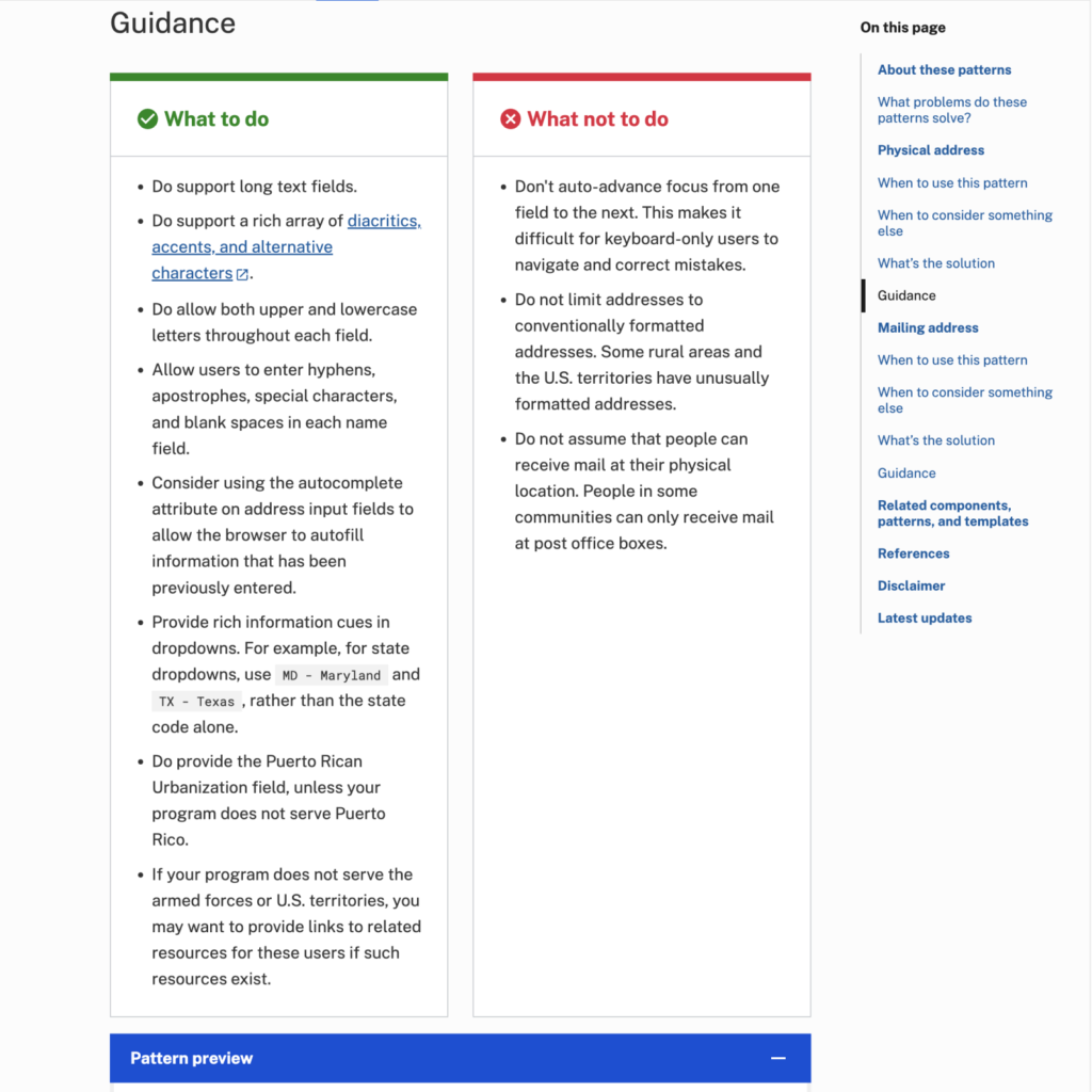
We present a collection of good best practices in the Pattern menu. We provide an easy way to fill out complex forms or choose your language to prove your identity. When providing personal information such as address, contact information, and birthday, it tells you what to do and what not to do. It also suggests what the pattern might look like when actually applied to the web. We also provide pattern codes you can use. When considering addresses, there's also something to be said about collecting international addresses for U.S. military outposts or citizens living abroad.
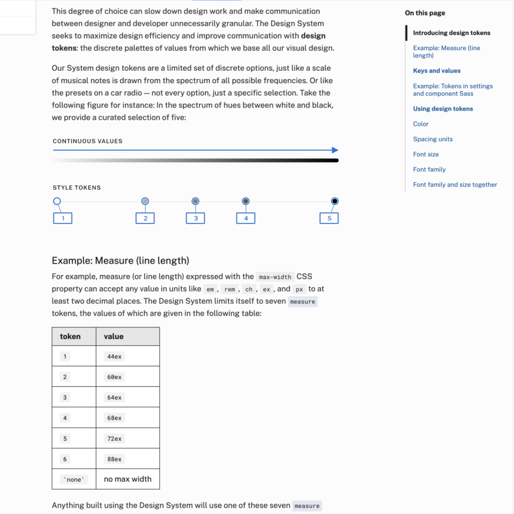
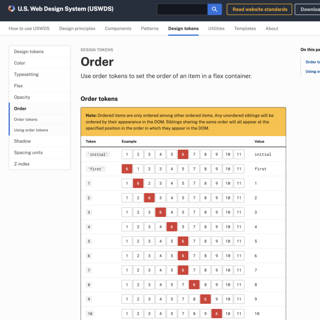
Design tokens defined basic design elements such as color, font, transparency, and shadow. We defined the size and order of flex, which defines the font size, line spacing, and spacing. We also provide a 'utility', a simple HTML class that specifies scope using CSS.

I was surprised that the scope was wider and more detailed than I expected, and I was also surprised that it was open source. I imagined that if it were a government design system, somewhere in the center, all designs would be controlled and changed. The unification of the Korean government logo also comes to mind.
National services will usually not have as much competition from services on the market. Therefore, there is not much need to show something different from others. Rather than something sharp, we need a universal and inclusive design that anyone can use at a similar level.
It would be nice if the components of government services were unified into one module, but that would be impossible. If you can't prevent the proliferation of activeX or clumsy solutions, it seems like a good idea to at least provide a toolkit like this.

