The government regulates the UI to deceive users.
The Fair Trade Commission (hereinafter referred to as the Fair Trade Commission) has announced that it will prepare dark pattern guidelines as a major promotion plan for 2023. In the “Policy Direction for Consumer Protection from Online Dark Patterns” announced in April, it was stated that guidelines will be created that can be followed while respecting market autonomy. Then, on July 31st, 'Online Dark Pattern Self-Management Guidelines' was announced.

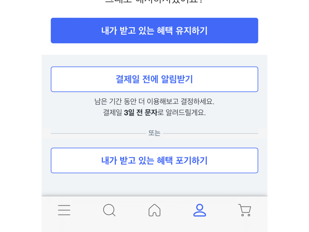
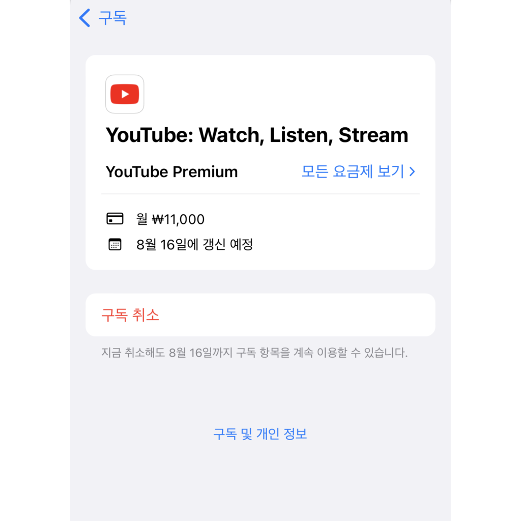
Coupang's obstruction of paid membership withdrawal, OTT's automatic renewal, and pun on "I don't want to receive marketing information when signing up" were mentioned. It is said that it will be applied to online platforms such as e-commerce and large portals.
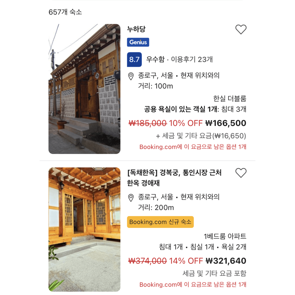
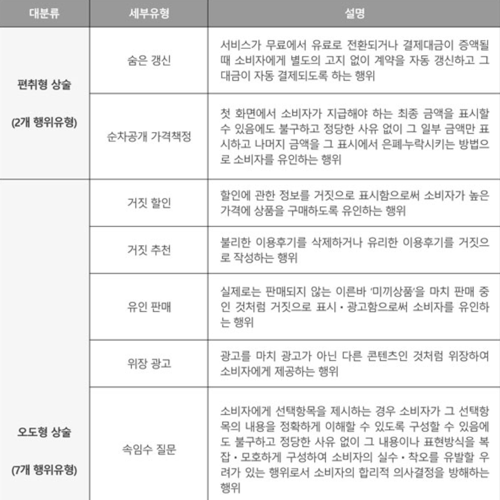
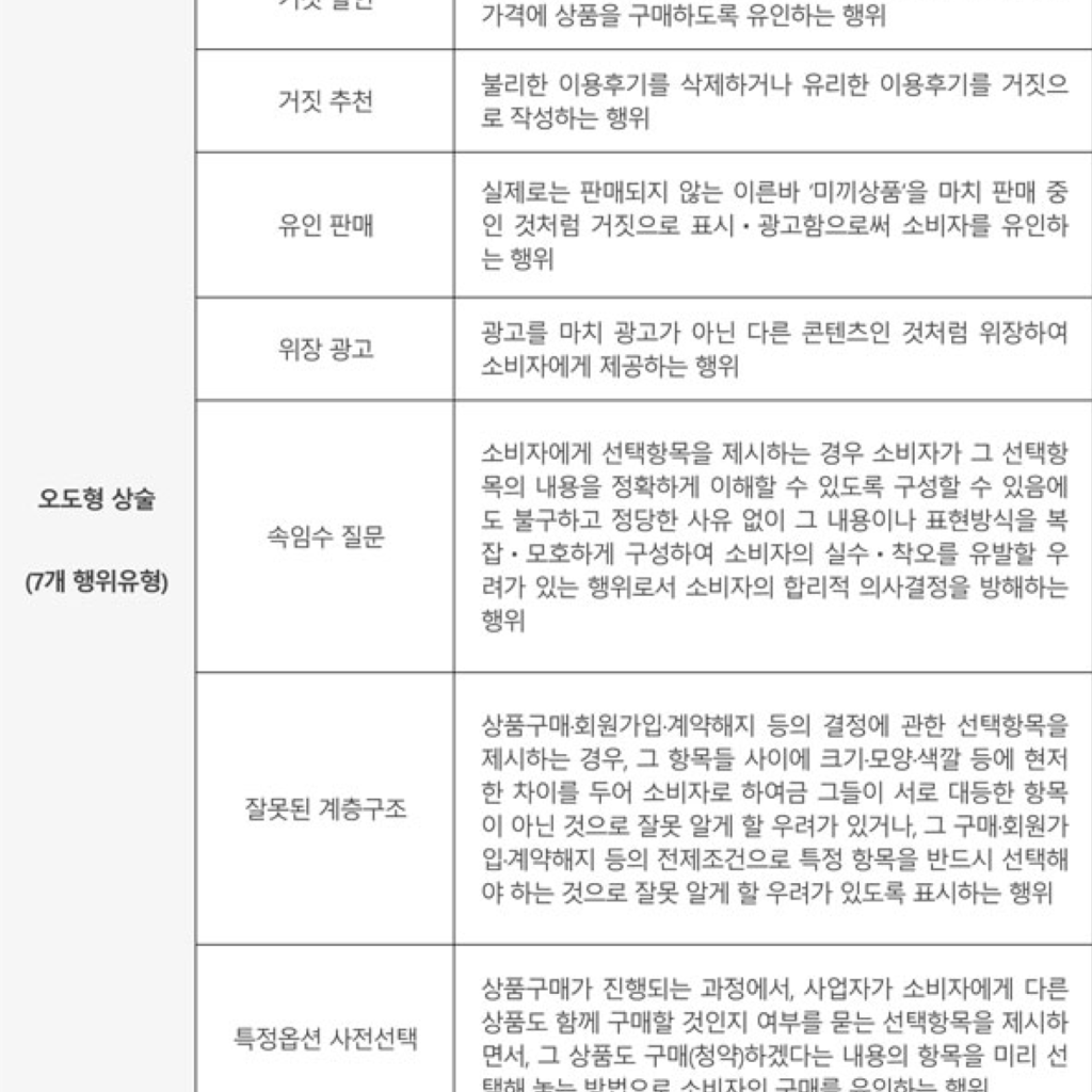
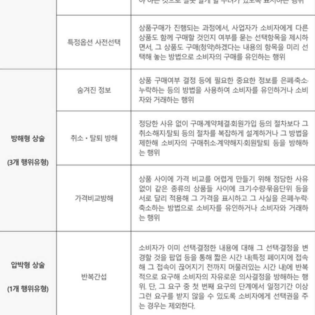
The Fair Trade Commission classified dark patterns into 4 types of fraudulent, misleading, obstructive, and pressure-type tactics and 19 detailed types.
I wrote a good UI that the government thinks in sentences. Will it work? Guidelines can only be presented if you can decide what is good for you. There are also meaningful guidelines with negative commercial behavior in the offline market. There are false real estate sales, false advertisements, and manipulation of reviews. However, some guidelines are difficult to understand. Representatively, there is a guideline for 'use of emotional language'.
“Simply using emotional expressions is not a problem in itself, but it should not be to the extent that consumers cannot accurately understand the meaning of the expression.”
So how should we express it? What is the degree to which you can accurately understand the meaning?
I agree with the direction of making the UI value-neutral as a tool. Of all the government regulations, the most tangible government regulation was consent to marketing. You must indicate (optional) when signing up and use (advertisement) when delivering information that benefits you. I thought this was not a bad policy from the point of view of consumers to a certain extent so as not to be buried in a mountain of unnecessary information.
However, there are many guidelines that have ambiguous value to consumers in the guidelines announced this time. If this kind of commercial activity is called a dark pattern, the luxury market that emphasizes unique brands or installments based on credit transactions can also be seen as dark patterns. Are self-guided guidelines effective? I'm worried about the ambiguous standards, but I'm also glad that at least a consensus has been formed that customers should not be deceived.