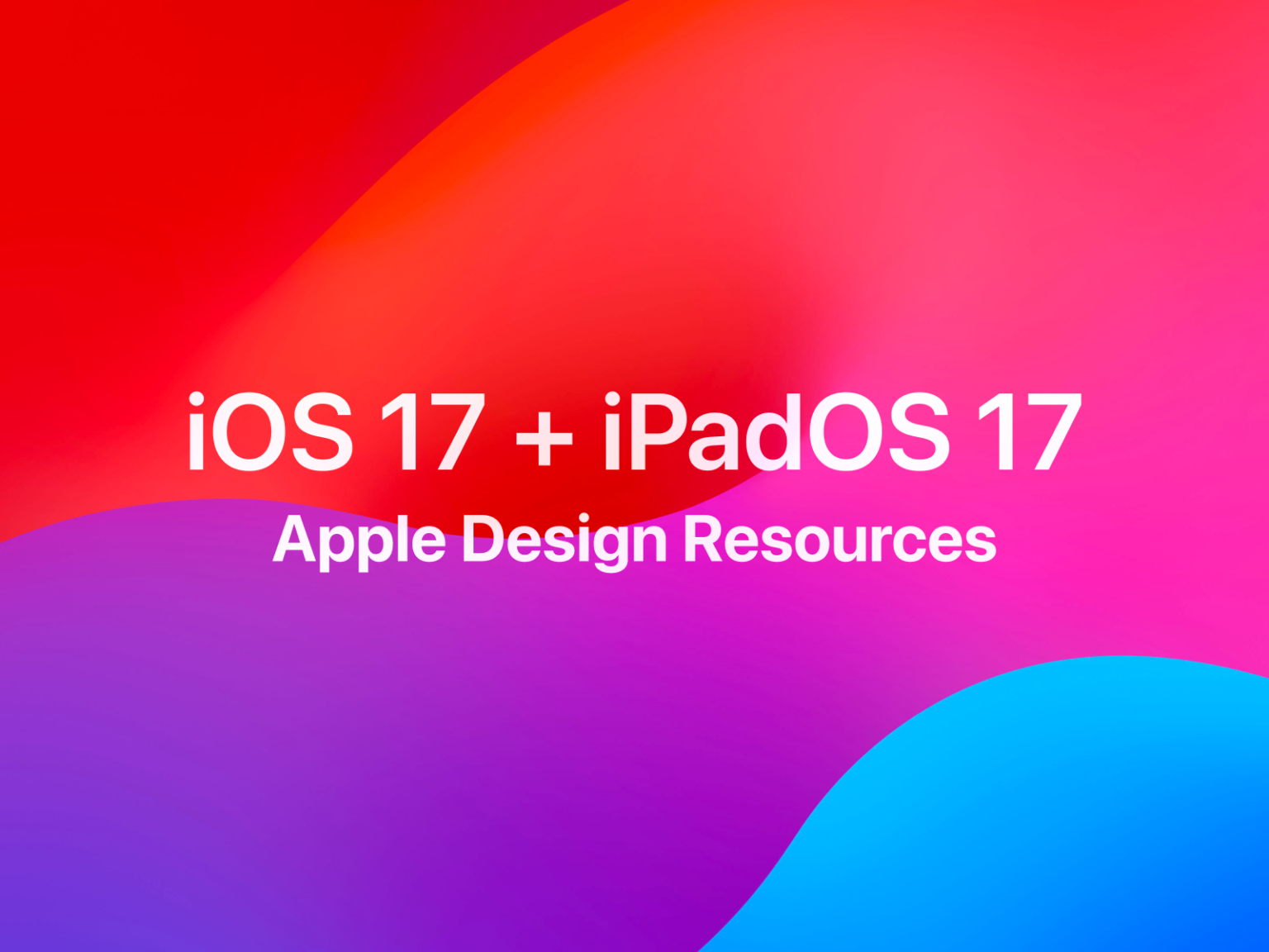

애플이 피그마 커뮤니티에 iOS 17, iPadOS 17의 리소스를 공개했습니다. 스케치를 위한 패키지 파일을 제공했던 것처럼 피그마에 애플의 플랫폼 디자인을 공유했습니다. 피그마가 디지털 프로덕트 설계의 기본 프로그램이라는 것을 공인 받은 느낌입니다.
프로덕트 설계를 하다보면 꼭 필요한 애플 리소스가 많습니다. 스크린샷을 찍거나 커뮤니티를 돌아다니면서 찾아야 했는데 이제 최신 파일이 한 곳에 모입니다.
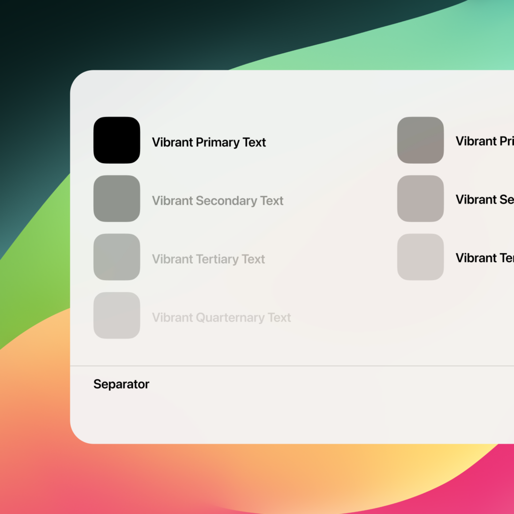
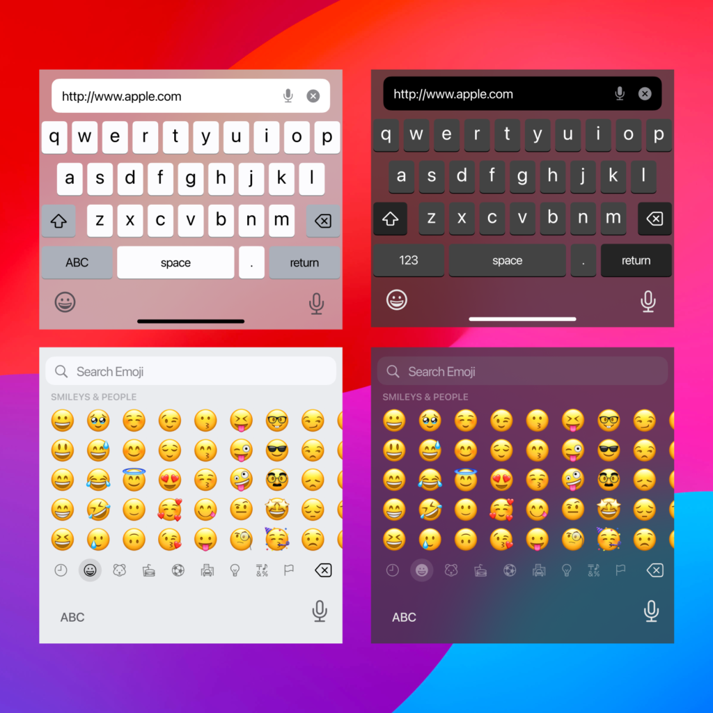
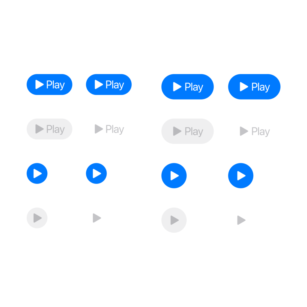
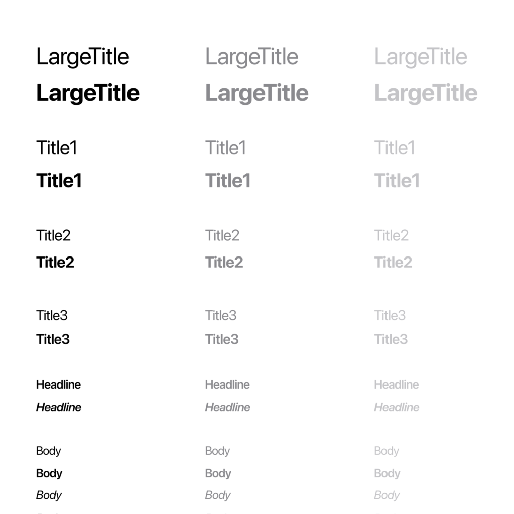
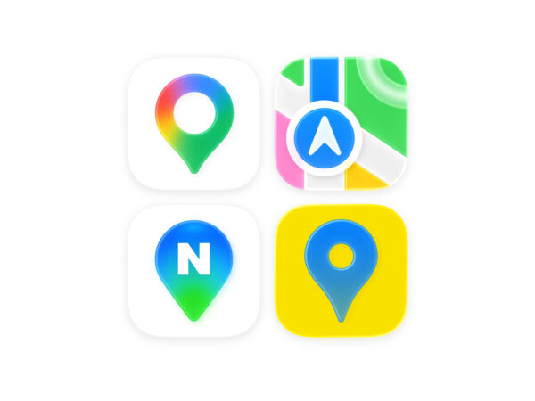
텍스트와 색과 같은 기본적인 요소부터 시스템 인터페이스와 복잡한 컴포넌트가 포함됐습니다.얼럿, 시트, Face ID처럼 내가 설계한 앱이 시스템 요소를 사용할 때를 표현해야할 때 쓸 수 있는 여러 템플릿이 있습니다.특히 알림 템플릿, 키보드가 찾기가 항상 힘들었는데 손쉽게 사용할 수 있습니다. 홈 스크린 배경이나 기기 베젤같은 요소도 깨알같이 쓸모 있습니다.


SF Symbols와 SF Pro가 있어야 정상적으로 표시됩니다. 앞으로 iOS와 iPadOS에서 쓰이는 애플 페이, 앱 클립, 숏컷과 같은 구성 요소를 추가할 예정이라고 합니다. 더 나아가서는 Sonoma, watchOS 10, tvOS 뿐만 아니라 visionOS도 추가할 예정이라고 합니다.

‘OS 시스템을 사용한다’ 라고 쓰는 것이 항상 불편했는데 이제 사용자가 실제로 겪는 경험을 피그마에 기록하기 쉬워졌습니다. 시스템을 설계할 때 최대한 사용자가 하는 경험 그대로 기록하고 설계하는 것이 중요한데 반가운 소식입니다.
세계의 디지털 프로덕트 디자인 문법을 주도하는 회사의 실제 작업 파일이라는 것도 의미가 큽니다. 가상의 디자인이 표시되는 기기까지 제어하는 회사의 파일인만큼 배울 점이 많습니다. 애플이 정한 템플릿을 사용하는 것 뿐만 아니라 색과 서체를 구분하는 방식과 기준 등을 엿볼 수 있어 좋습니다. 가이드라인에 맞는 생태계를 위해 상세한 법전을 제공하는 것 외에 바로 가져다 쓸 수 있는 틀을 제공하는 것도 좋은 전략 같네요.


