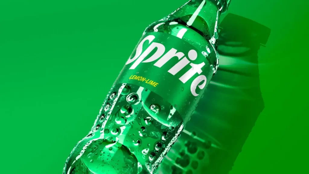
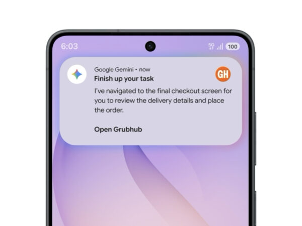
Sprite Global Brand Renewal: We'll cut back on everything we can.

Sprite-Dieline-wordmark-droplets

Sprites are rebranded. As part of our new global summer promotion campaign 'Heat Happens', we unveiled a new logo and packaging. Coca-Cola's in-house design team Turner DUckworthcollaborated.

With the typeface itself as the main character, it was designed to occupy most of the package. Dynamically refined fonts that fit the flow of the eye are impressive. The line leading to rit gives the feeling of riding a skateboard. S, p, e conveys a sense of speed as if flying in a font with multiple columns.

The yellow color was kept while emphasizing the green color, and the original star shape was moved elsewhere. It seems to have conveyed the feeling of 'subtracting' something for zero waist while refraining from using colors to suit the trend. It's a pity that the lemon lime's yellow color has become so little that it's hard to associate the taste with it. It is said that it will be applied to the brand from 2023.

Sources and more

Design Compass Newsletter

Every Tuesday morning, curated by a designer with 16 years of experience
A collection of inspiring news, trends and articles.

popularity

ios18-official-01
iOS 18 Officially Released: Call Recording Finally Happens
Jongno-emblem-01
Jongno-gu Rebranding: New Emblem Like Techno Gwanghwamun
agoda-dark-pattern-01
Agoda Dark Pattern: The Korea Communications Commission finally steps in

Design Compass Academy

thumbnail-course-list-ux
UX Design Class: UX Design for Selected Services
ui-design-main-mobile
UI Design Class: Learn the essence of an interface that will never change

Latest news

robinhood-01
soop-01
adobemax2024-01
Jongno-emblem-01
cybercab-01
ria-font-01
Hangul-gwaja-01
agoda-dark-pattern-01

Design Compass Class