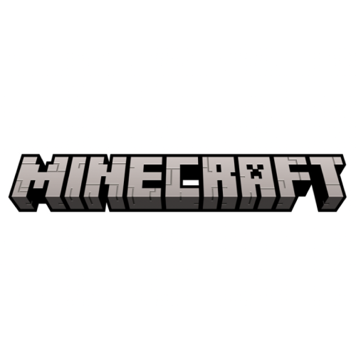
Minecraft, one of the larger metaverses, has changed its logo. At first glance, you may think, ‘What has changed… ?' However, upon closer inspection, various details have been improved for better visual tactility.
Light areas are darkened and dark areas are lightened. The contrast was lowered, so the clunkiness was reduced. I reduced the brightness of the light that starts at the bottom of the letters to reduce the awkward protruding feeling. Also, the details of the letters are not visible in the dark, but the darkness has been changed so that the sense of volume can be felt better. The cracks in each letter are aligned vertically and horizontally to deliver a strong pixel feel. If you look at the entire logo at a smaller size, the surface has changed to be smoother.
https://www.underconsideration.com/brandnew/archives/new_logo_and_identity_for_minecraft_by_bold.php


Every Tuesday morning, a designer with 16 years of experience curated Collect design trends.