Brompton, the visual identity of a folding and unfolding bicycle
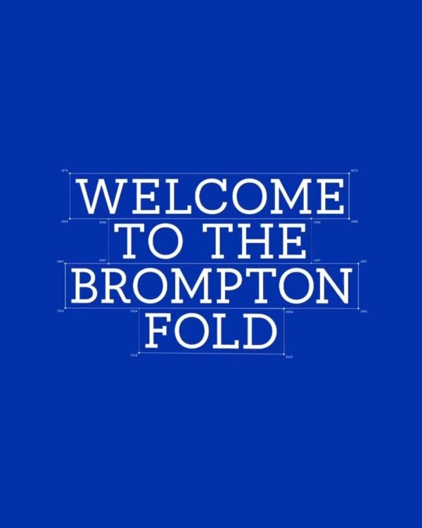
British bicycle brand Brompton has revamped its global brand identity. The work was undertaken by London-based Studio Blackburn. Launched to mark Brompton's 50th anniversary, this project focused on integrating brand expressions that varied by country and channel into a single system. The core brand strategy is 'Life Unfolded.' The new visual system originates from the structure of a Brompton bicycle folding and unfolding. While maintaining the existing logo and the symbol representing the bicycle, the graphics depicting the way the frame expands and folds [… ]
UK Gender Equality Index Visual Identity

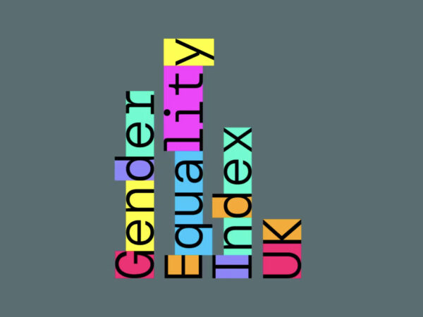
The Gender Equality Index UK, a data tool for measuring gender equality gaps at the local government level, has been released in the UK. This index aims to compare the socioeconomic outcomes of women and men by region, mapping the gaps and tracking changes. It is designed to reveal regional disparities that are easily missed by existing national-level indicators, serving as a tool for policy formulation and civil society activities. The results are provided as an open digital tool so that users outside of academia can understand and utilize them [… ]
Double Diamond, Britain's national beer, relaunched

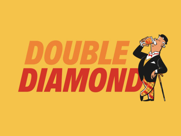
Double Diamond, once known as the national beer of the UK, has been officially relaunched after 29 years. According to Emily Gosling on October 28, 2025, Double Diamond was first brewed in 1876 at Samuel Alsop & Sons in Staffordshire. In 1958, it was recorded as the best-selling bottled beer in the UK, and in the 1960s and 1970s, it became ingrained in the public consciousness through TV commercials and the slogan “A Double Diamond works wonders.” However, commercial production ceased in 1996. […]
Saudi Now, a cultural exchange platform between Saudi Arabia and the UK

Saudi Now, a platform for cultural exchange between Saudi Arabia and the UK, has unveiled a new visual identity. The project was undertaken by London-based design studio Alphabetical and is being praised for successfully tackling the challenging task of a bilingual workmark with high quality. Featuring youthful energy, this identity clearly reveals a visual language that connects culture and language. The new logo is structured to combine an English sans-serif typeface with custom-made Arabic calligraphy. [… ]
Royal Albert Hall Rebranding

The Royal Albert Hall, a cultural icon of Britain, has revamped its brand identity to usher in a new era. Global consulting firm BrandFi, once again handling the project since 2014, refined the logo, typography, and signature colors to capture both the hall's history and a contemporary sensibility. The Royal Albert Hall is a rare venue where an orchestra and a rock band share the stage. However, over the years, the visual system has been fragmented and distorted, leading to a lack of consistency. […]
Rail Clock, the new British standard railway clock

A new symbol of British rail history has emerged. Design Bridge and Partners has unveiled the Rail Clock, the first national standard railway clock in over 50 years. Unveiled at London Bridge Station, the clock is attracting attention as a new icon, bridging the gap between British design tradition and modern technology. The Rail Clock is a project undertaken by Network Rail to commemorate the railway's 200th anniversary, in collaboration with the RIBA (Royal Institute of British Architects) and the Design Museum. […]
Innocent brand design becomes cuter

Innocent Drinks, the UK's leading fruit drink brand, has unveiled a new packaging design, partnering with independent branding agency Derek & Eric and strategist Silas Amos. The project focused on simplifying the brand's signature while reclaiming its original confidence, establishing a consistent visual identity across the country. Since its launch in 1999, Innocent has established itself as one of the UK's most beloved brands, known for its fresh fruit drinks, playful personality, and social good. […]
Royal Institute of Philosophy brand design

The Royal Institute of Philosophy, the UK's largest independent philosophy charity, has unveiled a new brand identity ahead of its centenary. The rebrand aims to elevate the Institute's profile, celebrate its work, and open philosophy to a wider audience. At the heart of the new brand strategy is the motto "Question Everything." This motto reflects the essence of philosophy and the Institute's spirit of openness, inquiry, and intellectual freedom, and aims to encourage people from diverse backgrounds to engage more deeply with the world.
Royal School of Drawing Brand Design

To mark its 25th anniversary, the Royal Drawing School has unveiled a new visual identity in collaboration with the world-renowned design studio Pentagram. Led by partner Harry Pearce and his team, the project visually embodies the school's values of creativity, generosity, openness, and the timelessness of drawing. Founded in 2000 by King Charles III and artist Catherine Goodman, the Royal Drawing School is a world-renowned institution specializing in observational drawing education, offering courses for all ages, from beginners to professionals.
British banknotes to change for the first time in 50 years, public opinion sought

The Bank of England has launched a public consultation on the design of its new banknotes. The Bank of England announced the launch of a public consultation to gather public input on themes for the next generation of banknotes. Since Shakespeare first appeared on banknotes in 1970, British banknotes have featured historical figures. This public consultation seeks to explore opportunities to represent Britain in a more diverse way, reflecting the changing times. The Bank of England has proposed six potential themes:
Burberry's optical illusion LP record

British luxury brand Burberry presents a festival campaign that combines bold musical interpretations with visual experimentation this season. At the center of the campaign is the 1990s rave classic 'Sweet Harmony'. This dreamy and modern version of the original song was created in collaboration with DJ Eamon Harkin (@eamonliquid) and the label XL Recordings. The song is the 'Festival Anthem' of the Burberry campaign, and it recreates the sensibility of rave culture, where romance and rebellion coexisted. The […]
The Economist Brand Design

This brand design, a collaboration between The Economist and design studio Nomad, took approximately six months and redefined the visual language for the digital age while maintaining The Economist's unique identity. The iconic red and the Economist serif typeface were retained, and a new design system was developed to deliver a consistent experience across various media, including podcasts, videos, and live events, building on the brand's 180 years of editorial authority. A key element of the design is "glyphs." Previously, […]