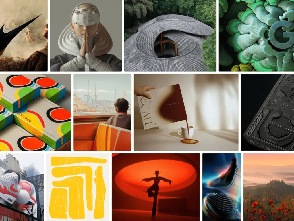
On December 6th, Behance shared its top visual trends for 2022. Drawing on the diverse design portfolios of over 30 million creators, Behance annually identifies compelling visual experience trends. This year, the trends include a feast of green, block typography, layering, and monochrome. Be sure to check out Behance's mood board, which showcases the work of leading artists by theme and provides a variety of examples. A feast of green, block typography, layering […]
Idotype has rebranded. Idotype is a group that communicates in various ways so that more people can use fonts, the letters of the digital age, more conveniently and beautifully. They have rebranded their logo, symbol, wordmark, and homepage. Idotype stated, “Just as warp and weft are woven to make a piece of clothing, Idotype overlaps dots and lines to create fonts that are both useful and beautiful.” The combination of overlapping and pixels that can only be found in modern times is impressive. The unique […]
oduplo.studio is a Brazil-based design studio. They have designed for the Panama tattoo studio Wild Tattoo Society®, the Brazilian independent film production company 7MA Filmes, and the specialty coffee café Clave. They combine neutral colors and unique shapes in a fluid way. They especially use typography to convey the brand's impression. The wild and clear shapes leave a strong impression. See more and sources ODUPLOSTUDIO.COM Instagram / ODUPLO.STUDIO Similar articles Recent articles
Zigbang changed its logo after 10 years. It held a 'rebranding media day' and revealed its new CI. It overlaid an oval, meaning 'expansion', on the house icon that Zigbang focuses on, and contained its vision of 'infinitely expanding the housing experience'. It changed the Korean word 'Zigbang' to the English word 'zigbang' to emphasize its will to enter the global smart home market. It announced that it will focus on houses where people live, beyond the service of searching for houses. Starting with door locks and wall pads, it will introduce the Internet of Things (IoT) to create smart […]
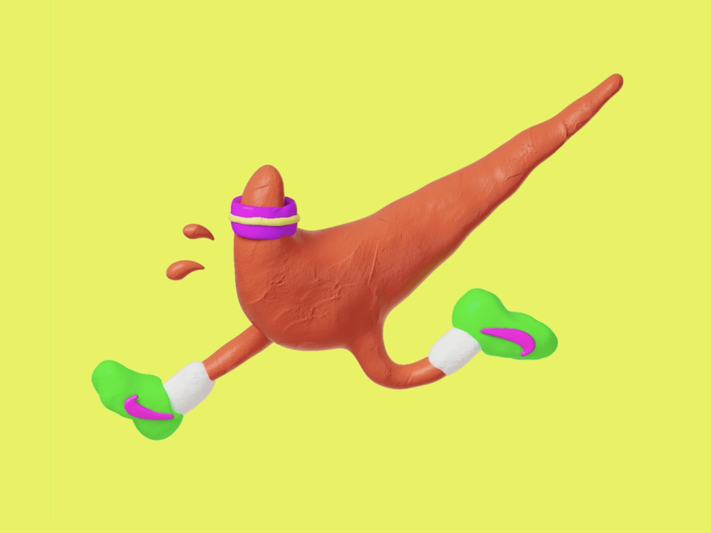
This work by Barcelona-based freelance art director, illustrator, and graphic designer Marti Serra, aka DSORDER, is rich in neon, chrome, and airbrushed elements. It incorporates elements of nostalgia while incorporating modern, flowing details. This striking work is so detailed that it almost makes you forget about similar concepts. See more and sources: Homepage, Behance, Instagram, Similar posts, Recent posts
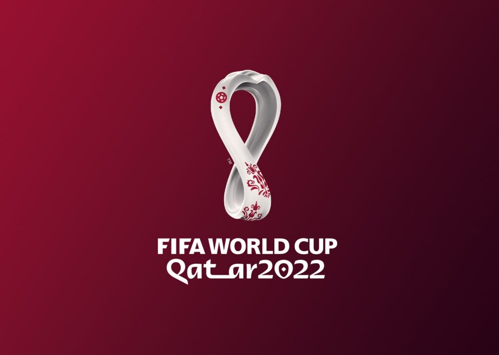
On September 4, the official emblem of the Qatar World Cup was unveiled. The World Cup design was done by UN-LOCK Brand. The design combined the traditional image of the World Cup, the trophy shape, with the traditional winter clothing of the Middle East, the woolen shawl. The applied pattern is an element that shows the heritage of Qatar culture and symbolizes the first ever winter World Cup. In addition, the emblem, which is reminiscent of the number 8, represents the eight stadiums where the games will be held, and contains a message that unites the world. At the top […]
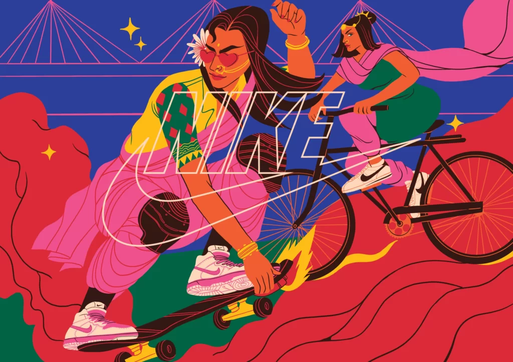
Boomranng Studio and Nike have come up with a captivating campaign. Nike's new personalization service is expressed in 20 illustrations. It captures the sounds, sights and feelings of Mumbai, the home of Boomranng Studio's founders. It expresses a sweet middle ground between tradition and modernity. It depicts Mumbai in a parallel world, not the present day. It expresses a new world where tradition and technology are combined in a retro-futuristic style. An optimistic future is powerfully captured in a maximalist style. See more […]
This is a Microsoft Designer Sizzle video by Not Real, based in Madrid, Spain. This video introduces Microsoft Designer, an AI tool for designers recently released by Microsoft. Not Real creates vivid movement based on high-sensitivity graphic assets. It shows high quality in any form of expression, whether it be photography, typography, illustration, or 3D. Recently, he created a video depicting various Microsoft products. Creative Direction: Valeria Moreiro […]
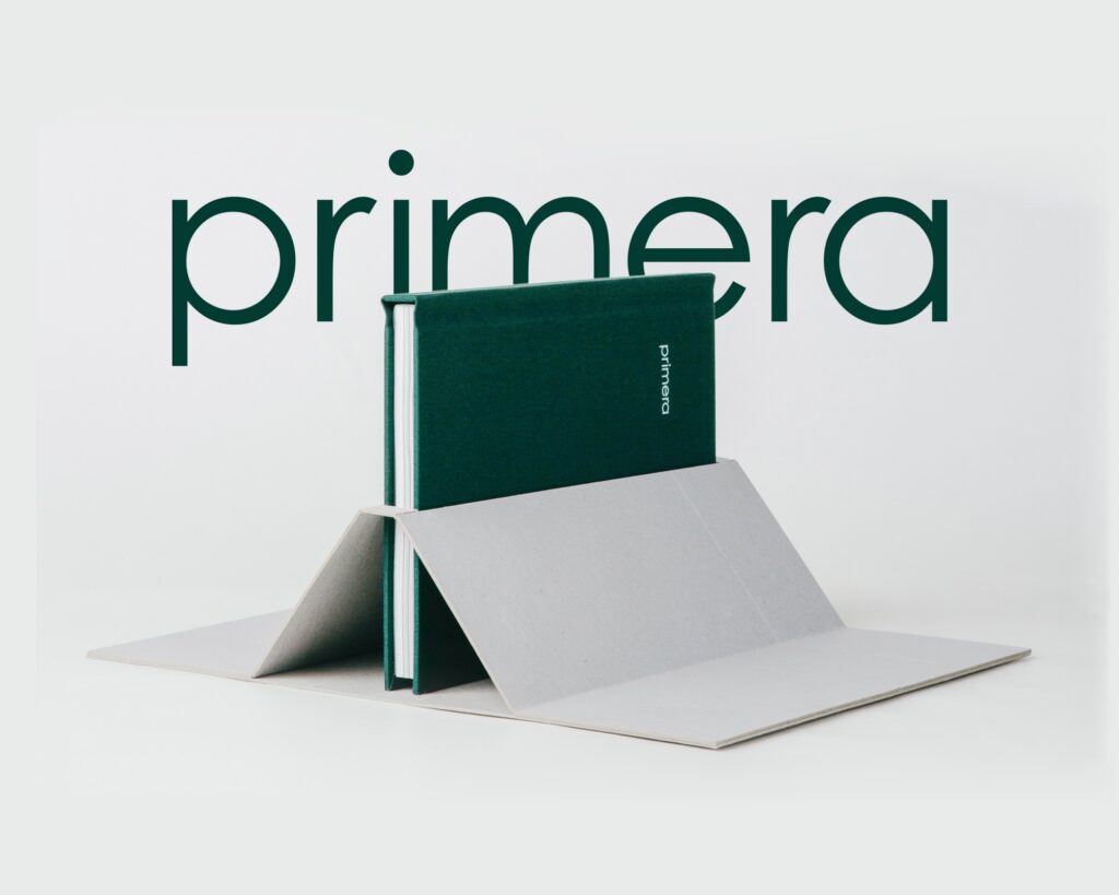
This is the editorial design of Angraphics' Primera Brandbook. The concentrated green and soft gray help to relax the eyes. It is attractive that various raw materials are expressed by cutting out various raw materials from paper. The form where you can feel the texture of the raw materials on the thin paper along the outline is refreshing. When the entire thing is overlapped, it also conveys the feeling of compressed essence. The English font that looks like ink is slightly dripping and the Korean font that looks like it was written calmly with light pressure go well together. More […]
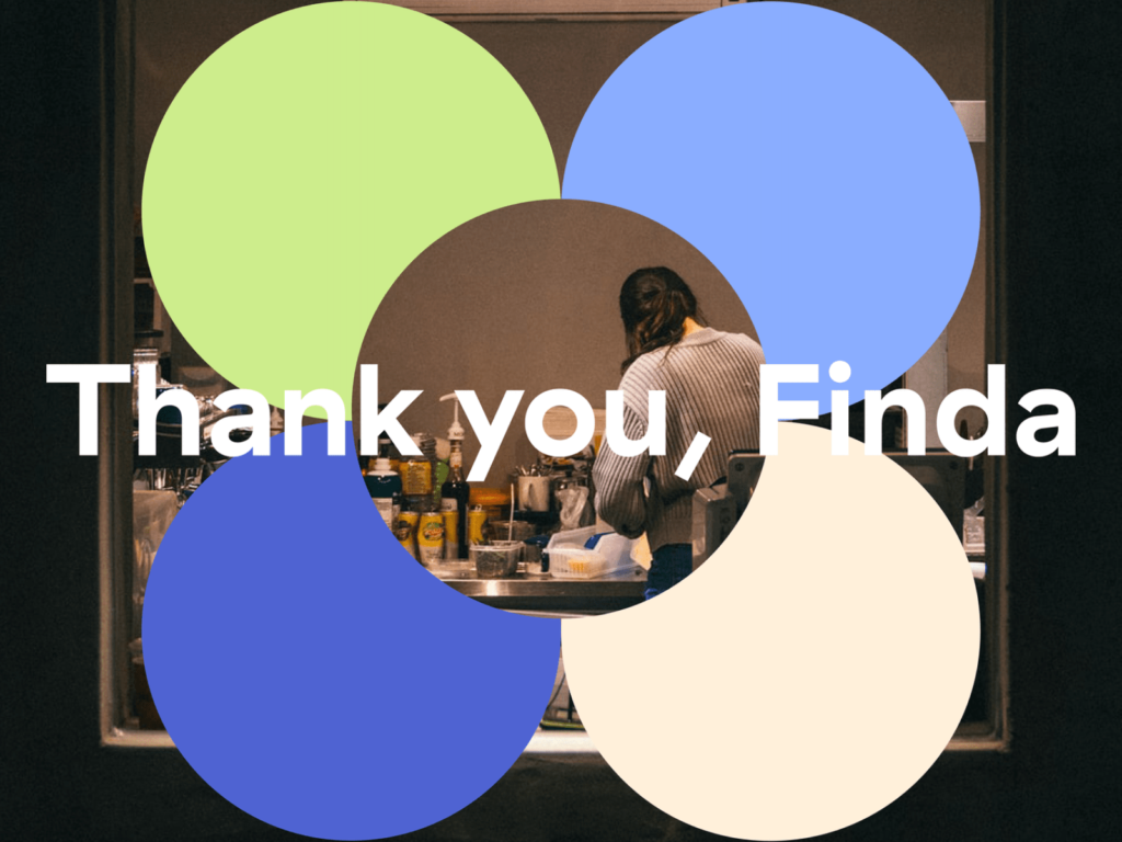
Recently, Finda has been sending messages to customers in various ways since its rebranding. Finda is a loan comparison platform that compares and manages 62 1st and 2nd financial institutions and over 200 financial products at once. It also provides a refinancing service that can help you move to a better loan. In line with its vision of eliminating the asymmetry of loan information, it asks questions about passive lending. Recently, it created a rebranding and brand campaign video with Ordinary People. […]
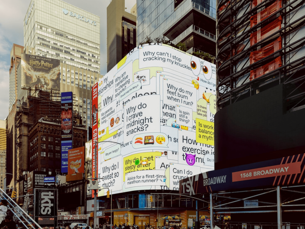
‘Less noise, more experts. Subtract the noise, add the experts.' The Washington Post has launched a campaign titled ‘Subtract the noise’ with New York-based Koto to promote its newly opened health section, Well+Being. Five digital billboards in Times Square were filled with message bubbles. “How much vitamin D do you need?” “Why am I hungry?” “Is work-life balance realistic?” “Stress can damage my brain […] ]
Nike has unveiled its Never Done Playing brand campaign identity, in collaboration with creative studio Burn & Broad. Burn & Broad co-founders Eugene and Vicente describe it as “entering an imaginative world full of play, laughter and fun.” Combining live-action footage shot by Soursop with typography and 3D graphics by Brun & Broad, the campaign captures the ever-changing power of children’s imagination and creativity. The wildly joyful typography […]