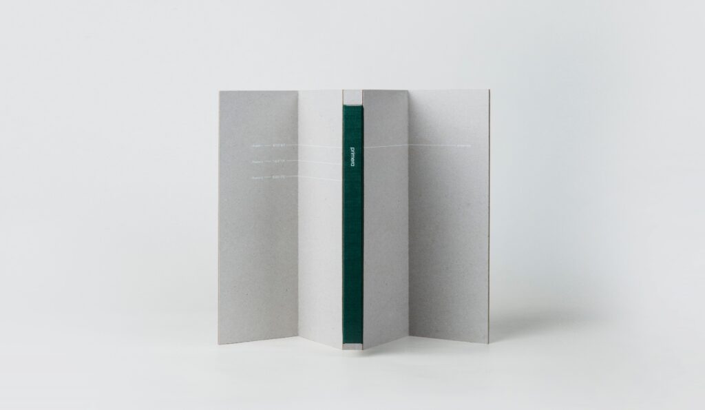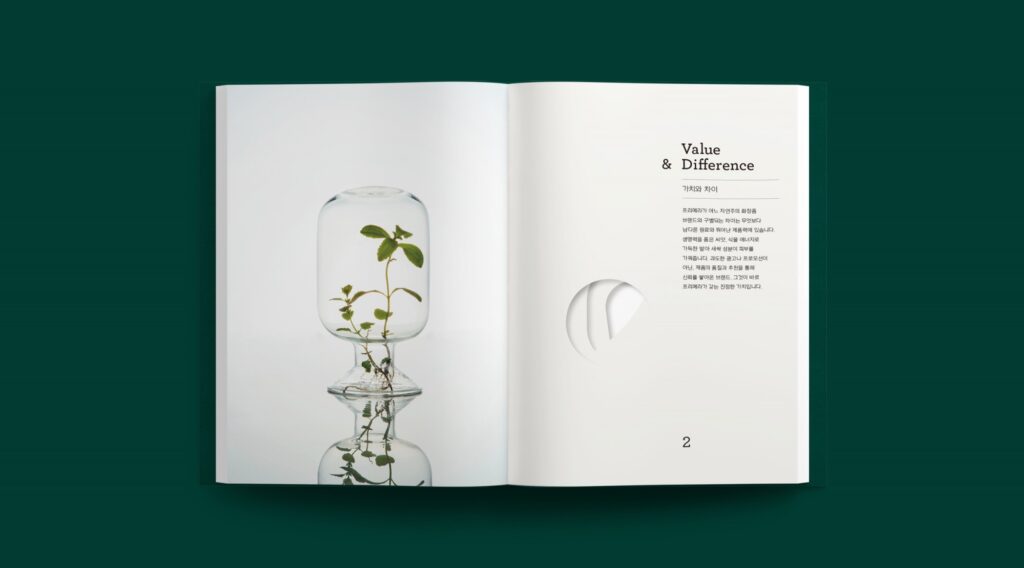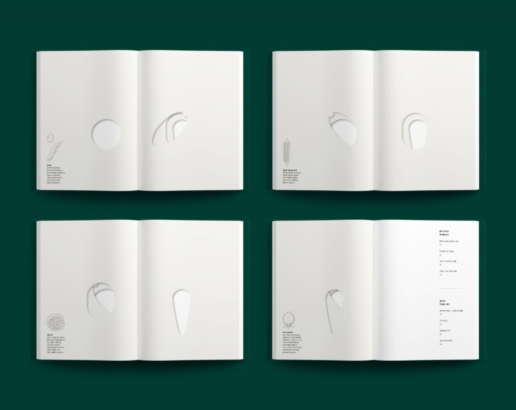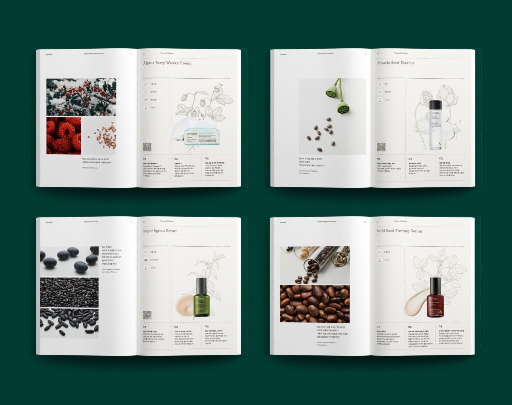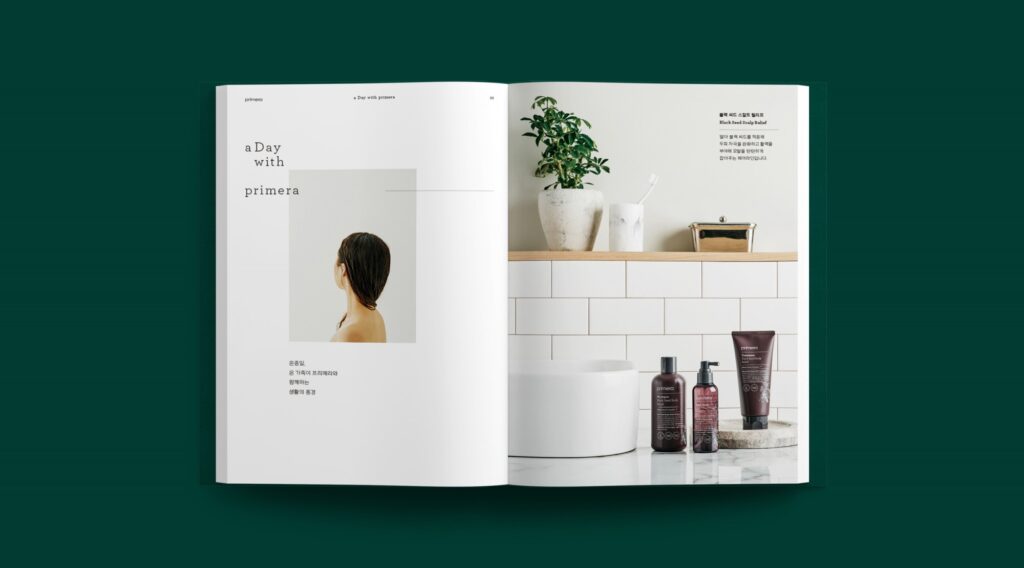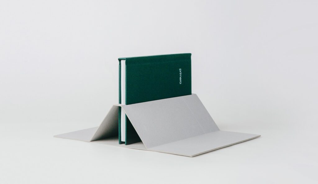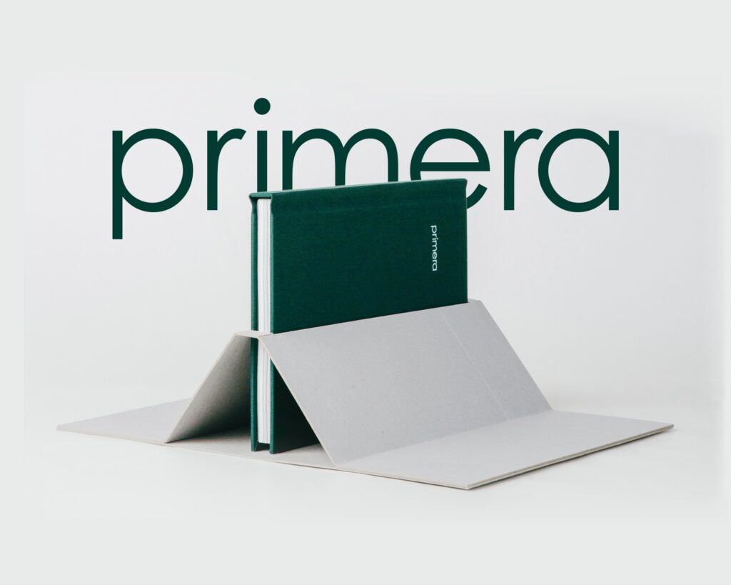
This is the editorial design of Ahn Graphics’ primera brand book.
Concentrated green and subdued gray help to relax the eyes. It is attractive to express various raw materials by cutting them out of paper. Along the outline, the shape of the thin paper allows you to feel the texture of the raw material, which is fresh. The shape when the whole is overlapped also conveys the feeling of being a compressed integer. The English font, which looks slightly inked, and the Korean font, which looks like it was written calmly with light pressure, go well together.