
Tokyo Dome City has been rebranded. Studio &Form and typeface designer Toshi Omagari worked together to transform the visual identity for 2023-2024. Tokyo Dome City, previously called Big Egg City before January 1, 2000, is an entertainment complex in Tokyo that gathers various facilities such as Tokyo Dome, an amusement park, spas, hotels, and theaters. The original design was expressed in a way that can go back and forth between analog and digital. So that it can be recognized as a single system in any environment […] ]
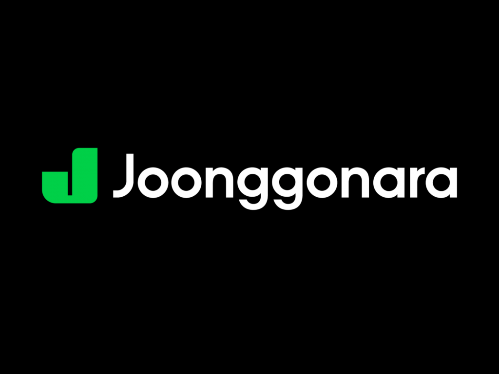
Joonggonara has been rebranded. Joonggonara is an online used goods trading community that started on Naver Cafe and is a platform used by nearly 20 million people. Since its opening in December 2003, it has ranked first in the number of Naver Cafe members and has consistently maintained its ranking ever since. We shared in detail how we changed the brand identity of Jungjoongara, which has maintained its original form for 20 years. Part 1 summarizes the brand direction pursued by Joonggonara and how to express the brand […] ]
Onstage is ending its 13-year journey. Onstage is an indie music platform operated by Naver Cultural Foundation. Under the theme of discovering hidden music, it has shared live videos every week since November 2010. In line with the motto, ‘Hidden music meets the world,’ it has introduced various music. From Baek Yerin and Beenzino to Dear Cloud, Nell, Glen Check, Lee Seung-yeol, Jo Deok-hwan, Park Sung-yeon, and Leenalchi, it has spread good music across time and genre. On November 16, it will introduce its last music and end its operation. […]
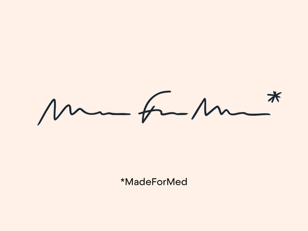
MadeForMed has rebranded. MadeForMed is a medical communications service co-founded by Dr. Julien Pourcel and his colleagues in 2014. Based in France, they are building a community with 20 colleagues. Their goal is to modernize family medicine by providing close patient care. With the number of doctors decreasing and health becoming a consumer good, MadeForMed aims to bring doctors and patients closer together. This rebranding highlights the unique mission of the service across various visual identities […]
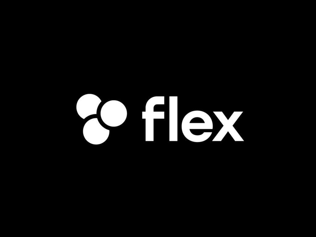
Flex has rebranded. Flex is an all-in-one HR platform that solves problems related to human relations that occur when running a company. A symbol has been added to the logo, which was made up of the word mark flex. The value that Flex pursues is said to be 'to connect all HR experiences into one and create a new change in the way we work. The essence that we have focused on has been consistent so far, and we decided to express the keyword 'team', which is our identity. 👁️ Designer's Eye Flex defined 'Flex-ness' based on the keyword 'team'. […]
Wanted has rebranded. Wanted is making new attempts to go beyond a platform that connects companies and job seekers to encompass the entire 'people's work'. We had to express our future direction while containing our current identity. It is said to have been completely redesigned to overcome a palette that is difficult to create a unique impression and a form that is difficult to use in various environments, both online and offline. The new Wanted visual identity focused on expressing ‘a career super app that will open up all possibilities for working people.’ 👁️ Designer’s eye […] ]
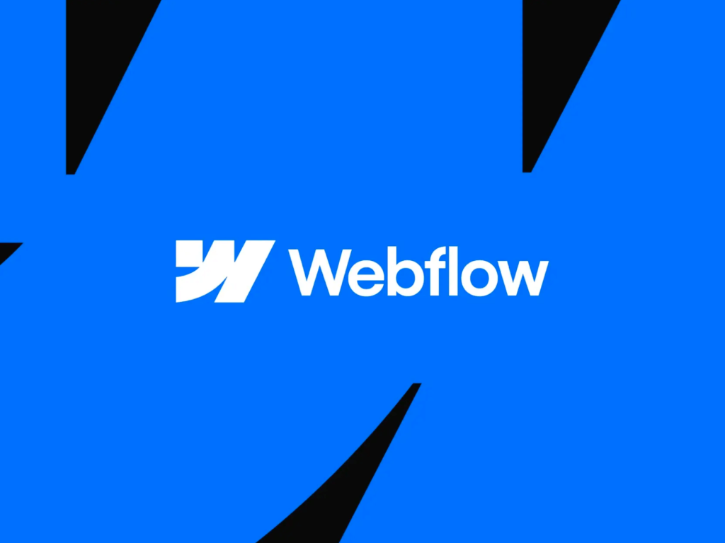
Webflow Webflow has been rebranded. Webflow is an American company based in San Francisco that provides services for building and hosting websites. Since its launch in 2013, it is an online visual editor optimized for creating websites without code. This rebranding was also shared along with various changes through the Webflow Conference on the 5th. 👁️ Designer's Eye The W in the service name is deconstructed to symbolically represent the basic elements of the web: HTML, CSS, and Javascript. This is a webflow […] ]
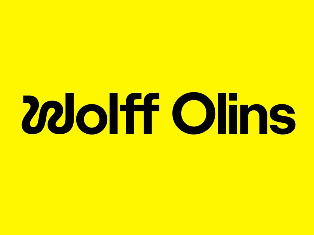
Wolff Olins has rebranded. It was founded in London in 1965 by designer Michael Wolff and advertising executive Wally Olins. He has contributed to the design of iconic brands such as the Beatles' historically significant Apple Records, Johnson & Johnson, Google, and Airbnb, and has recently designed brands for Leeum Museum, LG, Instacart, and Uber. Wolf Olins is trying something new by opening a new location in Los Angeles and expanding to the West Coast. Step up to the challenge […] ]
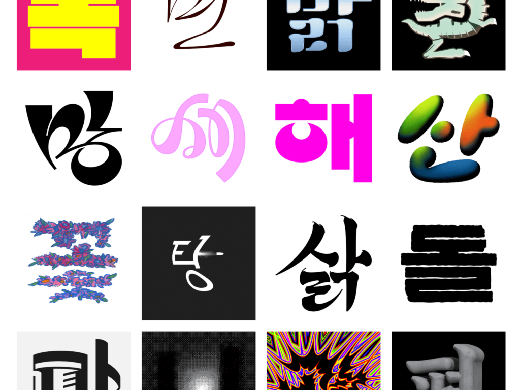
In commemoration of Hangul Day, Sandoll held an exhibition called ‘My Favorite Hangeul.’ This is a project where over 100 creators freely select ‘one letter’ and create lettering. The 'Hangeul' lettering created by various creators is scattered individually, but it contains the meaning that 'Hangeul' is completed as the audience sees and reads it. You can visit the Hangeul Gallery on the second basement floor of Sejong Center for the Performing Arts from 10:00 a.m. to 6:30 p.m. On display until October 15, 2023. (Closed on October 10th) 👁️ Designer’s Eyes […] ]
‘Patreon’ has been rebranded. Patreon has been around for 10 years with a mission to help creators generate revenue directly. The company announced its ambition to go beyond simple paid membership and become a platform for creators, introducing a new brand visual identity and service features. This shift is for a “digital-first world that challenges static, outdated media brand-building conventions for identities that better reflect today’s ever-evolving creative landscape” […] ]
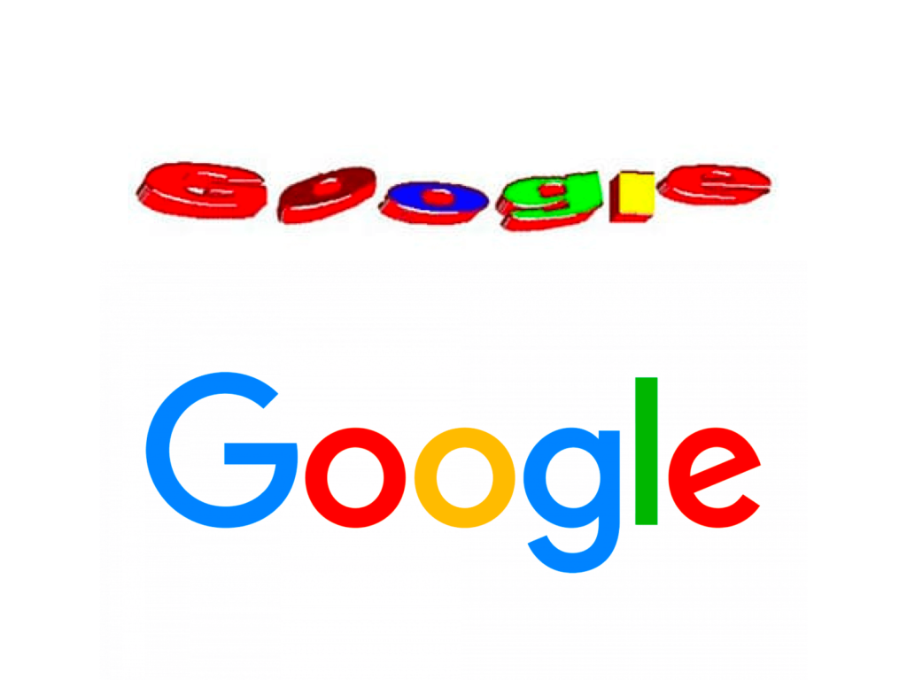
Google released Google Doodle to celebrate its 25th anniversary. Google Doodle is a way to hang a special anniversary or event on the front page of Google, the search engine. We transform our word mark ‘Google’ into various images or add Easter eggs such as mini games. Sergey Brin and Larry Page met at Stanford University in the late 90s. I thought that the world would become more connected through the World Wide Web and that search engines would be important. After developing tirelessly in a rented garage, in 1998 […] ]

'Irish Independent' has rebranded in collaboration with Mark Porter Associates. The Irish Independent is a local Irish magazine published since 1905. The project was led by Mark Porter, who worked as creative director at The Guardian for over 10 years. 👁️ The designer's eye harp has been a symbol of Irish Independence for over 60 years. However, several Irish brands use the harp as their symbol. What represents Ireland? Ask questions and explore everything from the Neolithic to Irish design of the 60s and 70s […] ]