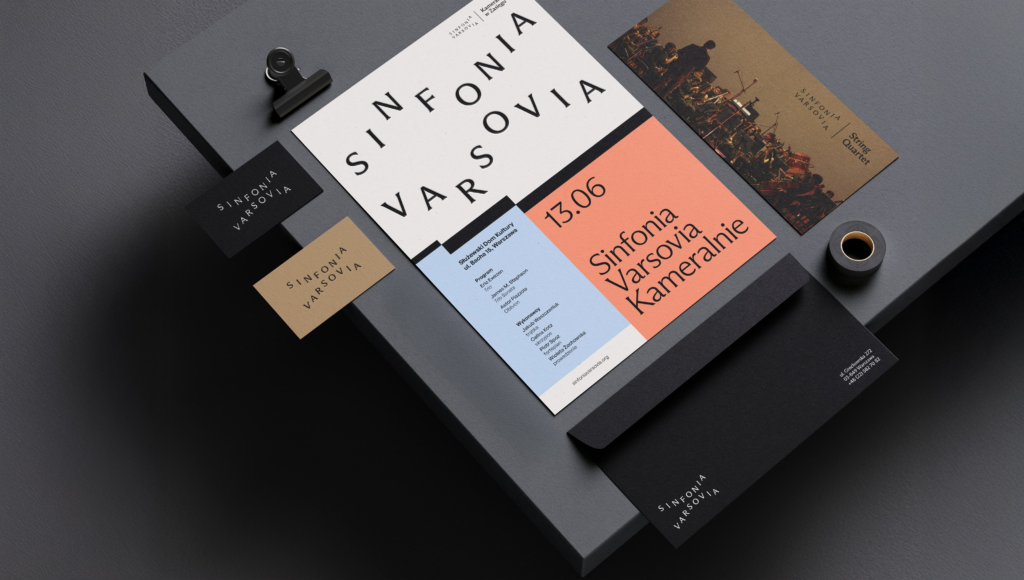

This is the brand design for Sinfonia Varsovia, an orchestra based in Warsaw, Poland. It was proposed by TOFU Studio. However, this project was not actually implemented because the brand identity competition ended without a final decision.
Sinfonia Varsovia is a Polish orchestra known for its international collaborations, extensive repertoire, and educational programs. A new music center is also currently being established in Warsaw. This proposal interprets the orchestra's activities not as a single fixed symbol, but as a structure where various sounds and experiences overlap.
The core of the identity is musical harmony. In a symphony, different instruments and sounds come together to create a single flow. This brand system also visualizes the scene where performance, education, festivals, community, and spatial experiences are interwoven. It views the moment when the audience meets the orchestra as a living musical process.
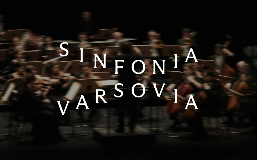
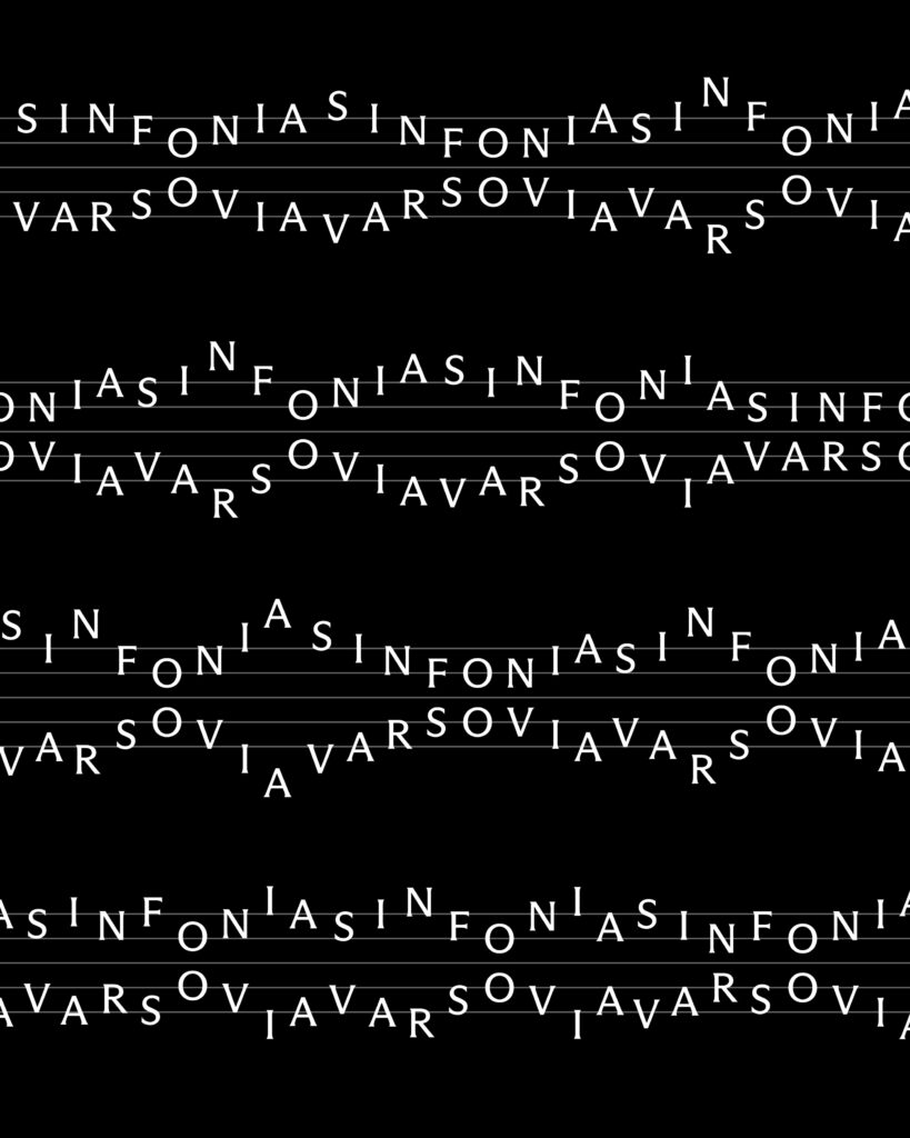
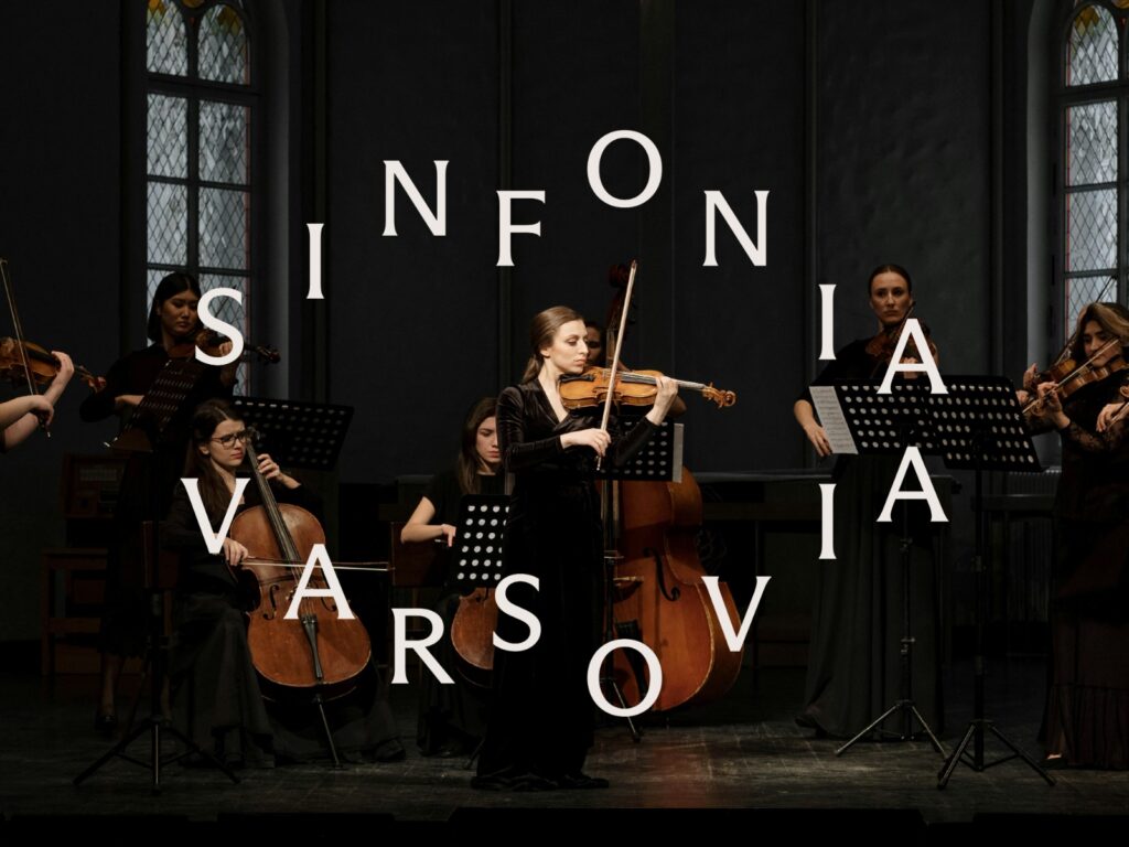
The logo originated from musical notation. The letters were arranged like musical notes on a staff. Through this, the logo becomes not a fixed mark, but an open system that can be continuously combined and varied. The vertically arranged letters evoke the image of a harmony where multiple notes sound simultaneously.
A semicircular line has been added to the basic mark. This line alludes to both the architectural form of the concert hall and the arrangement of the orchestra. As letters and lines combine, the logo becomes a solid institutional mark while simultaneously serving as a graphic device with rhythm and movement.
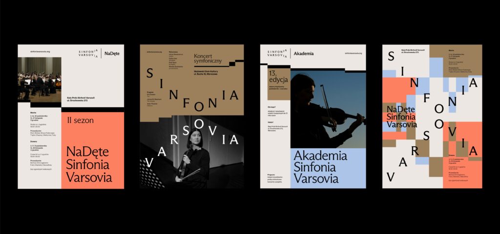
This system also extends to sub-brands. Utilizing simpler forms of the mark, it can be applied to various activities such as small ensembles, educational projects, and festivals. It is a structure that maintains the central identity while allowing each program to have an independent face.