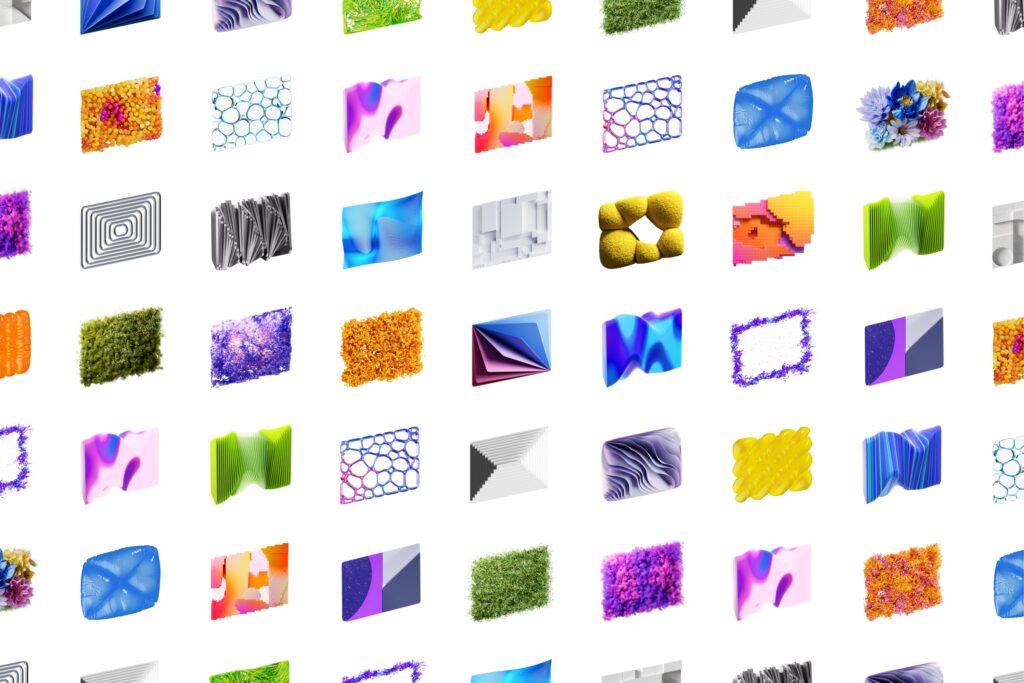
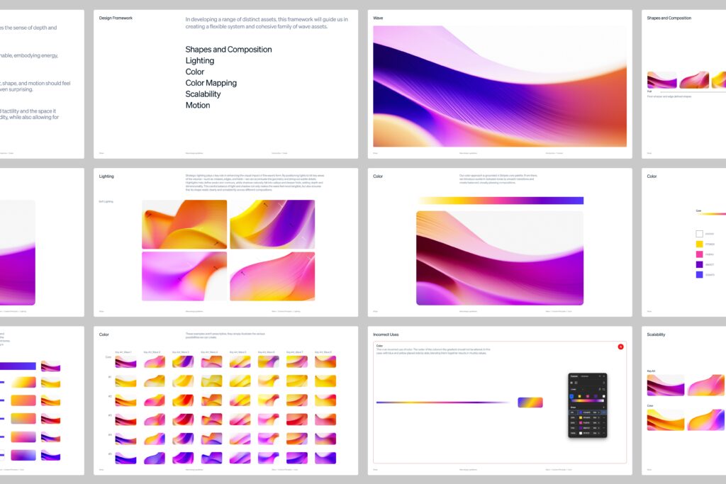
This is Stripe's brand visual identity. We collaborated with ESTUDI-IMAGE. Through R&D work that reorganized the brand's representative visual elements, Wave and Parallelogram, we developed an expandable visual system applicable across marketing.
The core principles are quiet confidence and optimism through color. Since the Stripe Wave has long been a symbol of the brand, we evolved it in a more immersive direction rather than completely changing it. By utilizing a closer viewpoint, a sense of space along the z-axis, deep depth, and light transmission, we made the graphics appear like living matter rather than flat decoration. The atmosphere is calm yet cinematic, and abstract yet possesses a physical sense.
Parallelogram also shares the same texture, color palette, and surface expression. This form is a graphic that has symbolized progress, optimism, and directionality within Stripe. In this work, depth and materiality have been added to match that meaning. While Wave and Parallelogram can be used independently, they maintain a sense of connection as being within a single brand world when placed together.