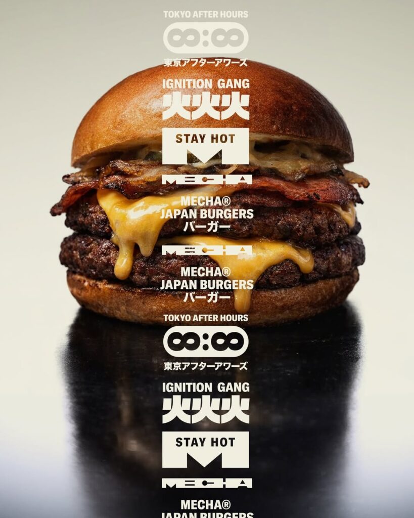

MECHA is a rebranding project that began at the moment when the existing Fry House Burger could no longer be described by its old name. The kitchen's direction shifted to incorporating a stronger smoky flavor, more direct energy, and Japanese elements without exaggeration. To keep up with this change, the brand required a new name and visual identity, and the name MECHA was born as a result.
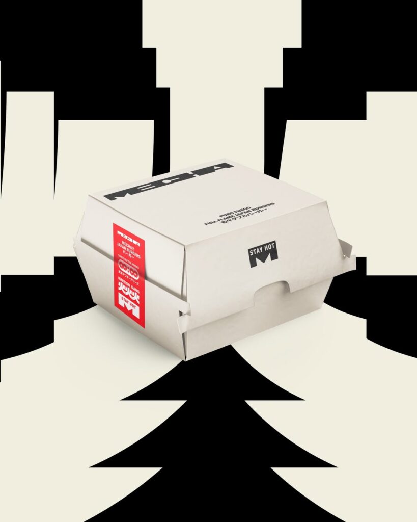
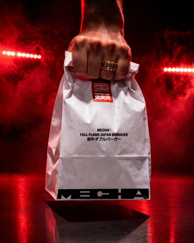
This change is also clearly evident in the visual design. Instead of directly imitating Japan, MECHA captures the energy felt from the signage, rhythms, and imperfect textures of Japanese streets. Rather than a decorative "Japanese style," it has created a visual language that allows the brand to move and expand. Through a system extending from packaging and clothing to shopping bags, stores, and streets, it expands the burger brand into a single cultural image.
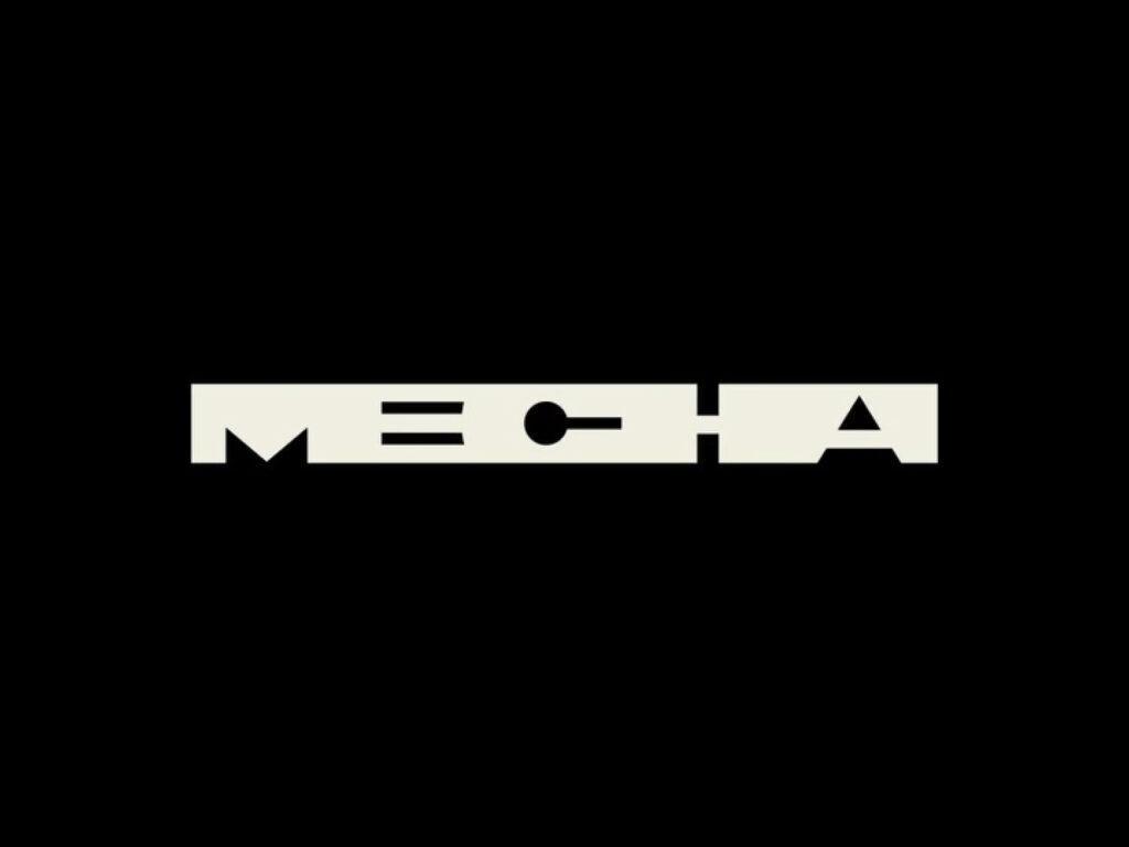
The graphic style, which forcibly combines the alphabet within a square structure, is particularly impressive. The letters appear as readable characters while simultaneously resembling abstract symbols, evoking the dense impression found in Chinese characters or Japanese signboards. This approach aligns with the mechanical and strong feel of the name MECHA.