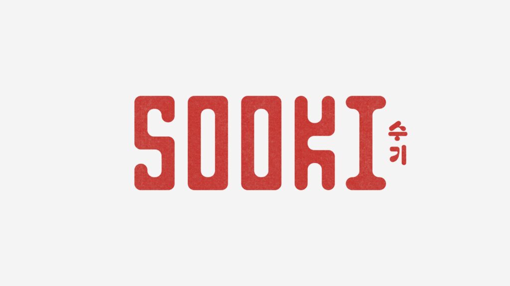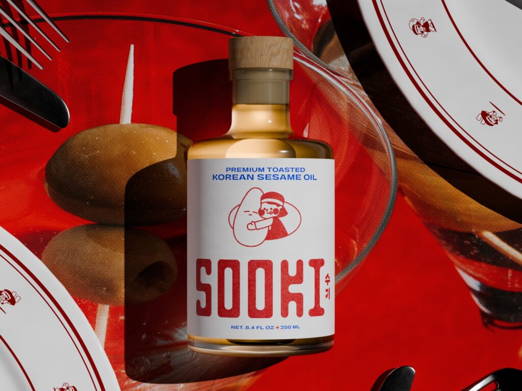
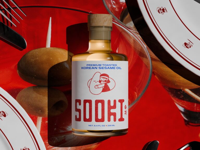
Sooki is a food brand introducing Korean-style sesame oil to the U.S. market. The brand identity was created by The Collected Works, a New York and New Orleans-based design studio. The brand name is derived from the founder's mother's name and is based on the experience of bringing sesame oil from Korea to sustain the family's dining table. The design focused on transforming Korean food culture and familial memories into a modern packaging brand.
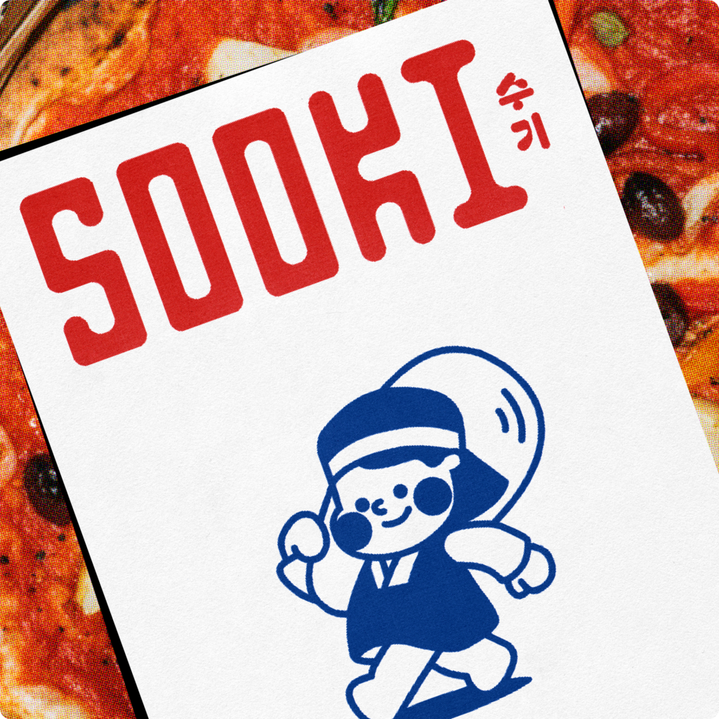
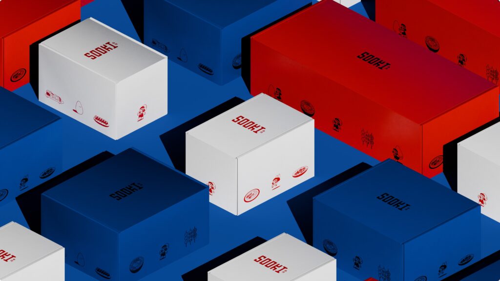
The core of the identity is a character system that blends tradition with a futuristic sensibility. Mascots reflecting Korean elements such as Hanbok, Bokgeon, and Binyeo convey both the brand's heritage and a playful impression. The color palette is simply organized into strong red, deep blue, and off-white, while textured packaging emphasizes the tactile feel of the product. The custom wordmark combines long, ink-like curves with a modern form, and the use of Pangram Pangram's Gatwick for the body text creates a unique yet premium impression.