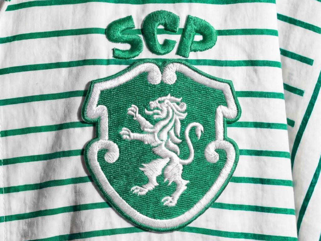
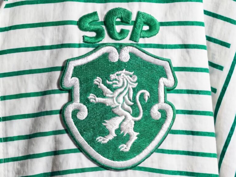
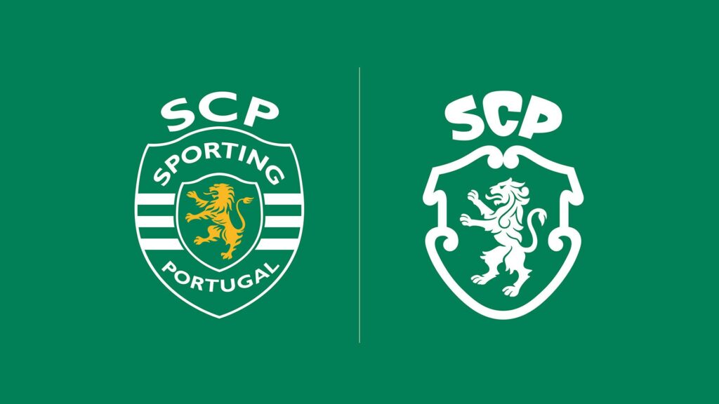
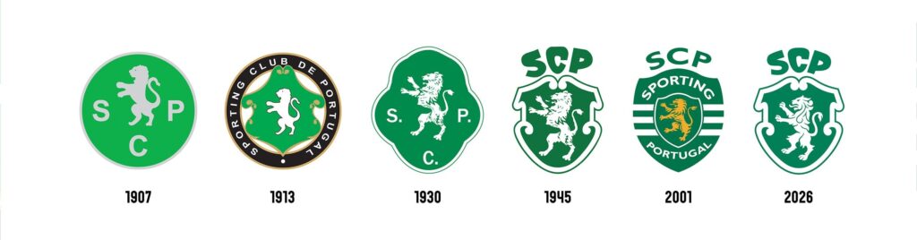
Portuguese football club Sporting CP has unveiled a new brand identity to mark its 120th anniversary. This redesign, the first in 25 years since 2001, proceeded by modernizing the club's historical heritage rather than creating a completely new symbol.
The new emblem takes the classic badge used from 1945 to 2001 as its primary reference. The shield shape has been refined, the lion has been redrawn, and the SCP monogram has been sharpened. Describing this change as an “evolution from the essence,” the Club stated that it has extended the values and symbols dating back to 1906 into its future brand system.
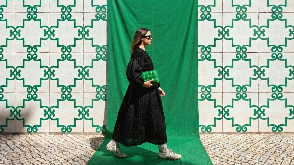
The new identity reflects five core symbols: a shield, the SCP monogram reinterpreted as a crown, a lion, green and white stripes, and 'Porta 10-A,' the entrance through which players enter the stadium. It was designed as a brand language that extends beyond a single logo to be consistently applied across uniforms, merchandise, digital channels, and the stadium experience.
The 120th anniversary commemorative uniform was also unveiled. To celebrate the club's founding year of 1906, 1,906 limited-edition pieces were produced and sold out in less than an hour after sales began. The new emblem will be used as Sporting CP's official visual identity starting from the 2026-27 season.
This rebranding differs slightly from the 'simplification' trend often seen in football club design. Rather than creating an overly minimalist new logo, it restored the traditional forms fans remember and refined them to suit the digital environment. It is an example of refining old symbols so they can be used for a longer time, rather than erasing them.

More and Sources