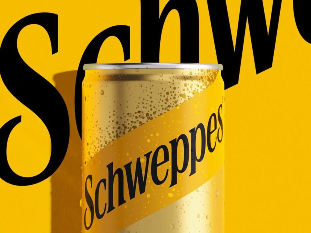
Schweppes has unveiled a new global brand identity. This rebranding was carried out jointly by JKR, Studio.One, and Mischief. Schweppes is known as the world's first commercial carbonated beverage brand, established in 1783. Rather than simply repackaging the old brand, this change focused on bringing back the history and symbols that Schweppes originally possessed.
The core of this rebranding is closer to "restoration" than "reinvention." Recently, the beverage market has seen a rapid increase in new brands emphasizing craft, artisan, and premium qualities. Amidst this trend, Schweppes re-emphasized that it is the archetype that created the carbonated beverage category. JKR examined Schweppes' archives and reinterpreted the 18th-century brand heritage through modern packaging and visual language.
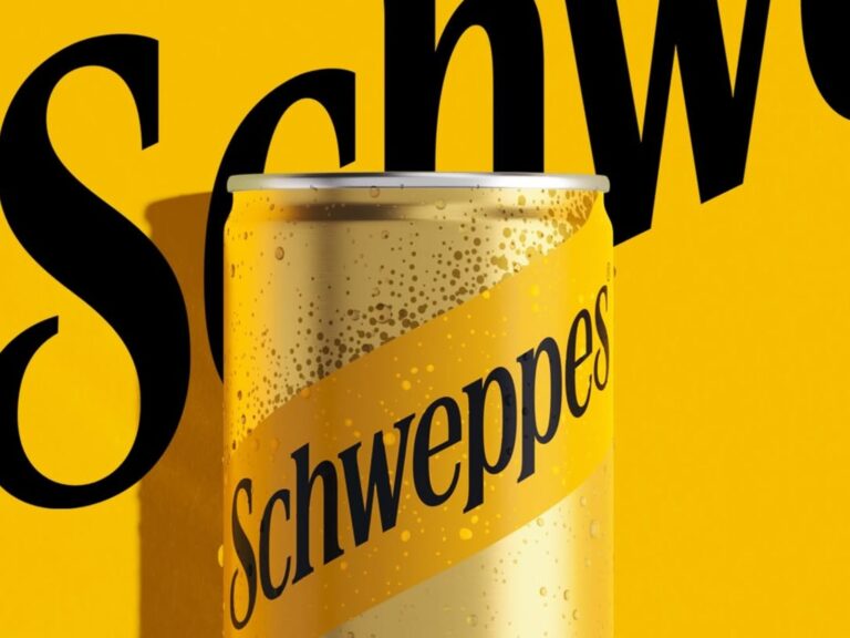
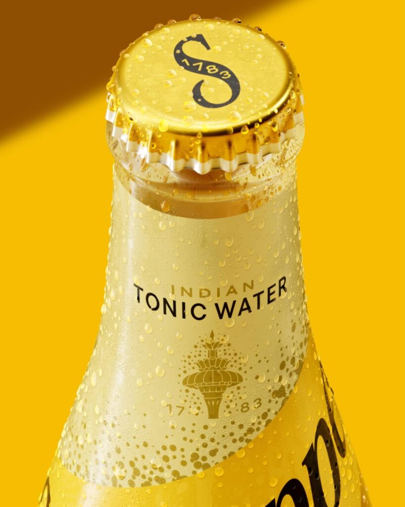
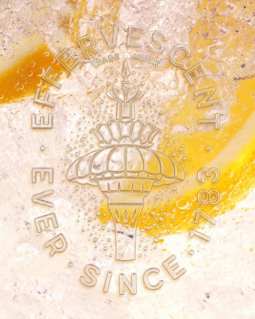
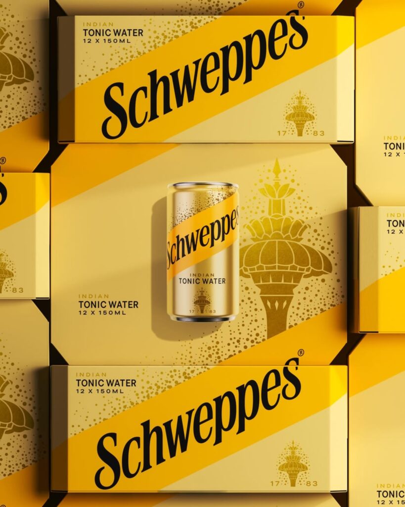
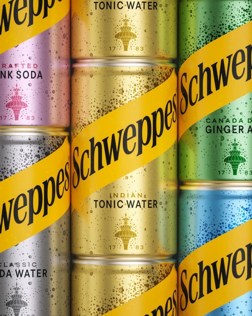
The new packaging is centered around a warm saffron yellow color. This color evokes the light of the golden hour and the social moments of enjoying a carbonated beverage. Serifs have been reintroduced to the logo, and details reminiscent of carbonation bubbles have been added within the letters. The fountain symbol, which connects to the 1851 London World's Fair, has also been modernized.
The brand platform has also changed. Schweppes has brought back Clive the Leopard, a long-standing advertising asset. Clive is also scheduled to appear on the screen at Piccadilly Circus in London this summer. This can be seen as a move by Schweppes to extend its brand memory assets into advertising and experiences, rather than simply changing the packaging.
This rebranding unfolds around the direction of “With time comes taste.” Rather than viewing the fact that it is an old brand as an outdated image, it interprets it as taste and trust that have deepened over time. Schweppes’ way of competing with young beverage brands is not to imitate novelty, but to more strongly highlight its origins spanning over 240 years.
A notable aspect of the Schweppes rebranding is that it utilized brand heritage as a strategy rather than mere decoration. The old logo, fountain symbol, carbonation bubbles, and saffron color all serve as elements evoking the past, while simultaneously functioning as modern assets that stand out strongly on the shelves.
Many long-standing brands try to erase their old image to look younger. Schweppes, on the other hand, turned its age into a differentiator. It is a rebranding that reclaimed its position as the originator of the category and re-established its own weight within the premium mixer market.
More and Sources