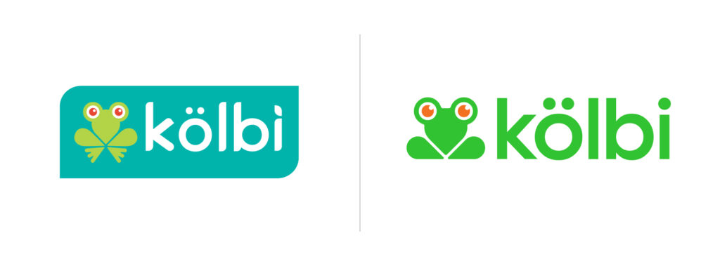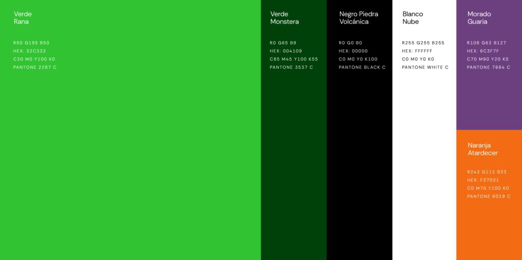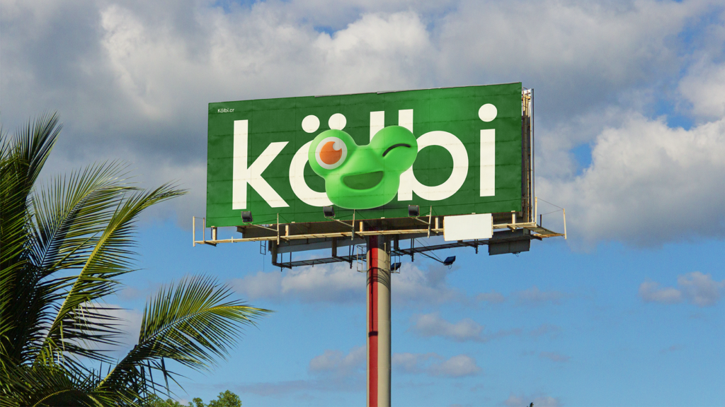
Costa Rican telecommunications brand Kölbi has revamped its brand image for the first time in 15 years. Kölbi is a telecommunications service brand introduced by ICE in 2009. Since then, it has established itself as a familiar brand to Costa Ricans, and through this rebranding, it has transformed into a younger and more dynamic image.
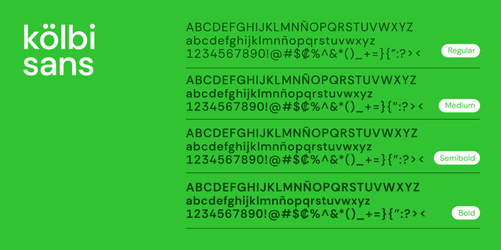
The core of this project lies not in discarding existing brand assets, but in refining them into a more user-friendly form. A new brand-exclusive typeface, Kölbi Sans, has been developed. Based on Hans Thiessen's Rethink Sans, this font has been adjusted to suit the character of Kölbi. Befitting a telecommunications brand, it is characterized by a design that ensures readability and a stable appearance across various digital touchpoints.
The most noticeable change is the brand character, the frog. The small frog that has symbolized Kölbi has been redesigned with a simpler and friendlier face. While the previous version was closer to a static icon, the new version has expanded into a character with smiling, winking, and surprised expressions. Produced in both 2D and 3D versions, it can be utilized more actively in digital content and motion graphics.