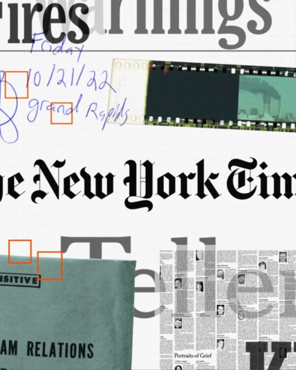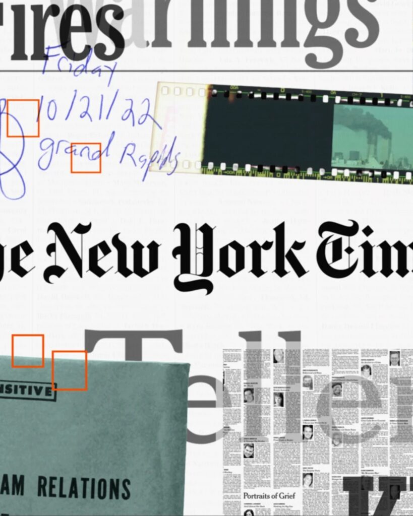
The New York Times collaborated with typeface manufacturer XYZ Type to create a numerical logo commemorating its 175th anniversary. The New York Times' Creative Director, Jesse Bratten-Geyer, and the in-house design team led the commemorative identity, while XYZ Type co-founder Jesse Reagan drew the numbers. The characteristics of the three letters from the newspaper's masthead were selected and transferred to the numbers 1, 7, and 5.
Initially, 175 was typeset using 'NYT Fraktur,' the New York Times' Blackletter typeface drawn by Ed Bengiat. It was redrawn because it was determined that the numbers appeared flat when placed next to the masthead. The XYZ type tested everything from angular Blackletter forms to long, extended decorative strokes. The final version reduced the ornamentation and retained one feature taken from the masthead's strokes for each number.
The letter 1 resembles the serif of the lowercase h used in the title. The end of 7 is finished in a flicked brushstroke shape, like the leg of a lowercase k. 5 tapers toward the end following the curve of a lowercase s. The composition is designed so that when the title and numbers are placed side by side, the strokes of each letter appear to share the same brushstroke, even though they play different roles within the numbers.
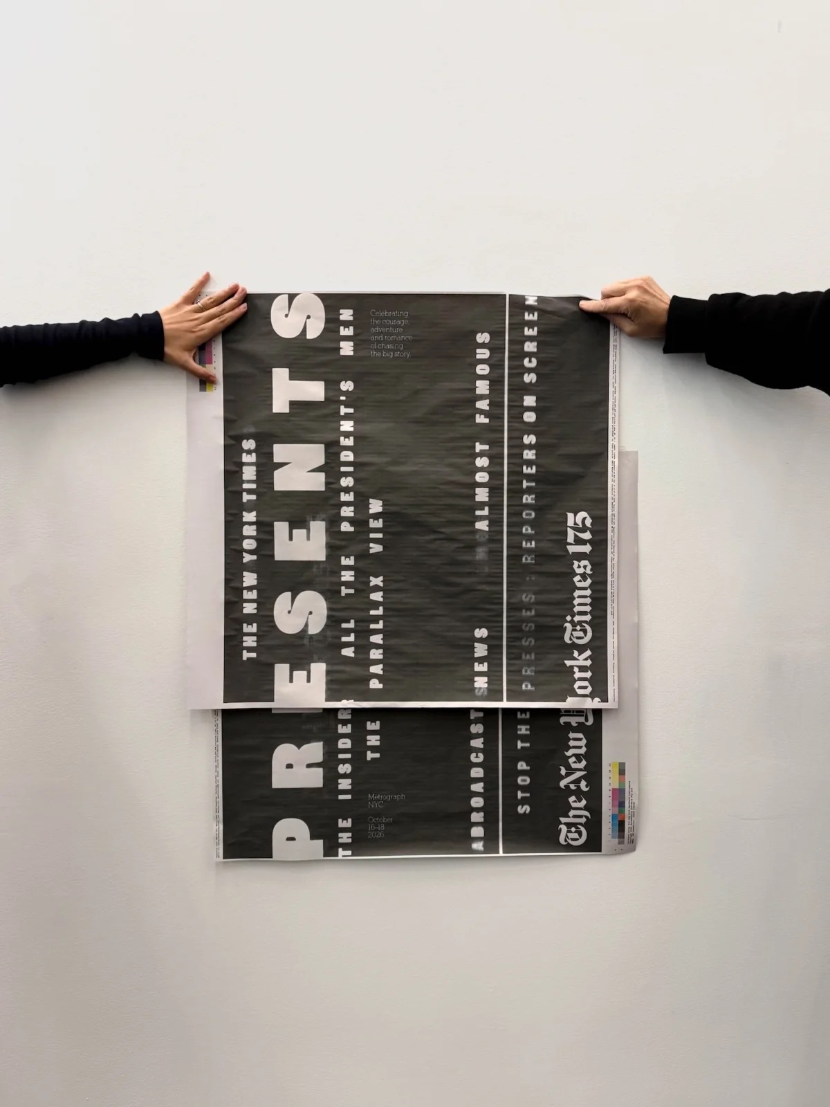
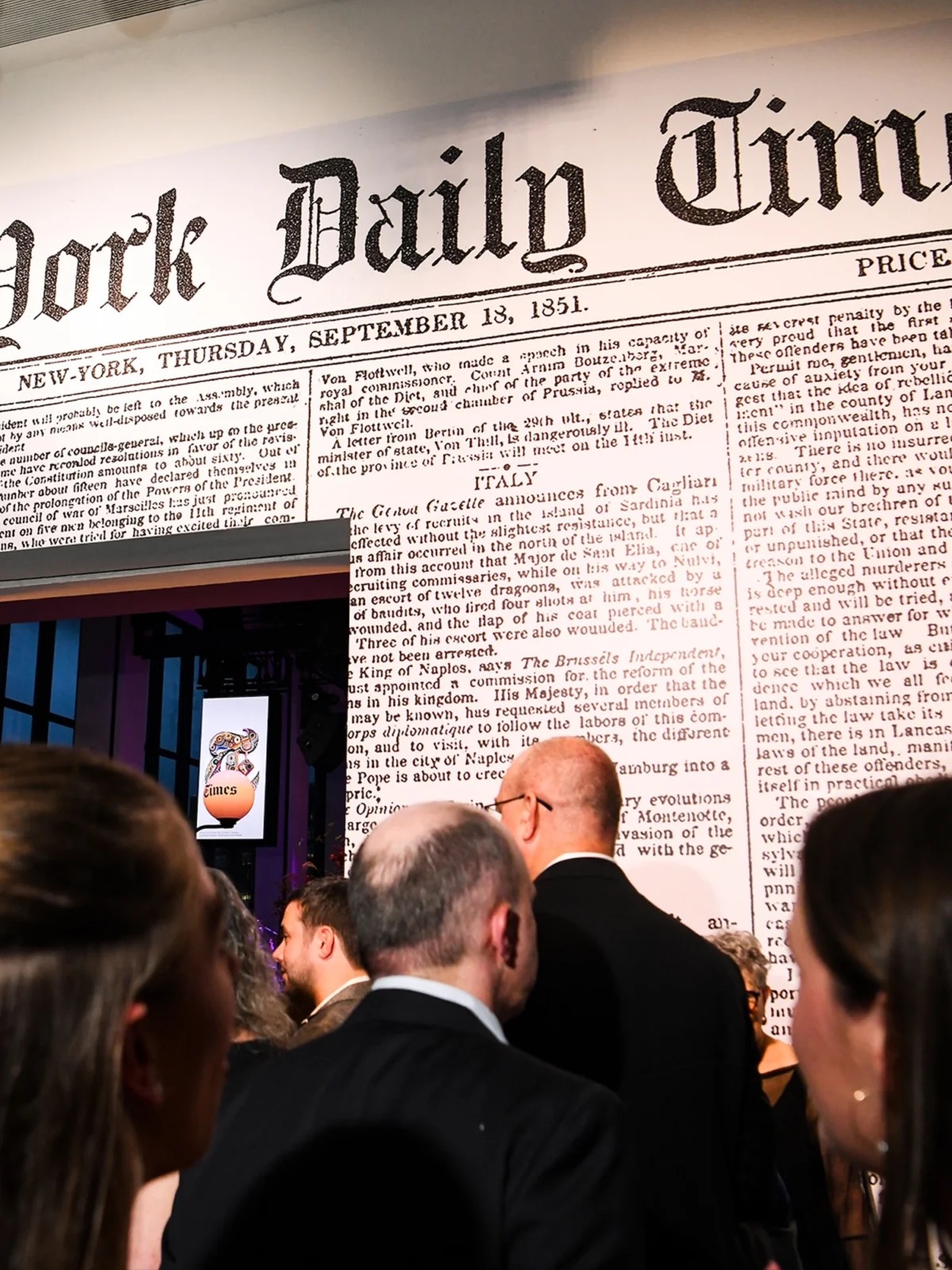
The numeric logo first appeared at the end of a New Year's Eve video introducing the history of Times Square and The New York Times. Motion designer Kiefer Keegan designed both static and animated versions of the numbers alongside the XYZ type. Subsequently, 175 was combined with the full masthead or the single letter 'T' in newspaper pages and exhibitions. Cheltenham Wright was used for commemorative headlines, while Franklin was used for body text and informational text.

More and Sources