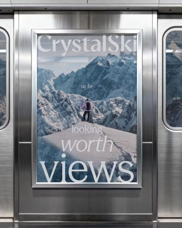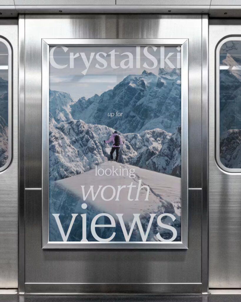
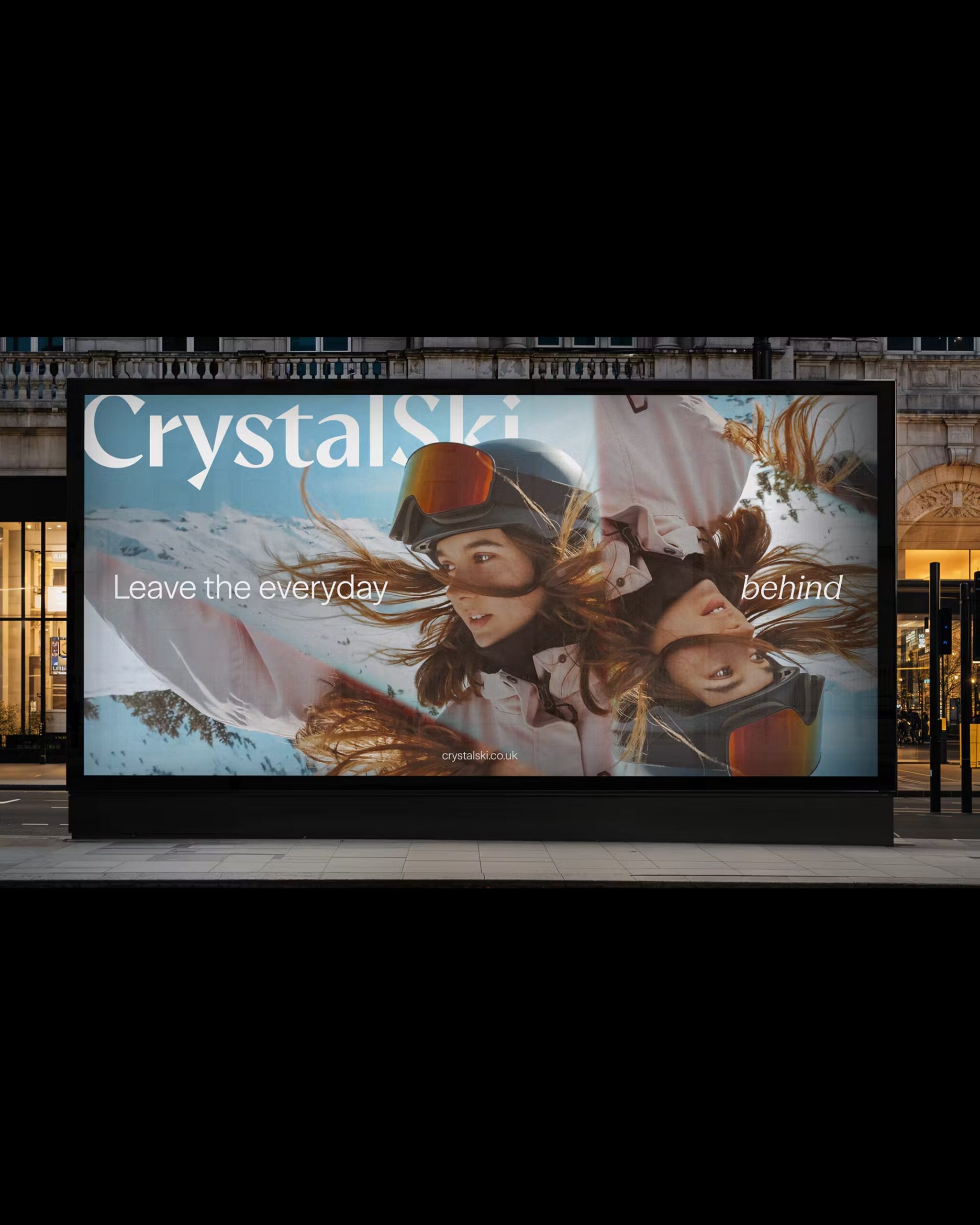
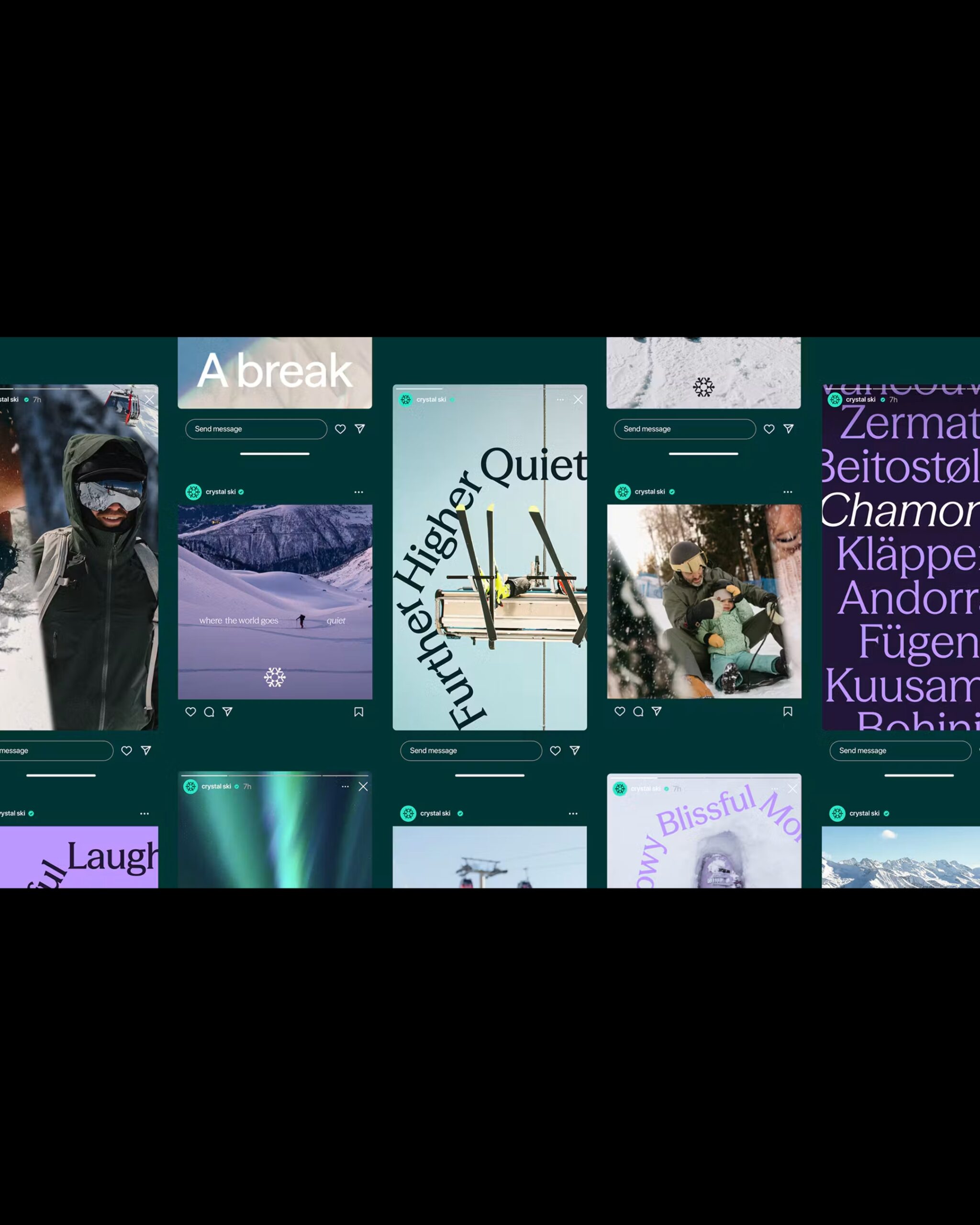
British ski travel brand Crystal Ski has unveiled a new brand identity in collaboration with design consulting firm Landor. Under the slogan "Escape to higher ground," the brand showcases the mountain scenery and relaxation that can be enjoyed during a ski trip. The new design has also been applied to outdoor advertising and social media content.
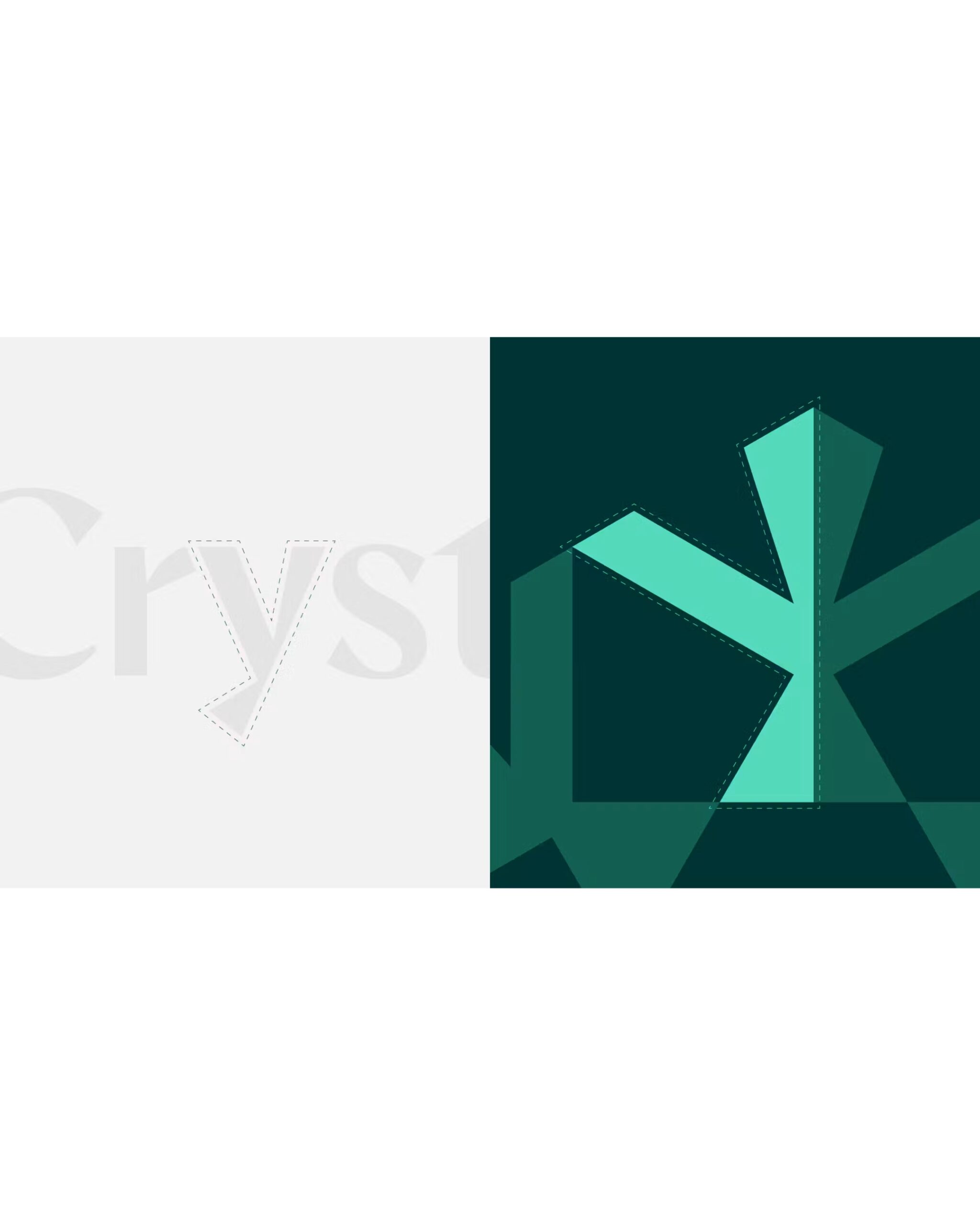
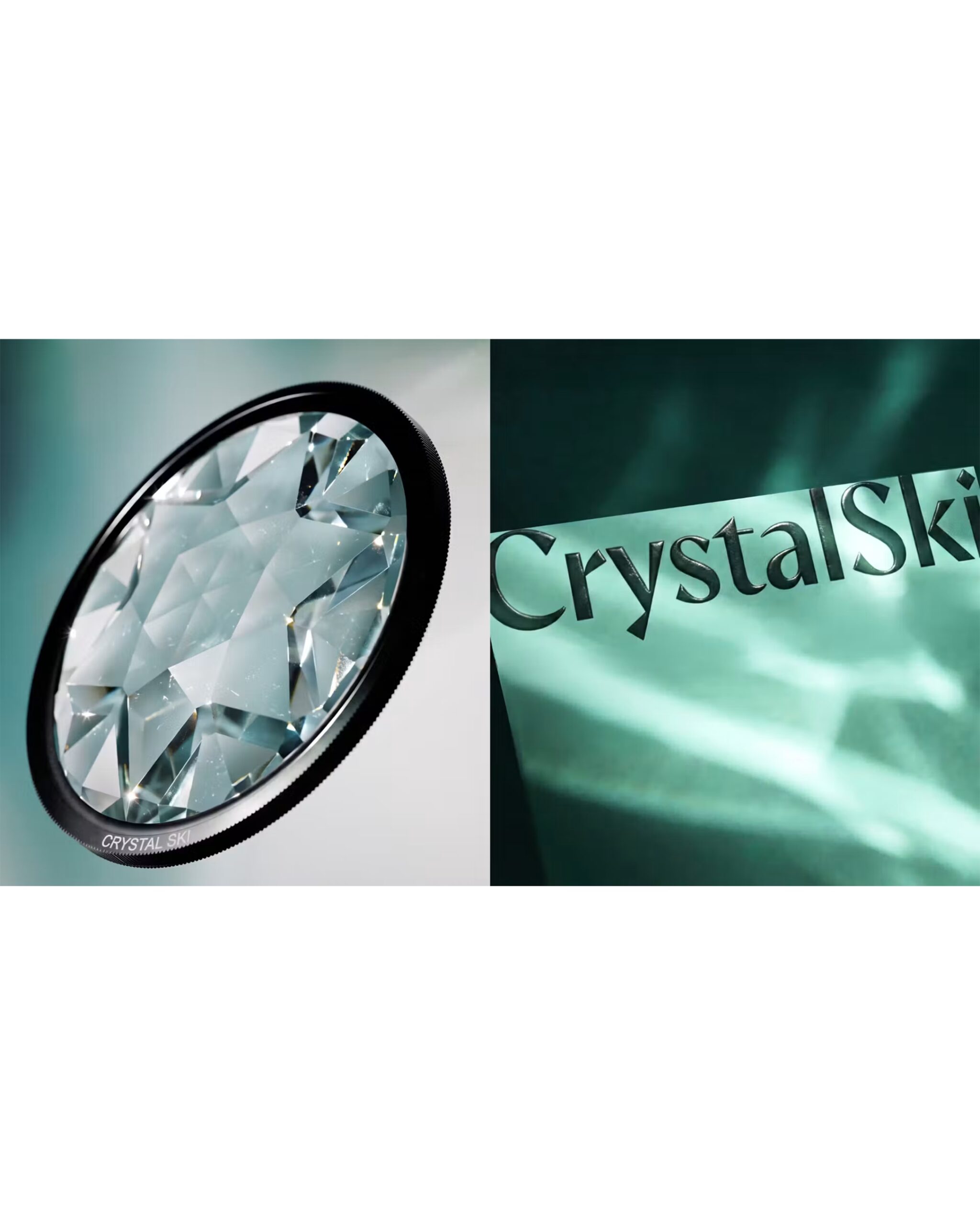
He took the split stroke of the lowercase 'y' in the wordmark to create a graphic resembling the six-fold symmetry of a snowflake. Lando calls this graphic the 'Crystal Lens.' It is used as a frame for photographs to reflect or overlap parts of the image in various directions. In outdoor advertisements, a figure of a skier wearing goggles was placed upside down. A circular prism with multiple facets also appears in production materials demonstrating refraction.
The ends of the wordmark's strokes were cut at an angle, and the dot on the 'i' was shaped like a rhombus. For the text, Display Type Foundry's Season Sans and Season Mix were used together. Concise sans-serifs were placed for information that needs to be read quickly, such as resort names and temperatures. For short phrases in social images, a mix of serifs was used and enclosed in an arch over the photos.
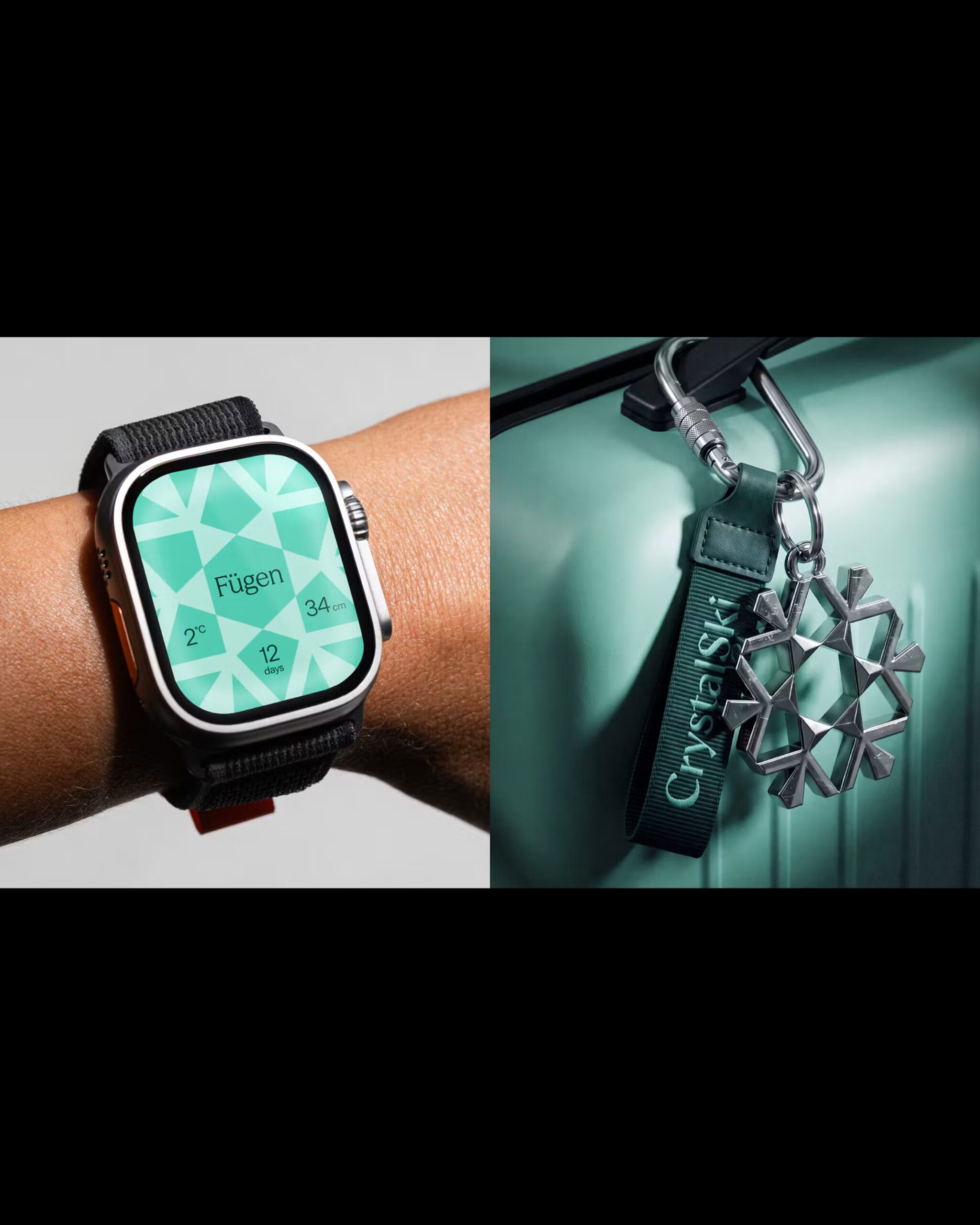
The colors were derived from the deep green of evergreens, the light hues of glaciers, and the colors of mountains at sunset. Snowflake graphics appear on social media screens, watch mockups, and suitcase decorations. When displaying photos, they serve as frames to divide the landscape, while on small objects, the snowflake shape is used as is.
More and Sources