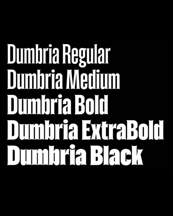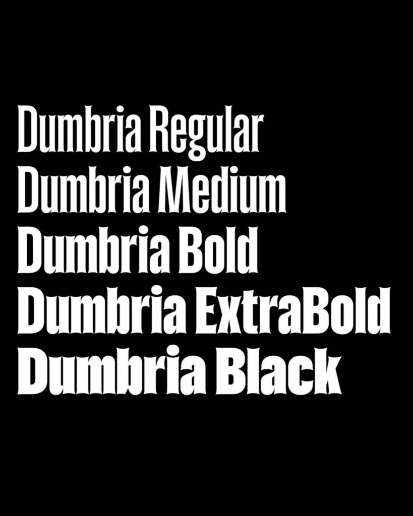
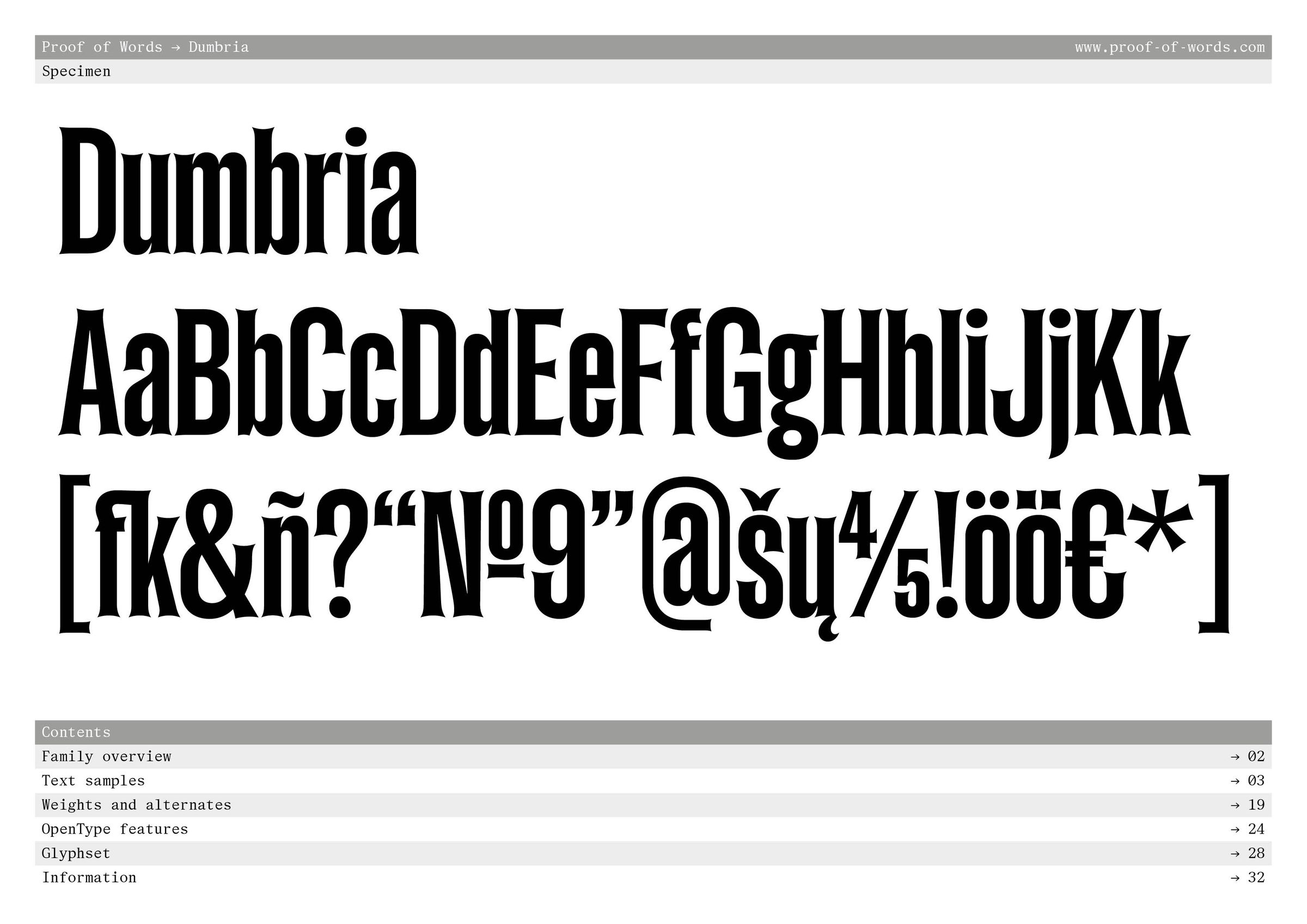
This is 'PoW Dumbria', a typeface designed by type designer Reymund Schröder and released by Proof of Words in October 2026. Léo Guibert and Fanny Hamelin were responsible for the font's creation. Schröder began work in 2016 and refined the form over approximately 10 years.
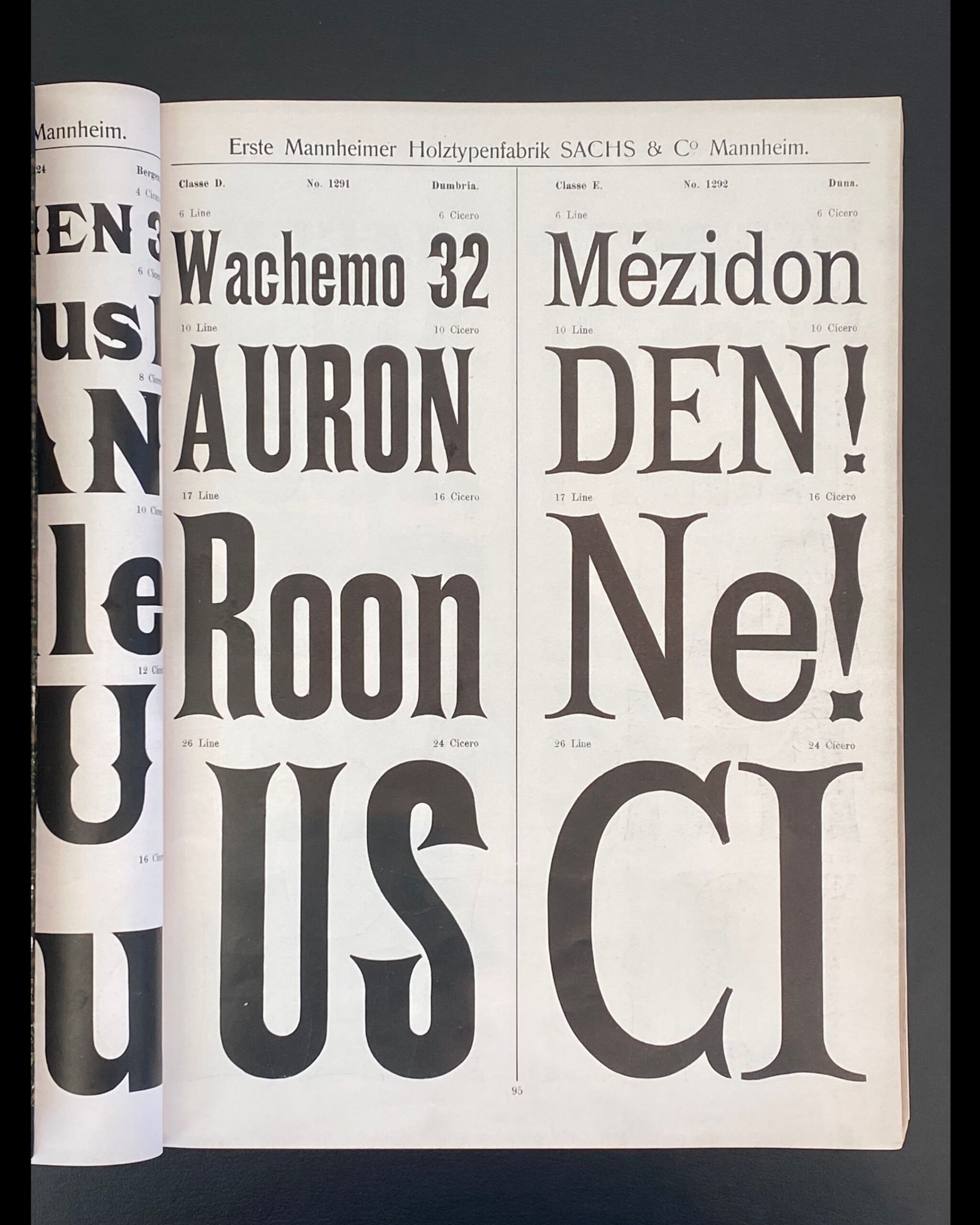
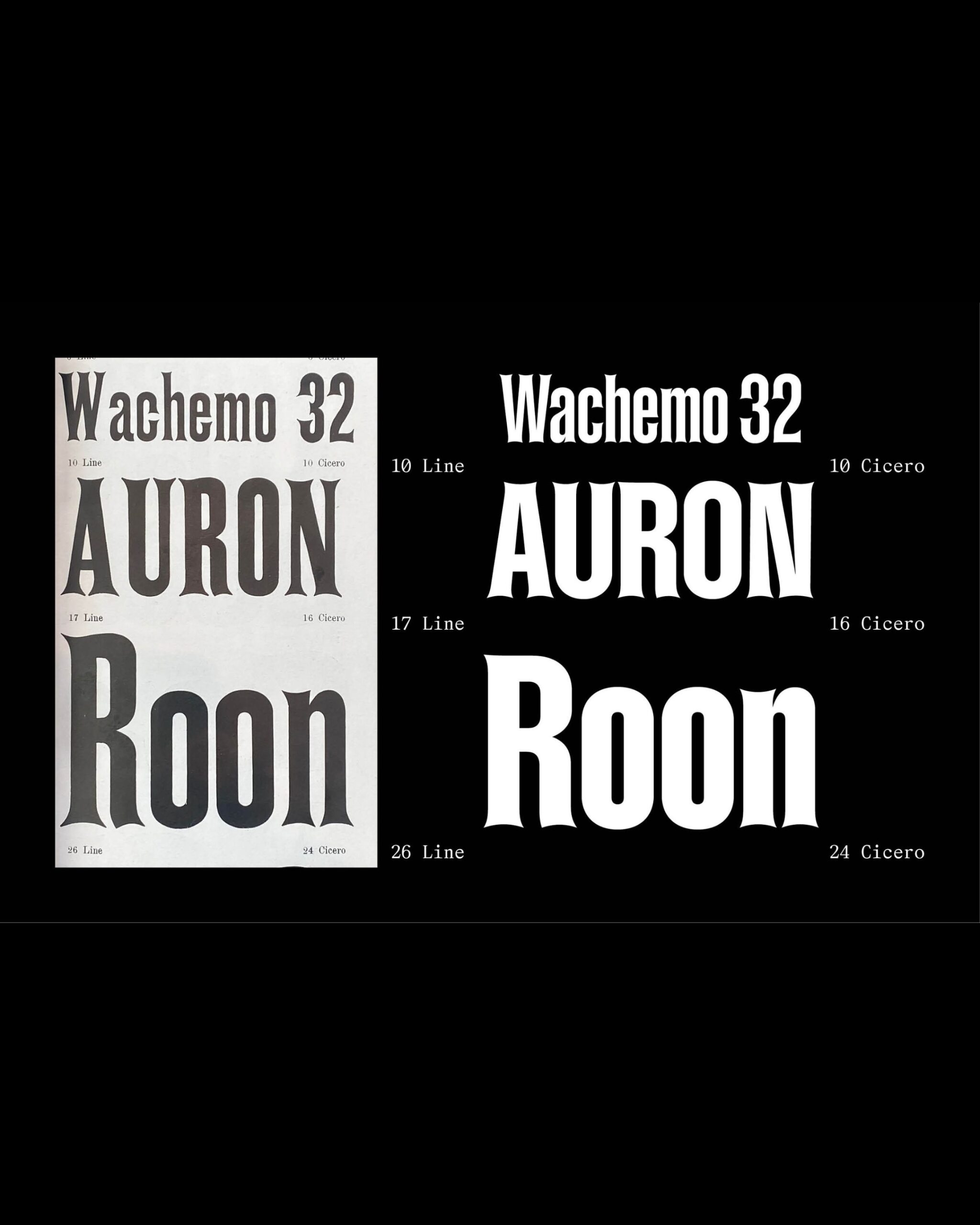
The starting point is a sample book published in 1902 by Sachs & Co., a woodblock printing company in Mannheim, Germany. The 'Classe D., No. 1291, Dumbria' that Schröder saw at the German National Library had only a few characters remaining on half a page. Based on this sample, the creator reinterpreted the parts where the characters were missing. If you place the old sample and the modern edition of 'AURON' side by side, you can see that in both versions, the ends of the strokes curve inward and the corners flare outward.
This concave finish is repeated in Dumbria's uppercase A and N. In Black, the empty space inside the letters narrows as the strokes become thicker. Even in words with a series of rounded letters, such as 'Roon,' the pointed corners at the ends of the strokes meet the rounded bodies. There are five weights ranging from Regular to Black, and the spacing between letters remains tight even when the weight is increased.
With OpenType options, you can change the end stroke of the lowercase 'a' and the shape of the 'r', or change rounded dots into square ones. There are also alternative forms to thin accent marks and some punctuation marks. Schroeder cited posters for cultural events that use large text, book covers, and editorial design as potential applications.
More and Sources
https://proof-of-words.com/typefaces/dumbria
https://proof-of-words.com/resources/pow-dumbria-few-words-by-its-designer