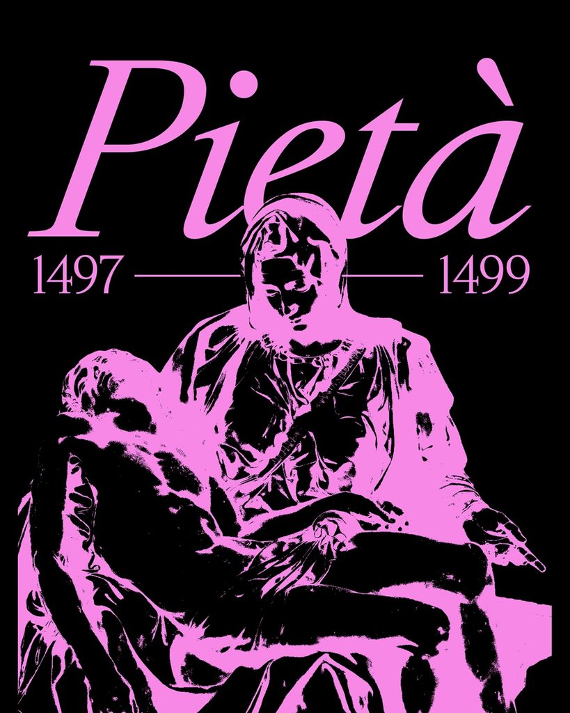
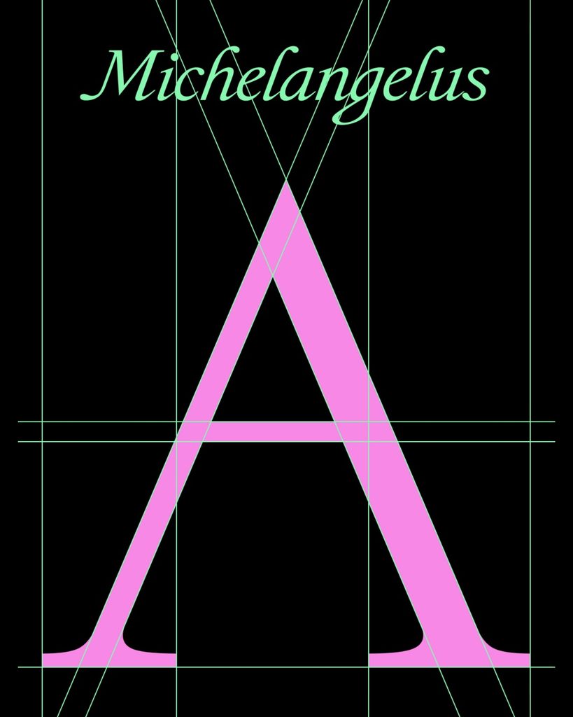
Microsoft has unveiled 'Michelangelus,' a serif typeface inspired by the handwriting and works of Renaissance artist Michelangelo Buonaroti. Commissioned by Fabrica di San Pietro, the organization managing St. Peter's Basilica in the Vatican, it was created by the Italy-Germany-based design studio Studio Gusto. This project commemorates the 400th anniversary of the basilica's consecration.
Instead of simply copying Michelangelo's handwriting, the designers analyzed the proportions, slants, and stroke rhythms of the letters in his signatures and letters to reconstruct them into a modern typeface. The lowercase letters were created based on his handwriting, while the uppercase letters derived their forms from the proportions of his sculptures and architecture. In particular, the italics were designed first to reflect the characteristics of the handwriting style of the time.
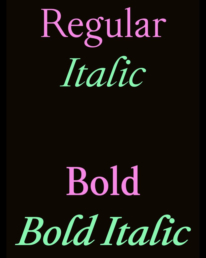
Michelangelos consists of four styles: Regular, Italic, Bold, and Bold Italic. Sources from St. Peter's Basilica state that it contains over 500 glyphs, while a Microsoft design article mentions over 2,000. It is currently available for free download and is scheduled to be distributed to Microsoft 365 apps, including Word, PowerPoint, and Excel, starting at the end of the year.
See more and sources