
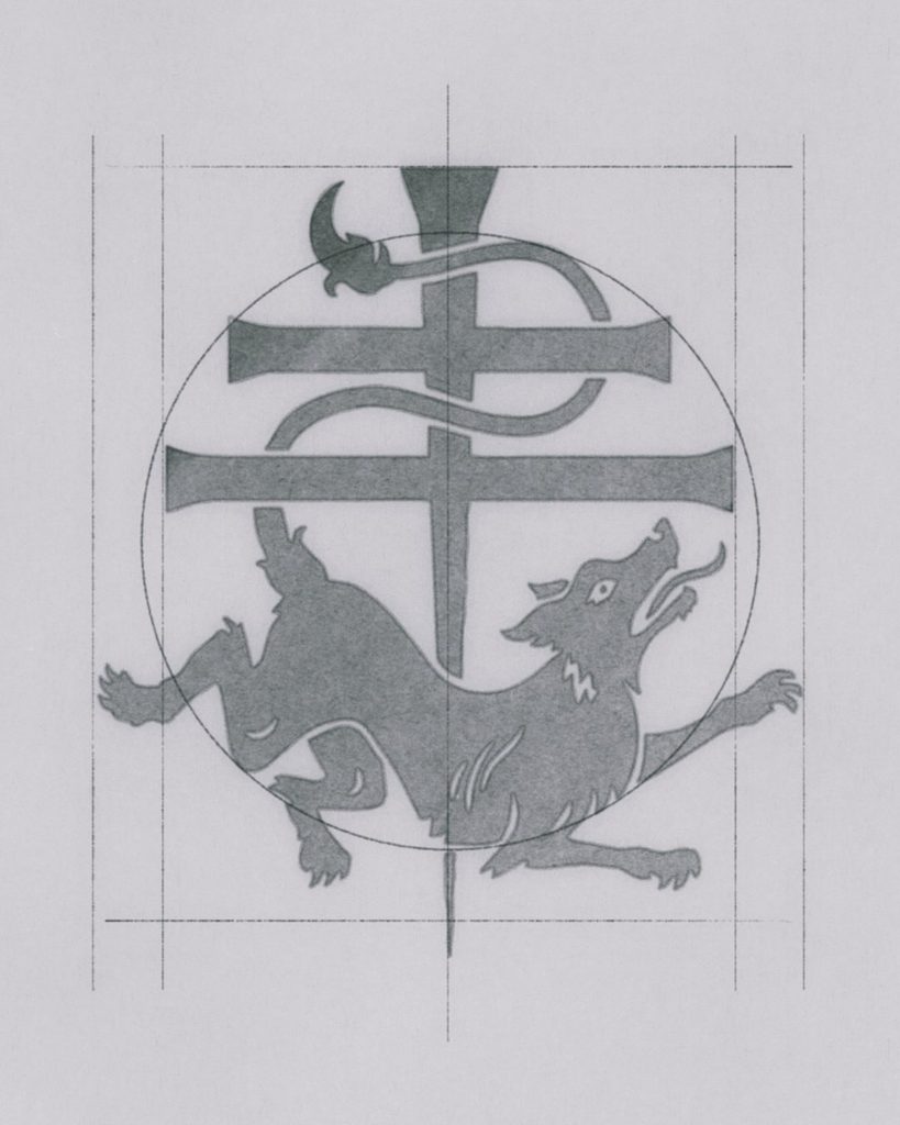
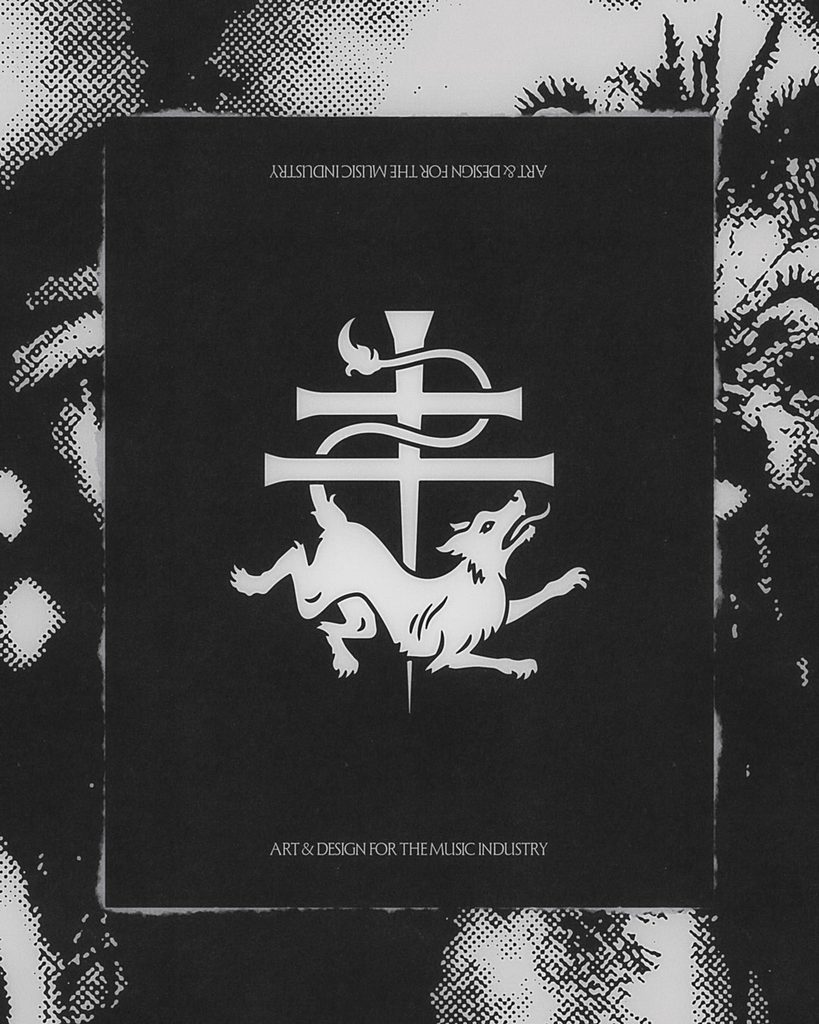
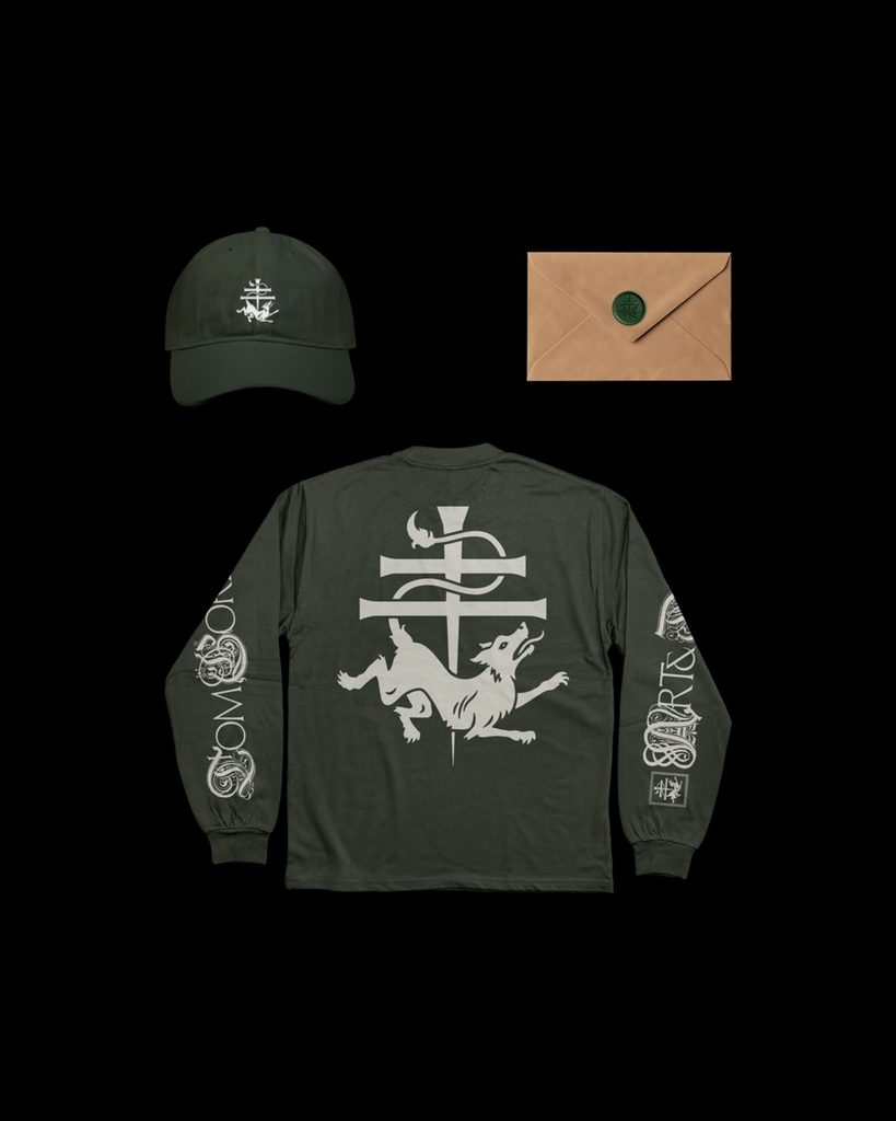
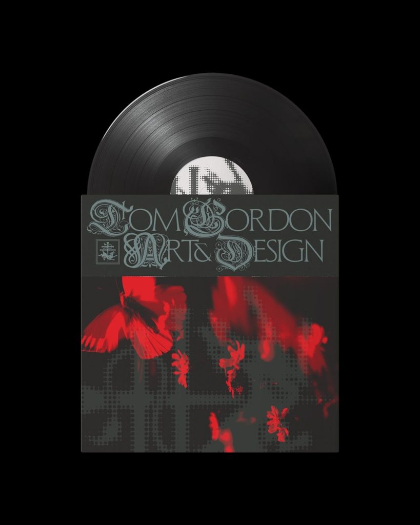
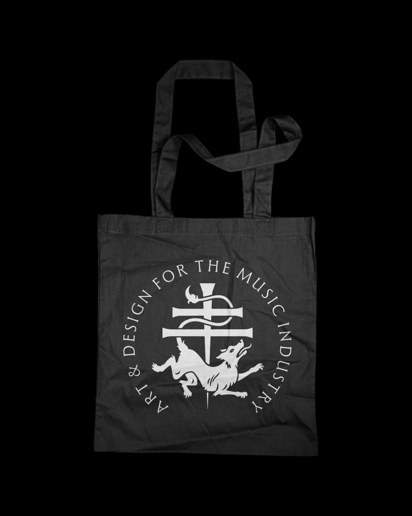
This is a personal sigil logo designed by Tom Gordon. Instead of a wordmark using his name, this work was designed as a symbolic system centered on the letter T. According to the released explanation, he determined that it was difficult to create a distinct impression when using his name as text, and after experimenting with various monograms and icons, he decided on a single-letter-based logo.
The starting point of the logo is sigil. Sigil is a method of combining letters and symbols to create a single sign. This logo uses the T as its central structure and symmetrically expands the surrounding forms to make it appear like an independent sentence. In essence, a form with stronger symbolism was chosen over a simple initial.
The design reflects the creator's living environment. He explained that while he lives in a rural area far from big cities, he works in the visually glamorous creative industry. The logo does not hide this sense of distance, but rather uses the folk atmosphere of his hometown as the standard for his personal branding.
This identity is an example of reorganizing personal branding, which is often easily pushed to the background of a portfolio. One's name, birthplace, and work style have been compressed into a single symbol. The 3D animation was handled by arthackr.
See more and sources