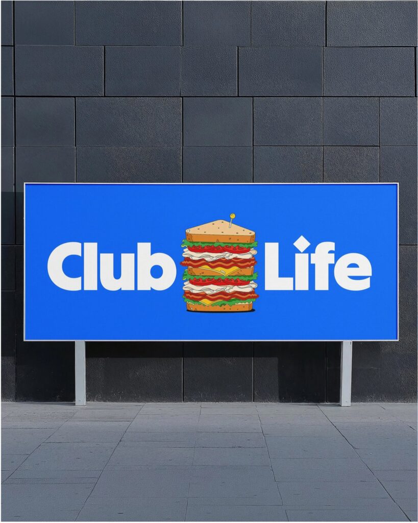
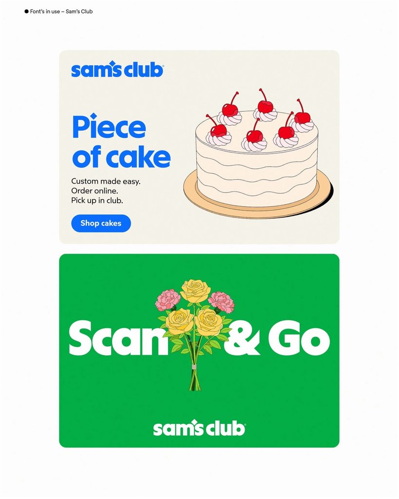
Sams Sans is a typeface exclusively for Sam's Club, developed by Sharp Type in collaboration with Turner Duckworth. This typeface was developed for Sam's Club's 2026 brand refresh. It is not merely a decorative typeface used for the logo, but part of a brand system that connects advertising, store signage, digital displays, packaging, and wordmarks.
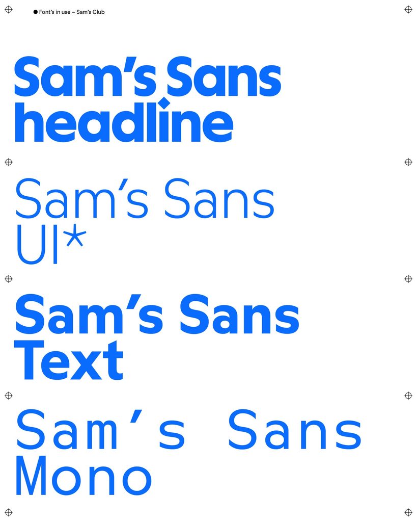
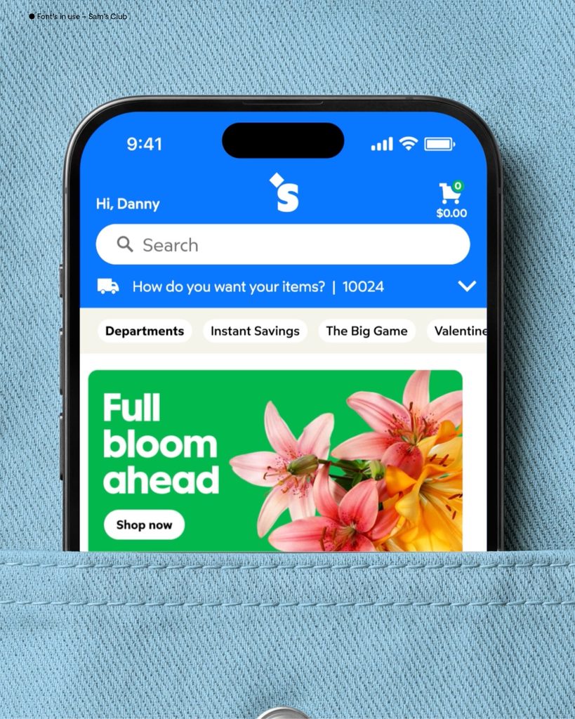
Sams Sans consists of Display, Text, Mono, and UI cuts. It is divided to allow use in different environments, ranging from large headings and body text to code-style information, as well as app and web screens. Sharp Type stated that this typeface was completed as a multi-style family in a short period of time through collaboration with the Turner Duckworth team.
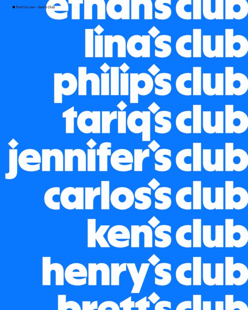
The most distinctive feature is that Sam's Club's diamond icon has been brought inside the letters. In the new logo, the diamond acts as an apostrophe. Within the typeface, this is reflected in the dot of the 'i', punctuation marks such as periods, and parts of the lowercase 't'. It is a method of extending the brand symbol beyond the logo to create a detailed structure of the typography.
This approach was designed for retail brands that utilize both in-store and digital touchpoints. Signage viewed from a distance needs to make a strong impression, while remaining legible on apps and the web. Sams Sans is based on geometric structures but maintains information delivery by using open typefaces and adjusted spacing.
See more and sources
https://www.sharptype.co/case-studies/sams-sans