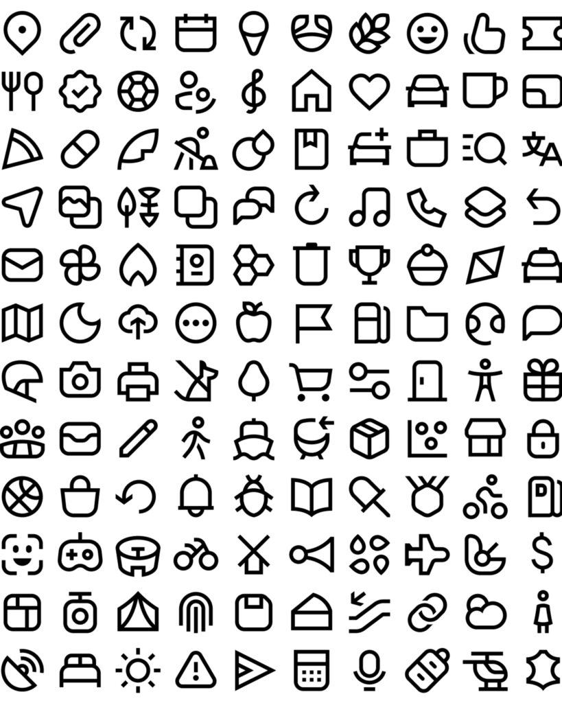
Uber has completely revamped the icon system within its enterprise design system, Base. This project was unveiled by Group Product Design Manager Samira Rahimi in March 2026. The existing icons were designed around 3px outlines, sharp corners, and geometric shapes. However, as services and features expanded, it became difficult to express complex meanings within the limited pixel space. Furthermore, consistency was compromised as different products used filled and outline icons.
Accessibility issues were also a reason for the redesign. While Uber used filled icons by default, the way the selection state changed from gray to black did not provide sufficient differentiation. Therefore, the relationship between the outline and the fill state was redefined. Based on the Uber Move typeface, the new icons feature a 2px stroke, square stroke caps, wide negative space, and emphasized curvature. This is a method of connecting typography and icons into a single visual language.
The Base team recreated 1,500 icons over the course of about four months. At the same time, they standardized naming and sizing rules and established a production system that allows for updates between design files and code. Uber explained that if two or more products begin to deviate from the design system, it should be viewed not as a simple error, but as a signal that the system needs to be modified. This overhaul was a project that revamped not only the form of the icons but also accessibility, consistency across products, and the way design and code are connected.
More and Sources