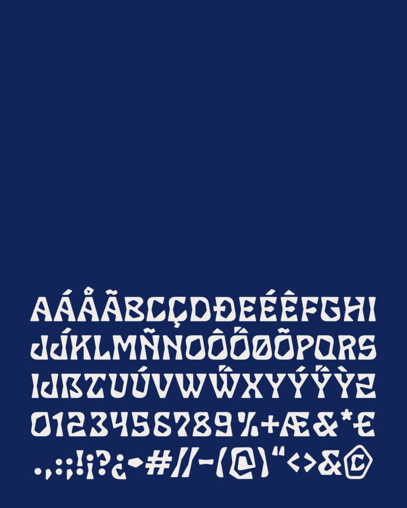
Studio Sappo of Hamburg, Germany, has unveiled its first in-house typeface, 'SC Ostrea'. Developed for product packaging and brand design, this bold display typeface is designed to maintain a strong impression even when viewed from a distance or printed at small sizes. A free trial version is currently available, and the full typeface is scheduled to be released later through selected font retailers.
The form of the typeface originated from an oyster. Instead of smoothly organized letters, it abstracted the rough edges, sharp corners, and irregular contours of an oyster shell. The strokes and letter structure were designed so that the typeface does not lose its unique character even when compressed and printed on curved cans or narrow labels, or when the letter height is reduced to about 2 cm.
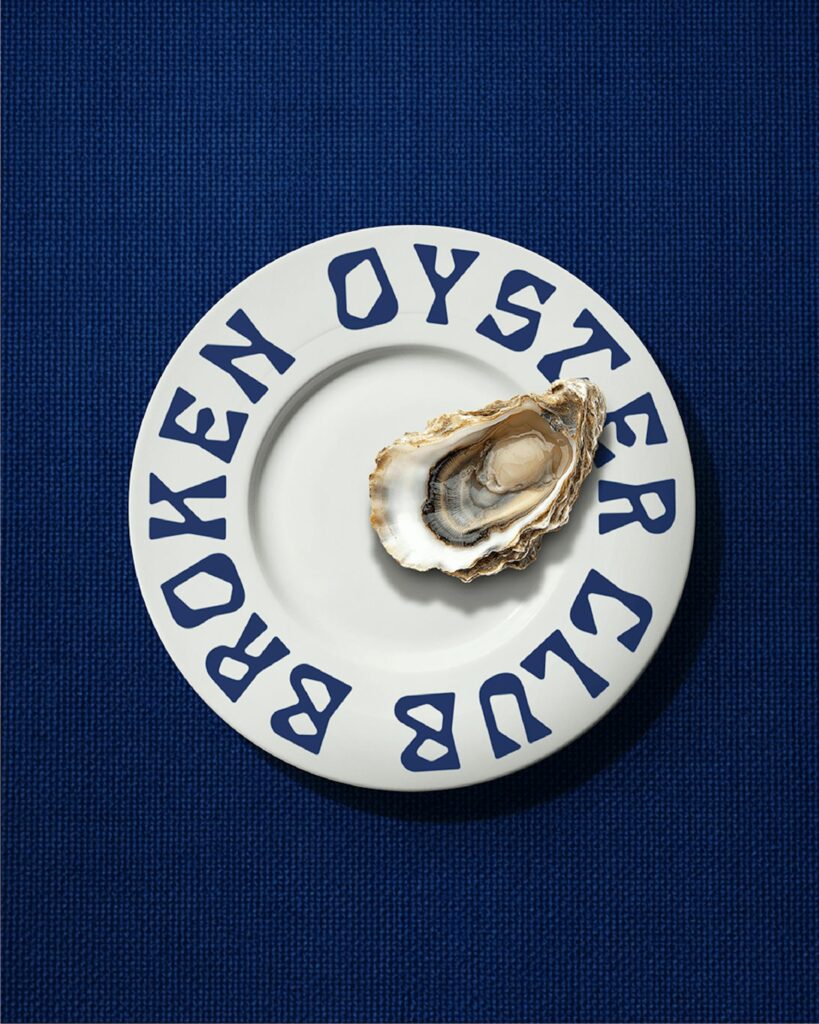
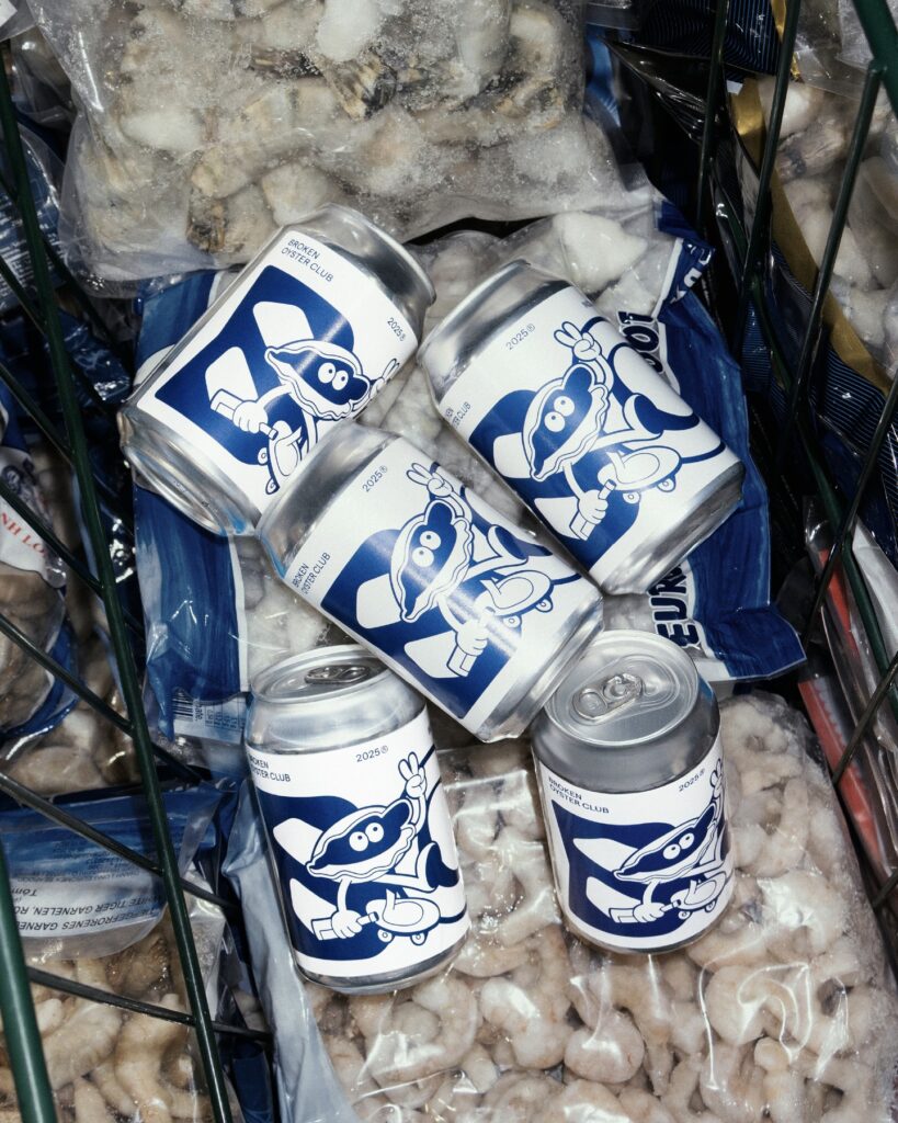
To validate the typeface, the studio created its own brand, 'Broken Oyster Club,' and applied it to oyster packaging and canned beer. Instead of the classic serif typefaces often used in seafood packaging, they prominently featured bold and irregular typography. This demonstrates how to connect typeface development and package design into a single process to create brand visibility and individuality in a real-world sales environment.
More and Sources