7-Eleven has unveiled a new visual identity for its stores in Korea. Designed by Seoul-based branding studio MHTL, this rebranding features a new expansion of the brand system centered around 7-Eleven's iconic number '7'.
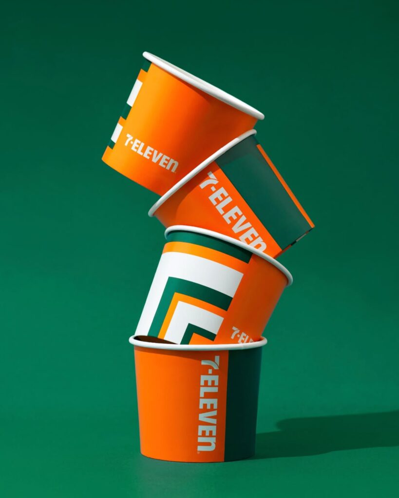
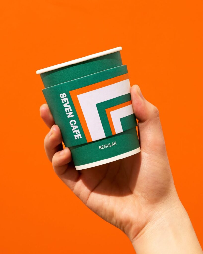
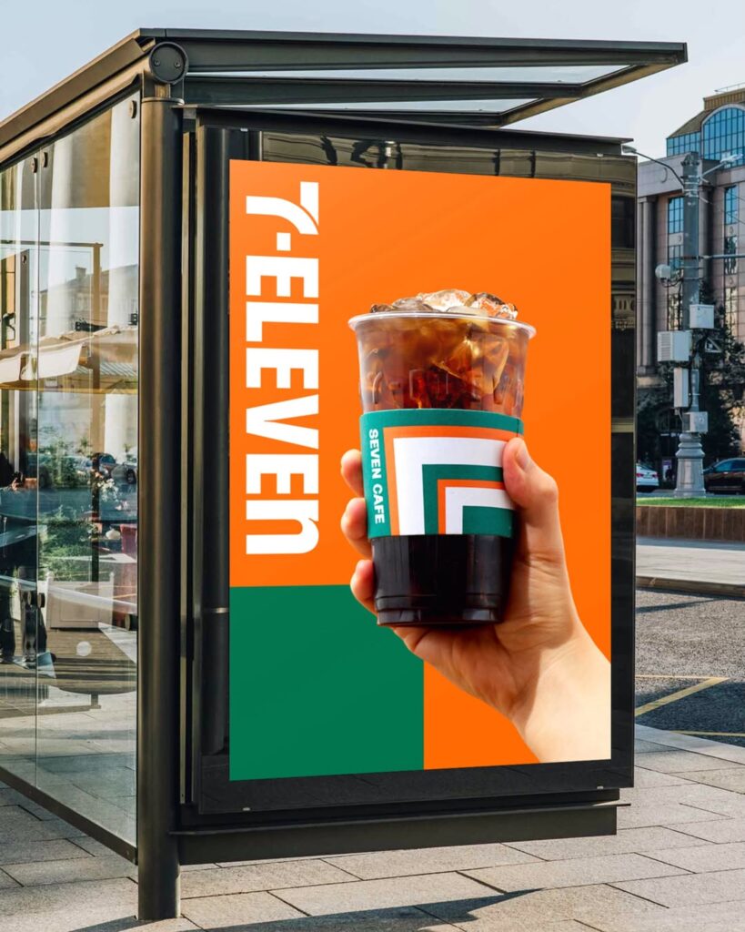
The new identity is based on the diagonal structure and green, orange, and red color palette, which are core elements of the existing logo. MHTL has developed these elements not merely as logo decorations, but into a modular graphic system that can be utilized at various touchpoints.
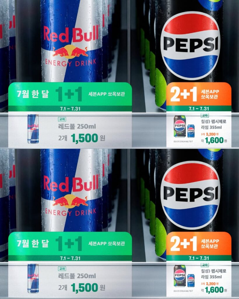
This graphic system is designed to be applied across physical and digital environments, including store exteriors, packaging, signage, and mobile interfaces. In particular, the diagonal shape derived from the number '7' is utilized as a pattern, layout, and information separator, providing a more flexible visual experience while maintaining brand recognition.
However, it is not yet known whether this visual identity will be expanded to markets other than Korea. Nevertheless, Seven Eleven Korea's new design system is drawing attention as an example of how a global convenience store brand can be reinterpreted to suit the sensibilities of a local market.
More and Sources