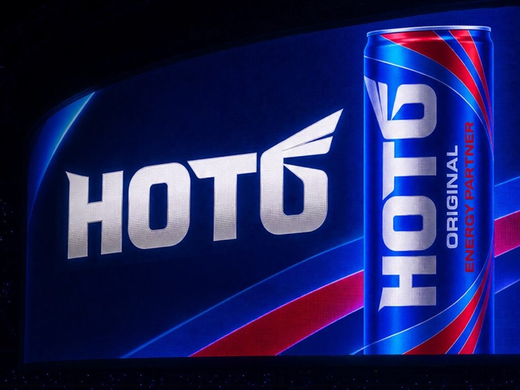
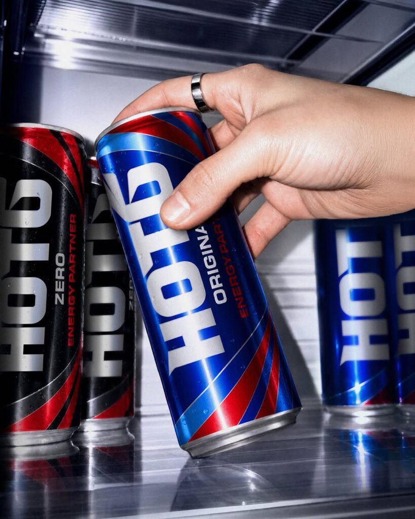
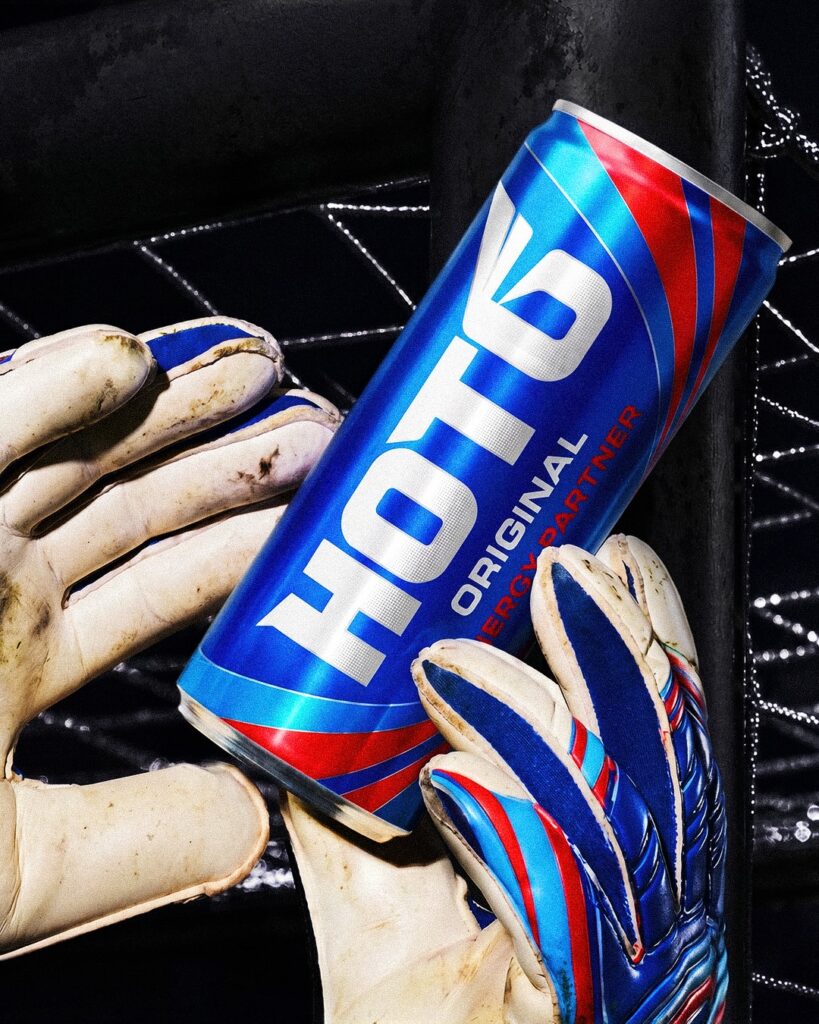
Lotte Chilsung Beverage has completely revamped the packaging design of HOT6, Korea's leading energy drink brand, for the first time in three years. This renewal focused on conveying intense energy and a spirit of challenge more intuitively while maintaining the brand's heritage. The existing phoenix image was reinterpreted by simplifying it into a curved graphic in the shape of wings, and a blue color symbolizing the hottest burning flame was applied to the front. In addition, the product name was placed prominently in the center of the package to enhance visibility and strengthen its presence as an energy brand.
This change extends beyond package design to encompass the entire brand experience. Hot Six is launching a brand campaign under the slogan "Light the Hottest Flame" and is running large-scale outdoor advertisements in major areas of Seoul, including Seongsu and Gangnam, from June 29 to July 28. Additionally, Chilseong Mall, the official online direct store, is expanding its reach to consumers by holding a scratch-off event to celebrate the renewal, offering mobile gift certificates and discount coupons.
The most significant change in terms of design is the refinement of the brand symbol into a modern graphic language. Visual completeness has been enhanced by applying a simple wing shape instead of the existing phoenix illustration, while utilizing blue as a core element conveys a more sophisticated impression despite maintaining a strong brand image. As the energy drink market expands beyond competition in functionality to competition in brand experience and design, this renewal is regarded as a strategic shift aimed at communicating with the new generation while preserving long-standing brand assets.
More and Sources