Alps 2030 Unveils New Olympic Brand Made of Mountains and Light
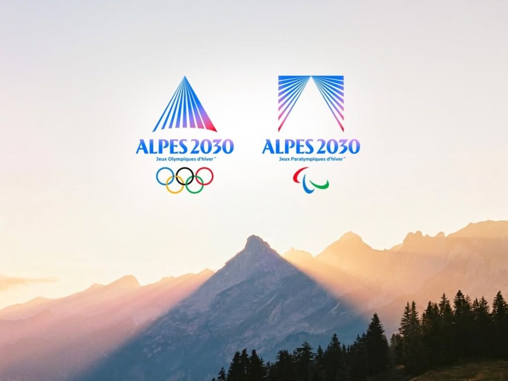
The Alps 2030 Organizing Committee, preparing for the 2030 Winter Olympics and Paralympics, has unveiled a new brand identity. The highlight of this unveiling is the two emblems for the Olympics and Paralympics, respectively. While sharing a single visual language, the two emblems are expressed in different forms and were designed around the concept of “mountains revealed by light.”.
Alps 2030 has been adopted as the official signature, replacing the previous name “Alpes Françaises 2030 / French Alps 2030.” The organizing committee explained that the visual inspiration for this brand came from the mountainous terrain, ridges, and changing light of the French Alps, particularly the Alpenglow that colors the mountain peaks at sunrise and sunset.
The emblem features a structure where radiating lines converge at a single point to form the shape of a mountain. Lines of light serve as elements that reveal the landscape, while the mountain peaks symbolize the stage of the competition and the challenge of transcending limits. The point where the lines meet signifies the moment when various journeys converge into one. The official website also introduces this identity as “an identity created by mountains and revealed by light.”.
The color palette consists of Midnight Blue and Azure Blue, evoking cold altitudes and ice, as well as shades of red and pink that express the moment warm light spreads across the mountain peaks. By adding the energy of warm light to the cold and solid image of winter sports, it appears to be an attempt to capture the atmosphere of the Alps that changes with time and season, rather than just a simple snowy mountain.
The most striking aspect of this design is that it treats the Olympics and Paralympics not as a single subordinate entity, but as two equal representations. The two emblems resemble each other but are not exactly the same, interpreting a single mountain in different ways through form and whitespace. Marie-Amélie Le Puy, President of the French Paralympic Committee, explained that this graphic choice is a symbolic decision intended to grant the Olympics and Paralympics equal status and visibility.
From freelancer to head of design at a unicorn startup, I've been creating impact through brand and product design for over 18 years. Currently, as CEO and editor-in-chief of Design Compass, I research design that drives business impact.