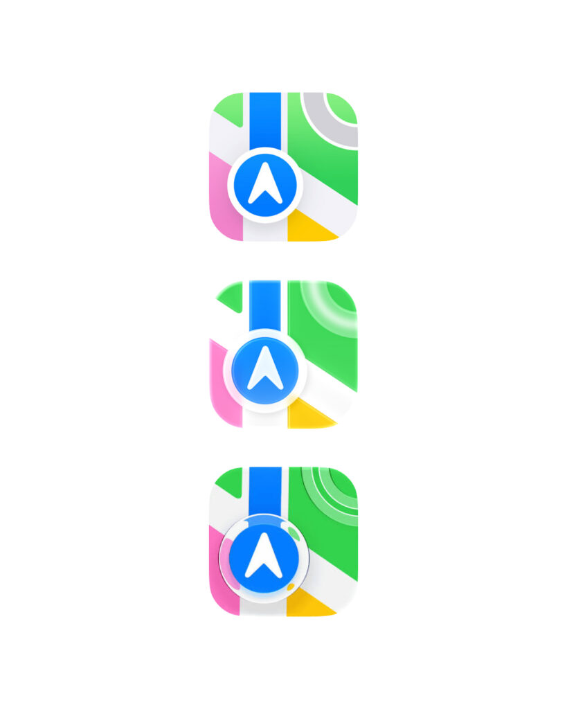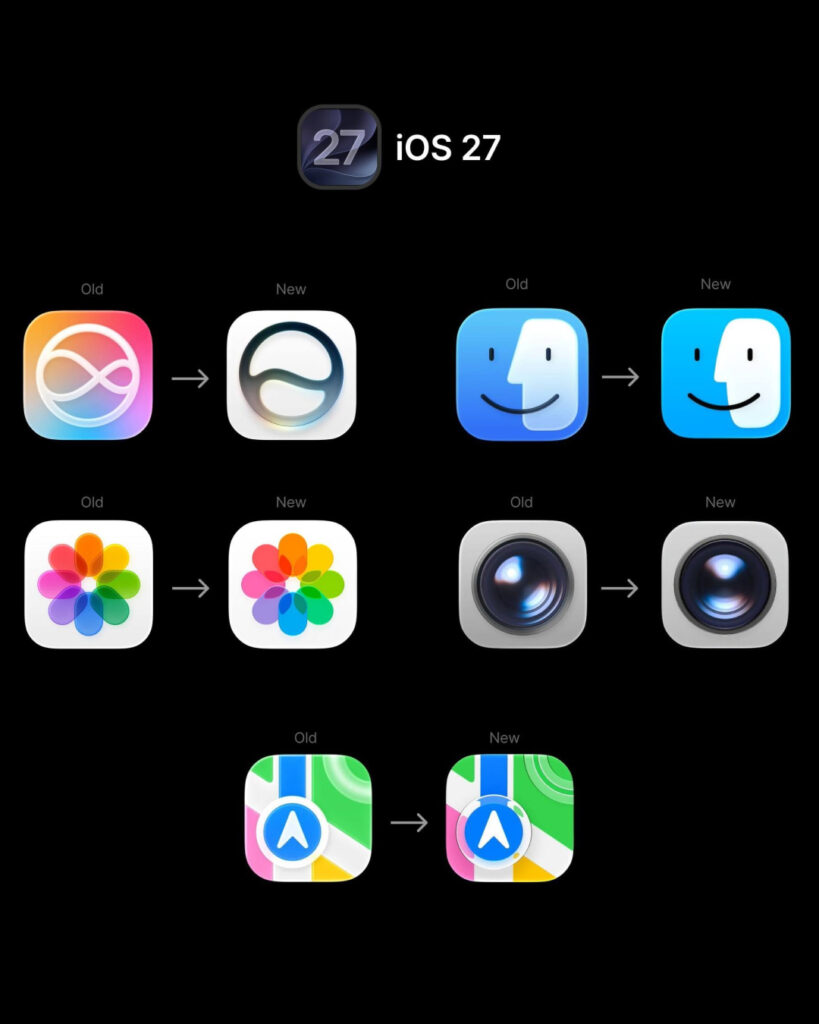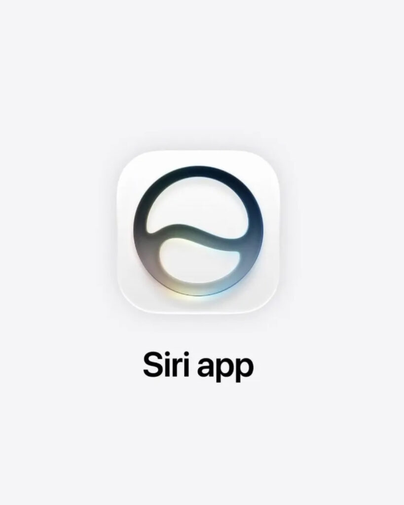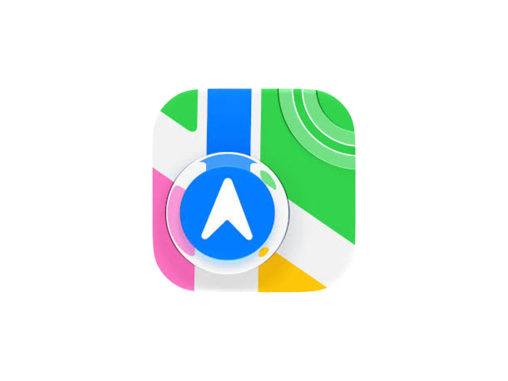
Apple has refined the app icon design in iOS 27. If iOS 26 was the version that fully introduced the 'Liquid Glass' design, iOS 27 is closer to a version that refines that style to be clearer and more practical.
The key features of iOS 26 app icons were translucent layers, light reflections, and glass-like textures. They were designed to look different depending on Light, Dark, Tint, and Clear styles, and the overall atmosphere of the operating system became more three-dimensional.
However, iOS 26 icons could appear blurry in some environments. In iOS 27, this has been addressed by adjusting many default app icons to be sharper and more detailed. While the glass texture is maintained, the lines, shapes, and color contrast within the icons have become more distinct.
The biggest difference is readability. While iOS 26 emphasized new visual effects, iOS 27 has enhanced recognition so that apps can be quickly distinguished even on small screens. Icons for frequently used default apps, such as Maps, Settings, Photos, and Mail, have been reorganized to appear clearer than before.
Motion effects have also been reduced. In iOS 26, there was a sparkling effect where the light on the edges of icons moved along with the iPhone, but in iOS 27, this decorative effect appears to have been reduced. Instead, the design has opted for a look that appears stable even in a static state.