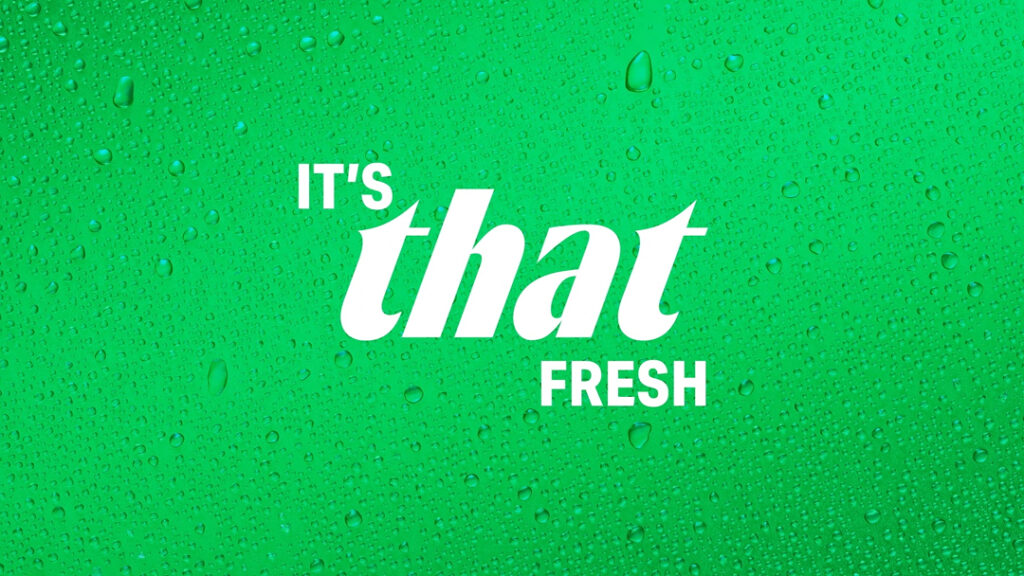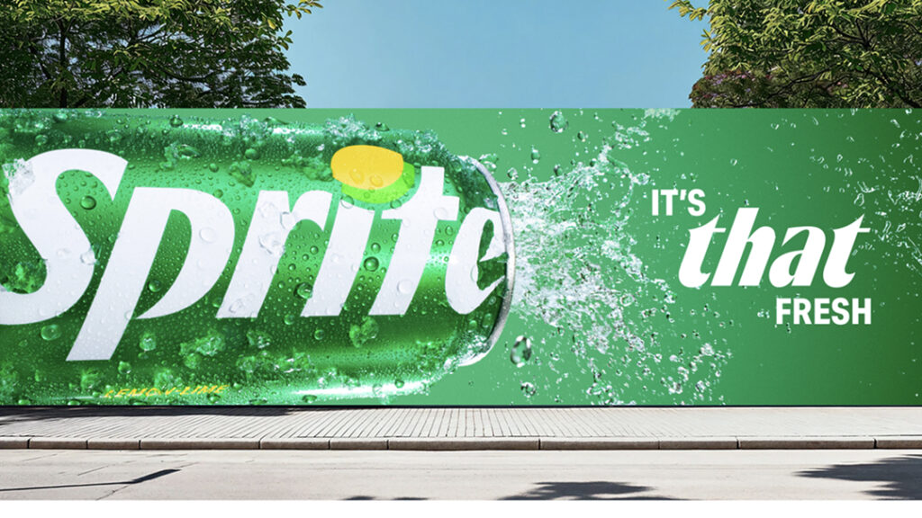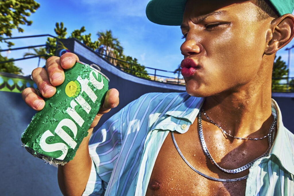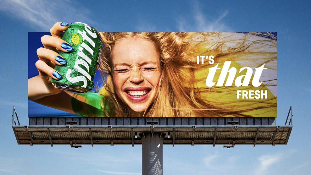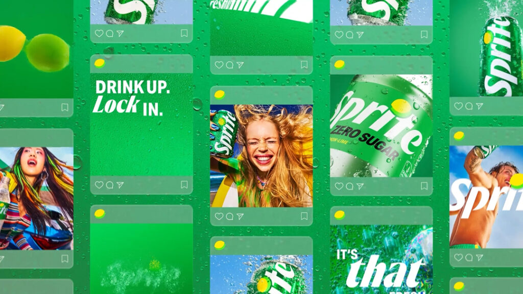
Coca-Cola has revamped Sprite's brand identity and brought the iconic Lyman symbol back to the forefront. The new slogan is "It's That Fresh." This move is interpreted as an effort to enhance the brand's presence by adding cultural assets such as music, basketball, and street style to the refreshing image Sprite has built over the years.
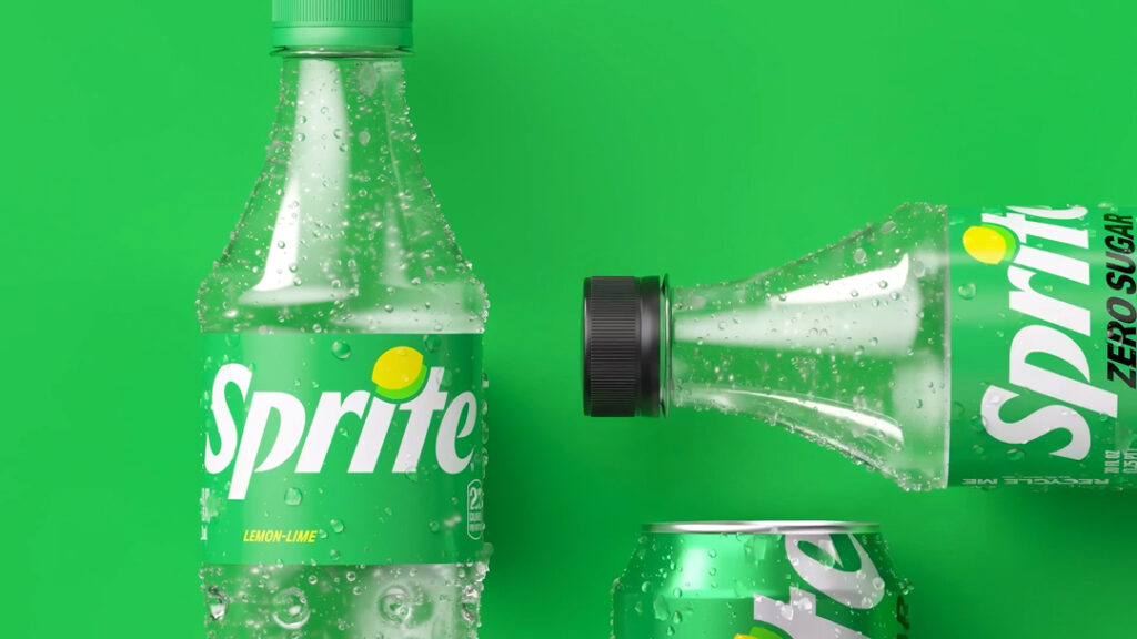
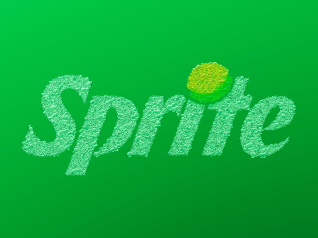
Lyman is at the center of this revamp. Lyman was the representative symbol that once evoked Sprite, but in this rebranding, it has been more closely integrated with the wordmark. The new symbol blends into the dot of the 'i' within the logo, creating a more concise impression. While the existing green and white-centered color scheme has been maintained, the brightness and saturation have been boosted to ensure it appears more distinct on physical shelves and in digital environments.
The package design has also changed. The wordmark applied to the can has been changed to a vertical format, and the overall composition has become simpler. As a result, the Lyman symbol stands out more strongly, and the brand's visual focus has become clearer. While the scope of the changes is not exaggerated, they are significant in that they make the brand's core assets distinct once again.
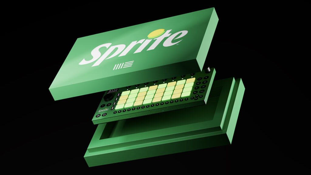
Sprite went beyond visual language and established a new sound identity. It collaborated with Studio 4 People to create the 'Sprite Sound' and worked with producer and artist Mustard to capture the sensation of a refreshing first sip through sound. British rapper Leostateril also produced original music using Ableton Move, an instrument exclusive to Sprite. In essence, the brand experience has been extended to the auditory realm.
Cultural collaborations are also continuing. Sprite is partnering with the Los Angeles-based Crenshaw Skate Club to strengthen its connection with street culture. At the same time, it plans to introduce new products such as Sprite Chili and Sprite Plus Tea in collaboration with Taki's, Tabasco, and McDonald's. New flavors such as Cherry Lime, Strawberry Kiwi, Berry Lemon Mint will also be added.
The new design will be applied sequentially to Sprite and Sprite Zero Sugar. The Zero Sugar product utilizes black to distinguish it from existing products. This revamp is not merely a simple packaging modification, but can be viewed as a reimagining of the brand by Sprite reviving its unique symbols and expanding them into visuals, sound, and cultural collaborations.