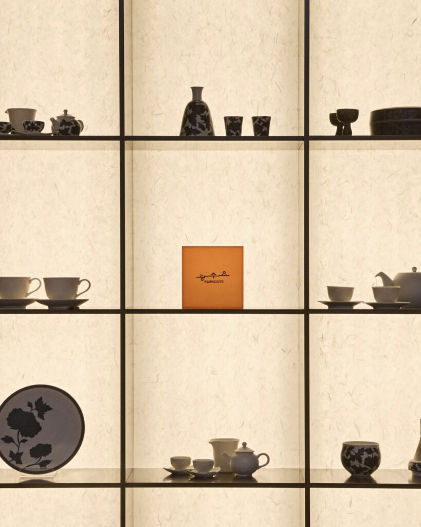
This is a rebranding project in collaboration with Gwangju Yoga Be My Guest and Clay.
This rebranding is not merely a simple logo replacement, but a project that revisits the brand's origins and philosophy, rephrasing them in contemporary language. The starting point is the 1966 White Porcelain Jar with Cinnabar Grape Design, created by our founder, Jo So-su. In this piece, vines flow freely, and grapes are depicted abstractly like stars. This demonstrates the founder's attempt and attitude to forge a new path toward the future of Korean ceramics, rather than merely following tradition. In this rebranding, Kwangjuyo has reinterpreted that sensibility as the "Spirit of the Stars.".
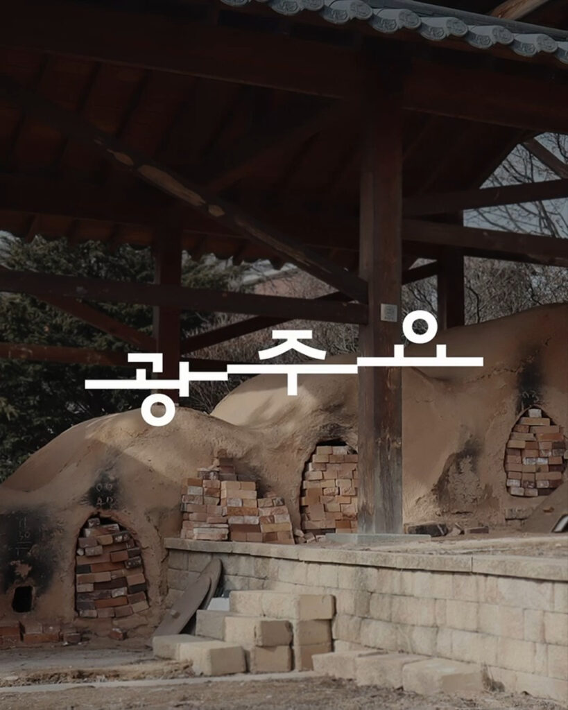
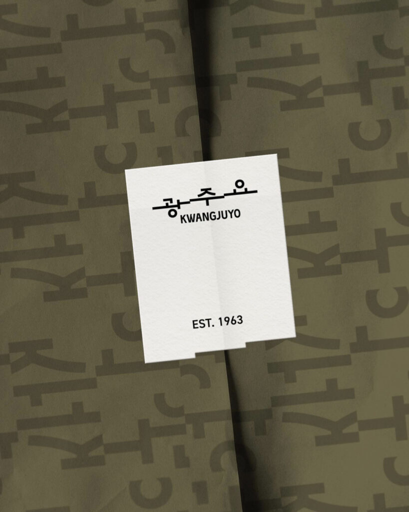
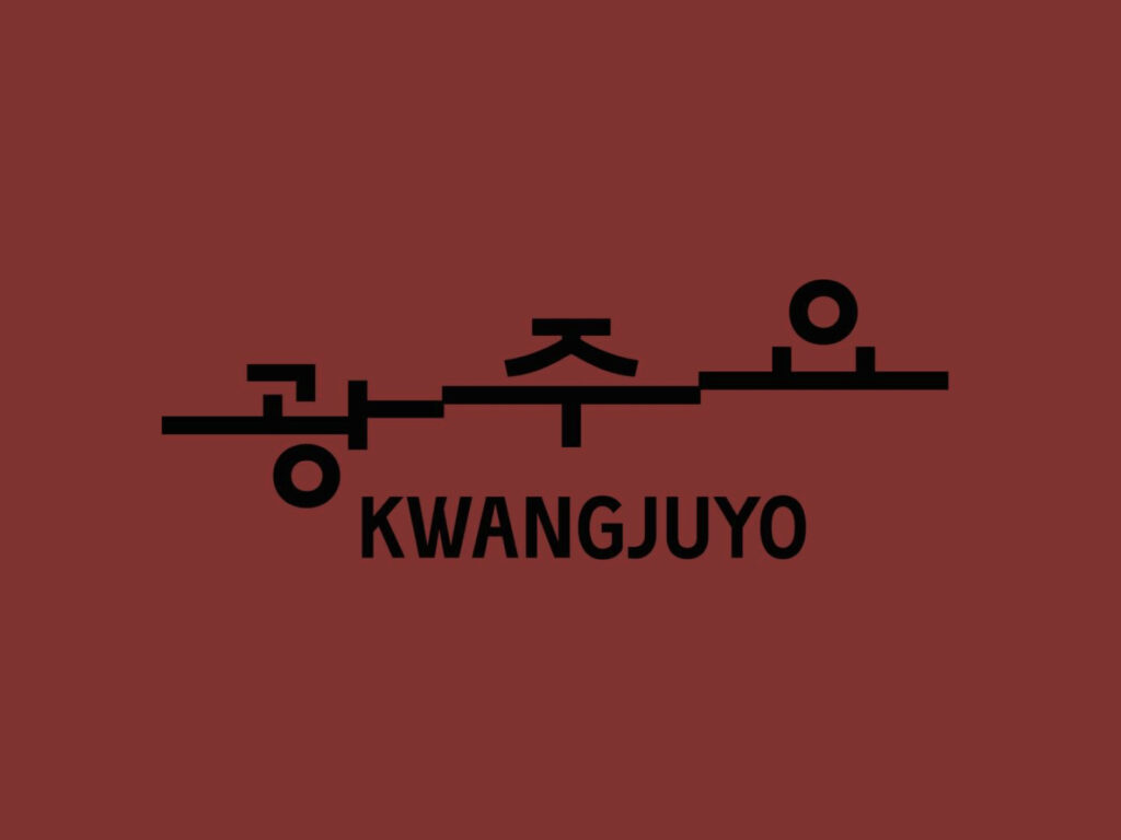
The new logo was inspired by the Sugwang-ri Oreum Kiln in Icheon, Gyeonggi-do, a National Registered Cultural Heritage site. Originally constructed in 1949 and renovated in 1962 into its current 12-칸 stepped structure, this kiln is a symbolic location where Gwangjuyo continues to fire to this day, carrying on the tradition of Korean ceramics. The structure, with its bays rising one by one, illustrates both the way time accumulates and the process of craftsmanship being built up. Gwangjuyo incorporated this form into the logo to visually express its brand philosophy of building culture upon tradition and adding a sense of sensibility to create a new path.
Client: Kwangjuyo (Hwayo Group)
Strategy: Be My Guest
Design: Clay
Suin Nam, Jimin Kwak, Minjeong Keum, Junhee Park