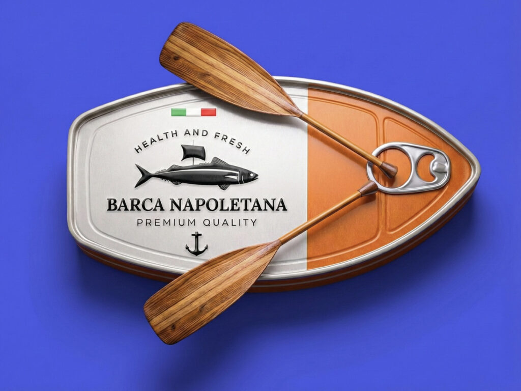
This is the Barca Napoletana canned fish package designed by Artian Design. It appropriately expresses the concepts of the sea, travel, and Italian quality. Designed to resemble the outline of a ship, the package intuitively connects to the meaning of the ship implied by the brand name 'Barca'. By separating colors through the layout, it creates a strong impression, while the white conveys freshness and the rich colors evoke vitality and flavor.
The typography uses a classic serif style to create a tone reminiscent of old harbor signs. Premium quality lettering and an anchor symbol reinforce the maritime theme. Additionally, the wooden oar graphic surrounding the package symbolizes craftsmanship, tradition, and naturalness, adding rhythm to the design.
The brand's message is summarized as health, freshness, and the source of the sea. The packaging conveys this in a calm and confident tone, and is designed to support long-term brand building through a memorable silhouette that catches the eye at first glance.