
To celebrate its 10th anniversary, music festival Simple Things in Bristol has collaborated with art director Alifie Allen to redesign its visual identity, featuring Greedy Goons (motion), Ben Dosage and Adnrew Cunningham (3D).
Alfie said the previous brand had conveyed beautiful moments but felt it had been stretched too far in too many directions and had lost its sense of structure. He wanted a tactile identity that would be recognisable as a festival that would take place each year, but still allow room for free expression.
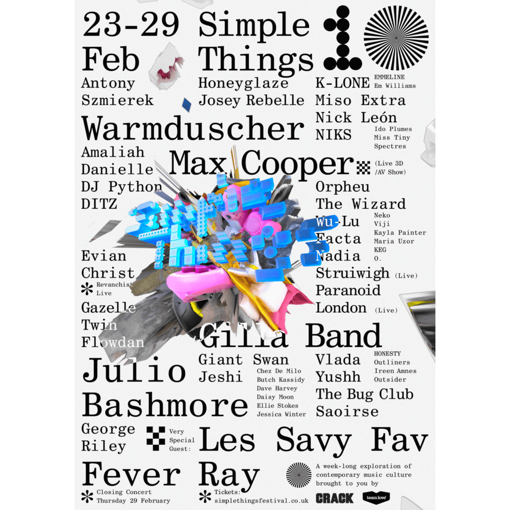
The graphic design of music festivals always provides a strong visual pleasure. Among them, Simple Things' new visual identity delivers an amazing experience. It is hard to compare it to the existing festival identity, and the bold display font and 3D motion are impressive. It feels like watching a fashion show or a showcase.
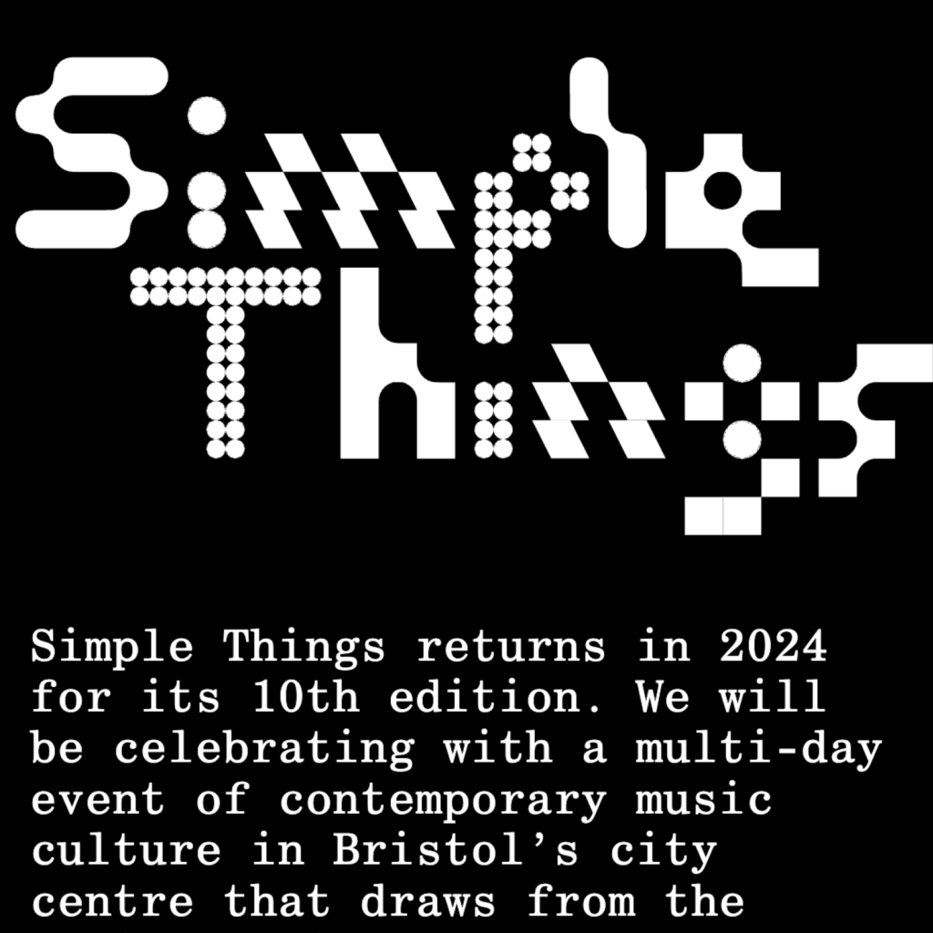
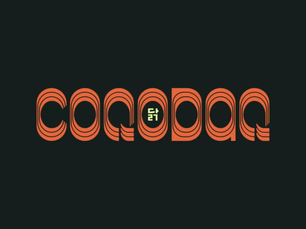
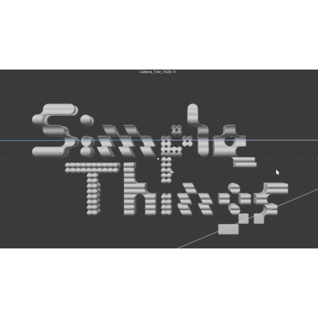
The most memorable and individual expression is the display font, which is a unique form that can mix letters to fit various music styles. Usually, fonts have a hard time matching the letters on both sides even if the shape or thickness of the letters is slightly different. However, by deconstructing the letters and expressing them as completely new graphic elements, the mixing does not feel very awkward.


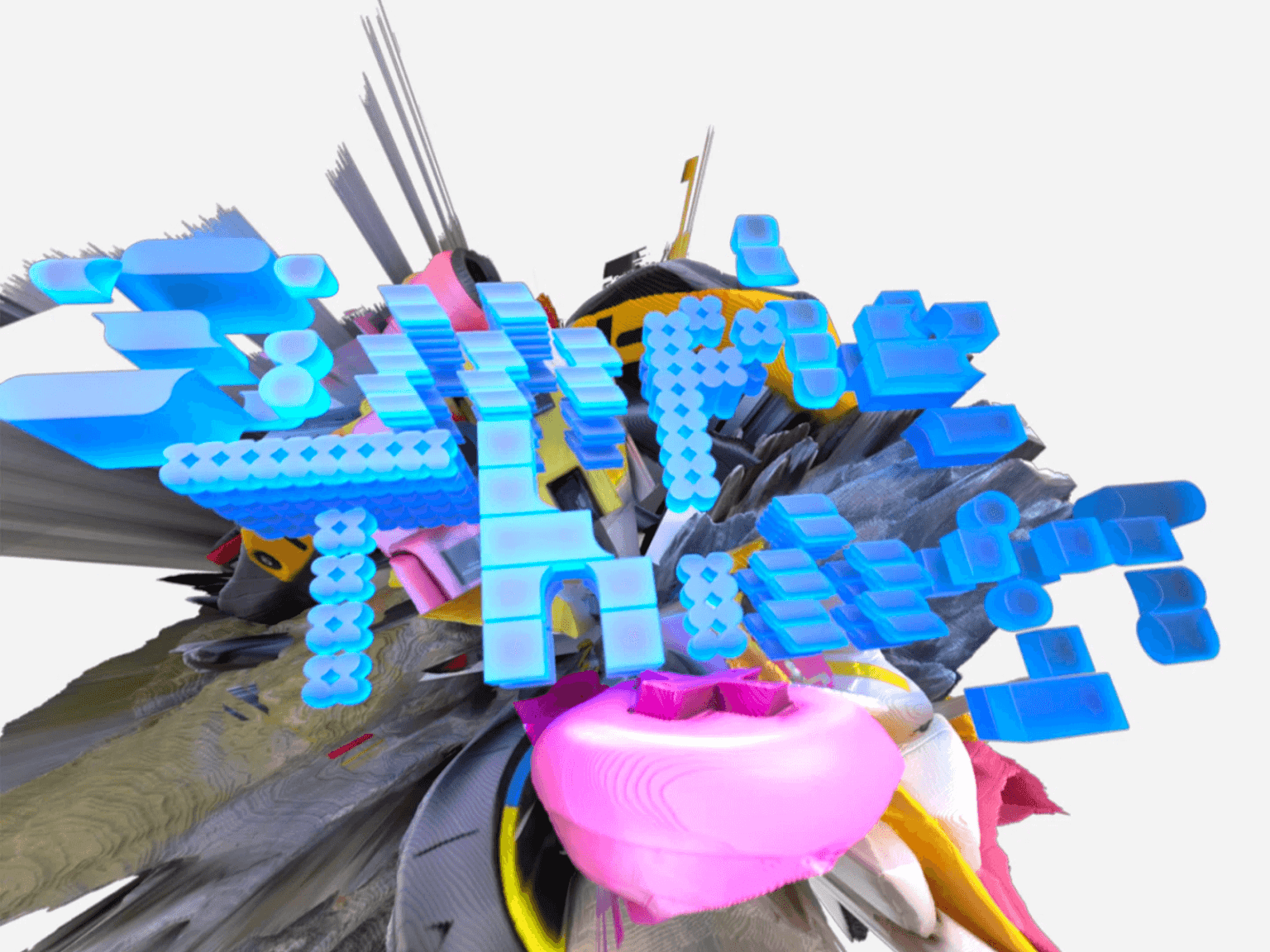
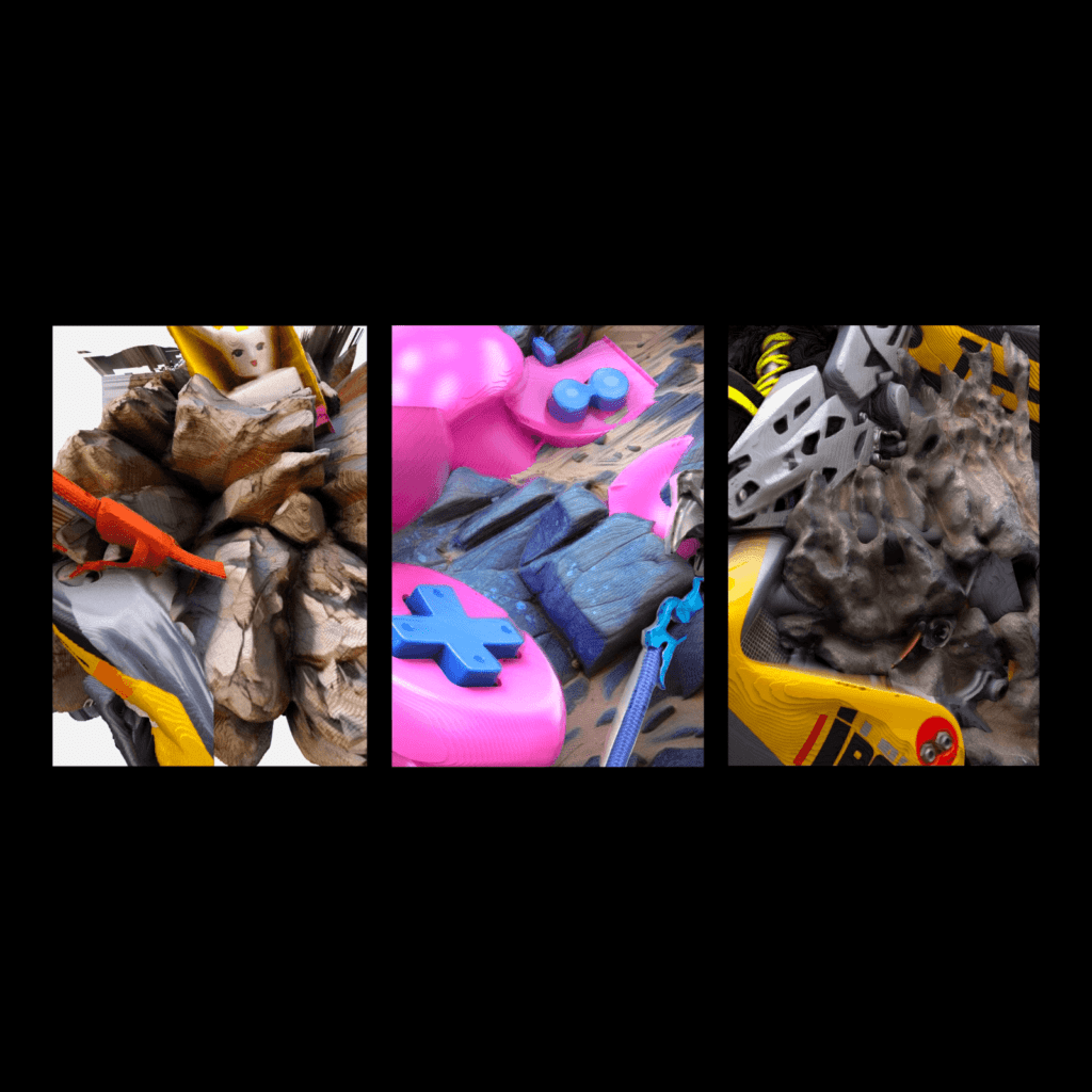
The characteristics of digital space are also deeply reflected there. The font style of Simple Things changes depending on the angle viewed in 3D space. Unique objects representing visual identity are also expressed in 3D. Objects of various textures are distorted in 3D. It feels as if various materials have come together to form an asteroid. It feels like a shock suddenly thrown into the world in white space.

A cool brand identity with avant-garde graphic design. It seems like innovative and surprising expressions come from places close to art and music. It's cool how they pursue a completely different path from traditional festivals while also bringing the Y2K style to life.