네이버가 앱 디자인을 개편합니다. 네이버는 지난 10월 30일 새로운 네이버앱에 관해 자사 블로그를 통해 공개했습니다. 전 국민이 사용하는 서비스가 앞으로 어떻게 변할지 자세히 알리기 위해 캠페인을 공개했습니다.
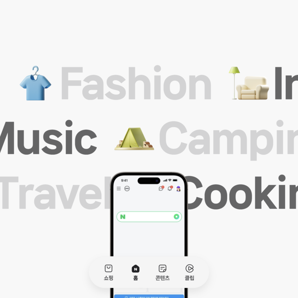
‘참, 쓸데 있는 즐거움.’을 슬로건으로 가장 큰 변화인 쇼핑, 홈, 콘텐츠, 클립 4개의 탭에 관해 알리는 캠페인 웹사이트를 공개했습니다.
네이버가 앞으로 어느 방향으로 나아갈지 알 수 있는 큰 변화입니다.
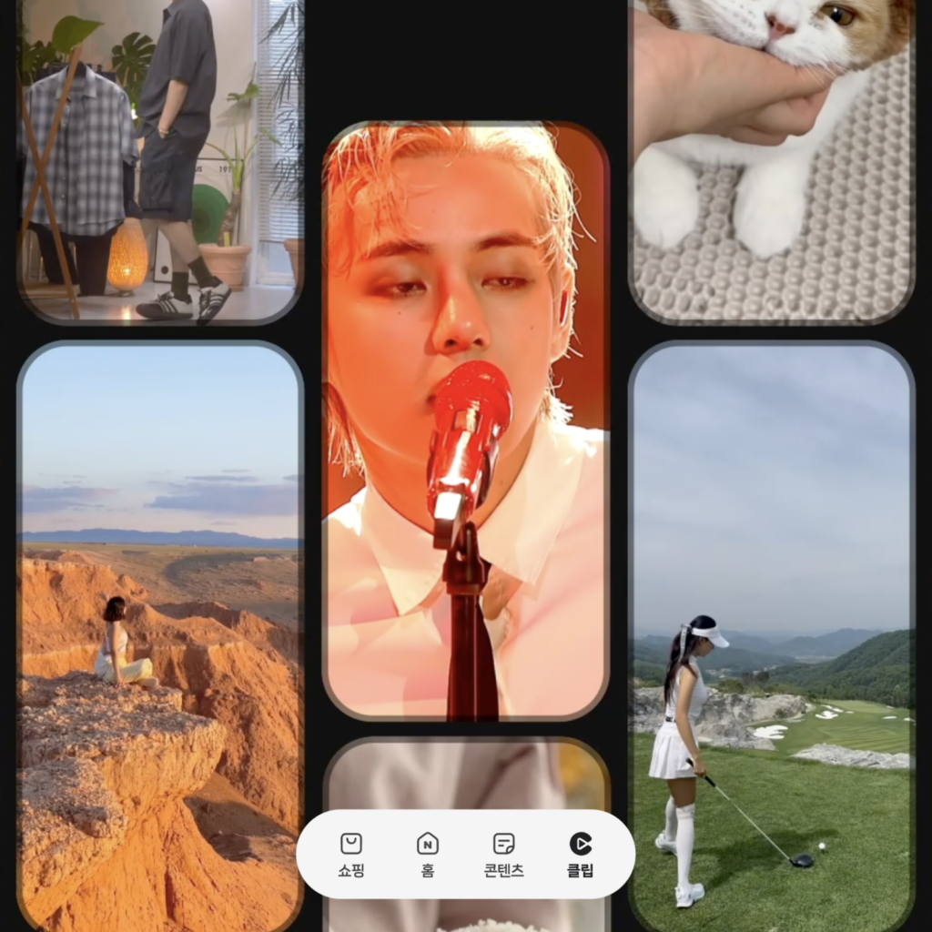
렌즈, 파파고, QR 등 유용한 도구에 빠르게 접근할 수 있던 원형 UI는 사라지고 4개의 탭으로 바뀝니다. 기존 쇼핑·라이프, 그린닷, 뉴스·콘텐츠 3개의 탭에서 라이프와 뉴스가 콘텐츠에 포함되고 클립 탭이 추가되었습니다.
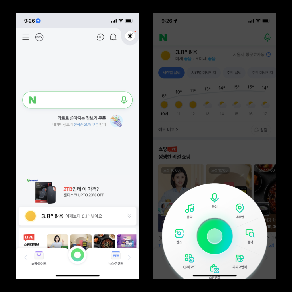
탐색을 위한 하단 탭은 다른 앱에서도 쓰이는 익숙한 형태로 바뀝니다. 탭의 아이콘은 그라데이션으로 그린 일러스트 스타일에서 얇고 부드러운 검은 곡선으로 표현했습니다. 탭의 상단 탐색 도구 영역의 배경에 색이 깔립니다. 쇼핑과 콘텐츠는 기존에 활용하던 색상 정체성을 유지합니다. 클립은 영상에 집중할 수 있게 다크 모드로 바뀝니다.
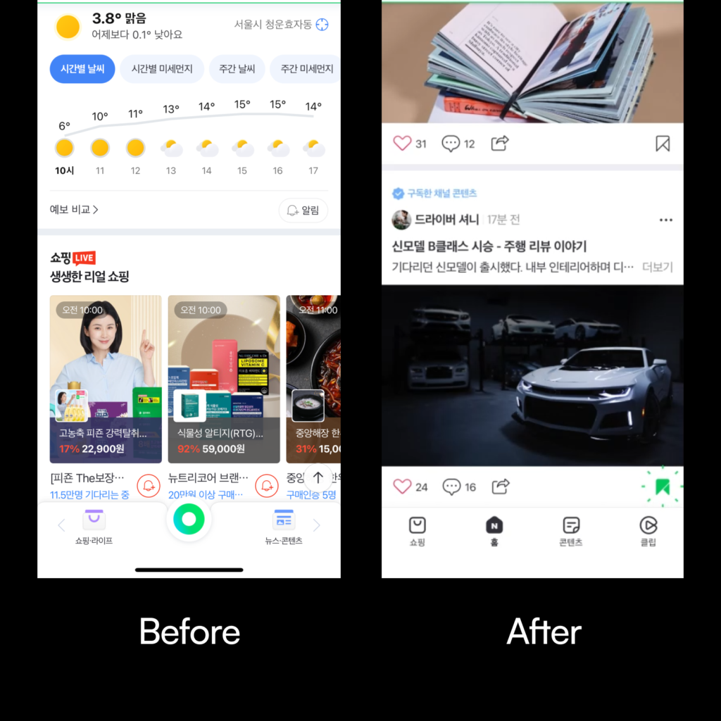
홈 다양한 정보를 블록 단위로 볼 수 있습니다.내 활동을 기반으로 콘텐츠를 추천합니다. 홈 피드에서 내가 찾는 키워드와 연관된 스마트 블록이나 내 취향에 맞춘 새로운 관심사를 제안하는 내 취향 테마를 볼 수 있습니다. 콘텐츠에서 계속 탐색을 이어갈 수 있게 방금 본 콘텐츠나 비슷한 콘텐츠를 계속 추천해줍니다.
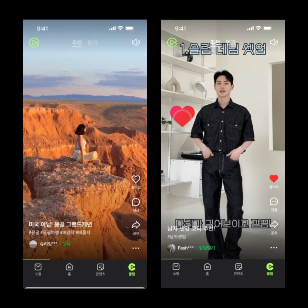
클립 숏폼 영상을 볼 수 있습니다. 영상을 보다가 마음에 드는 상품을 구매하거나 예약할 수 있습니다. 네이버 나우가 아티스트와 팬 소통하는 NPOP 서비스로 어떤 콘텐츠를 볼 수 있을지 예측할 수 있습니다.
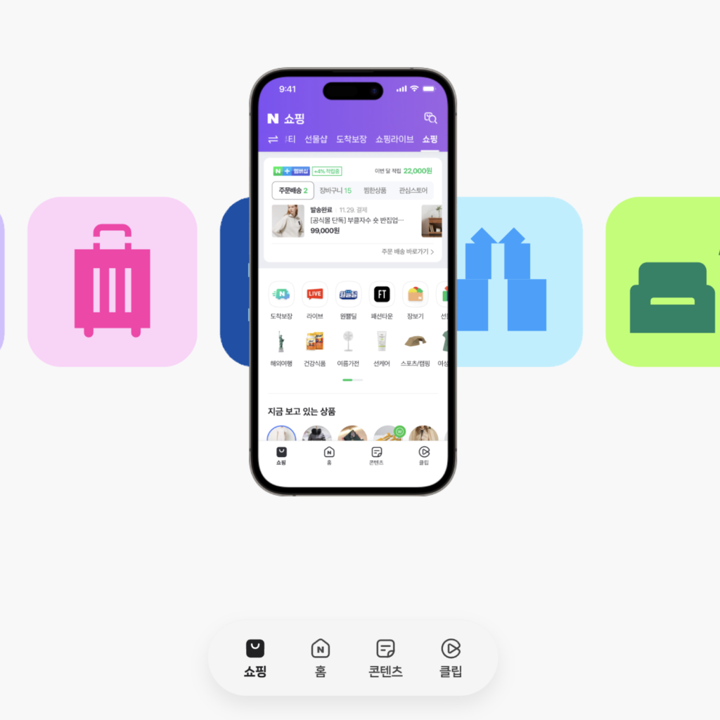
쇼핑 각종 쇼핑 관련 서비스를 이용할 수 있습니다. 도착보장, 패션타운, 장보기 등 유용한 쇼핑 관련 도구로 빠르게 이동할 수 있습니다. 쇼핑 버티컬로 바로 이동. 내가 검색하거나 구매한 상품에 맞춰 추천 영역이 확대됩니다.
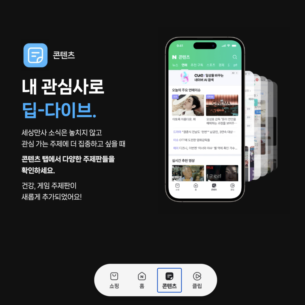
콘텐츠 뉴스, 연예, 스포츠, 경제 등 막강한 콘텐츠를 볼 수 있습니다. 건강, 게임과 같은 사람들이 관심을 가질만한 주제가 추가되었습니다. 뉴스 기사 뿐만 아니라 다양한 정보나 도구가 담겼습니다.
소개 웹사이트에서는 클립, 쇼핑, 홈, 콘텐츠 순으로 소개합니다. 지속적으로 아티스트에 관한 이야기도 소개하는 것으로 보아 엔터테인먼트 분야의 숏폼에 힘을 쓰려는 것으로 예측됩니다. 모든 탭 이름이 영어를 한글로 표현한 것이 눈에 띕니다. 홈이 두번째 위치에 있는 것은 이유가 궁금하네요.