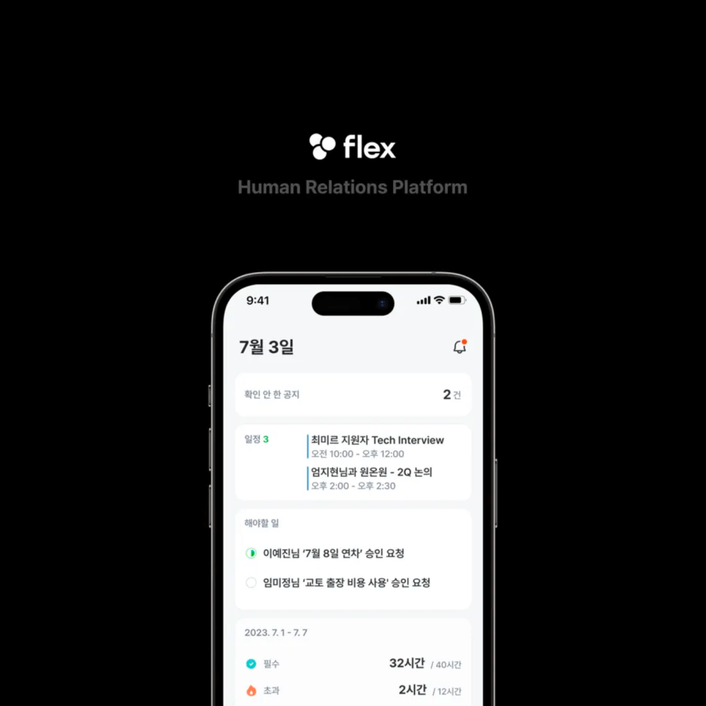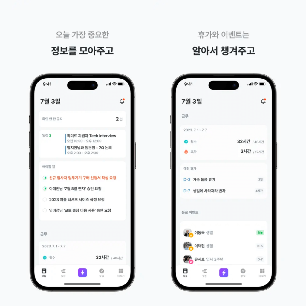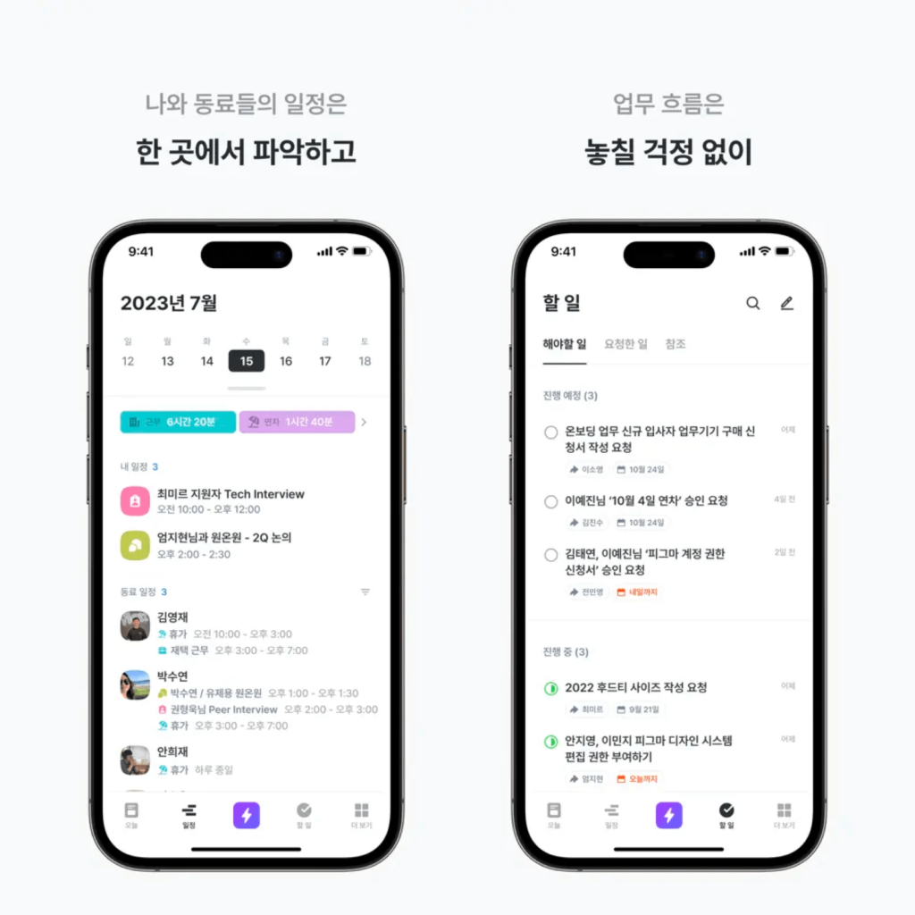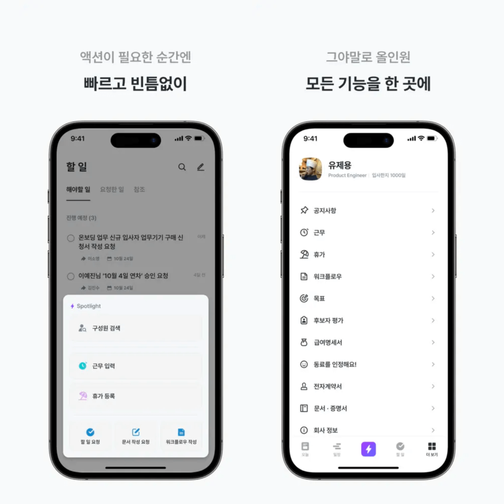
Flex has rebranded.
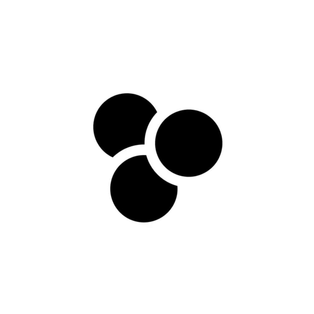
Flex is an all-in-one HR platform that solves human relations problems that arise when running a company. A symbol has been added to the logo, which was made up of the word mark flex.
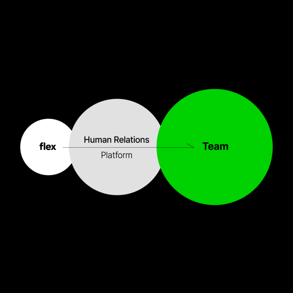
The value that Flex pursues is to create new changes in the way we work by connecting all HR experiences into one. The essence of our focus has been consistent so far, and we decided to express our company's identity with the keyword 'team'.

Flex defined ‘Flex-ness’ based on the keyword ‘team’. Values, essence, identity, goals, etc. were defined in sentences. Starting with the word HR, we defined it as Human Realations in Human Resources. We set a goal to create a team that grows based on trust.
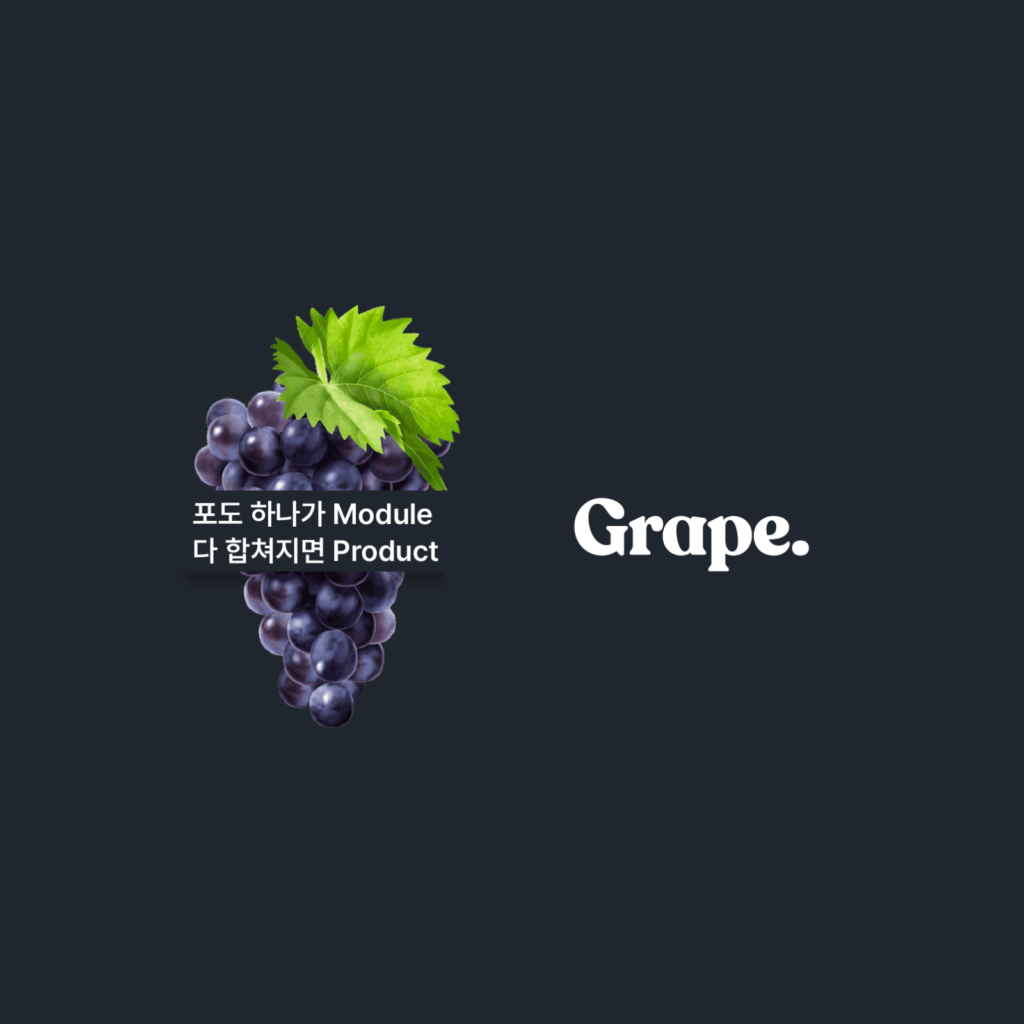
We looked through our company's history to visually express the values we pursue. Among them, the keyword Flex discovered was ‘grape.’ It is said that it was one of several candidates before naming it Flex. I thought it was similar to how people come together and become a team in the form of grapes where the grains come together and become one. In this way, a symbol in the form of an inverted triangle made of three circles was born.
The rebranding of ‘Carrot’ also reminds me of discovering the spirit by going back to when the service first started with Day 1 Mind.
Until now, when I thought of Plex, I only thought of the elegant UI of web products, but now I have a medium to hold onto in my mind. I can feel the effort to convey a message to people beyond solving functional problems.
It's good to take care of the essentials, but if you approach it by saying that immediate benefit is important, it feels as if they are mutually exclusive. But now, in addition to sophisticated BM and rapid growth, I think that expanding in the right direction has a big impact on the success of an organization.
