
Wanted has rebranded.
Wanted is making new attempts to go beyond a platform that connects companies and job seekers to encompass the entire 'people's work'. We had to express our future direction while containing our current identity. It is said to have been completely redesigned to overcome a palette that is difficult to create a unique impression and a form that is difficult to use in various environments, both online and offline.
The new Wanted visual identity focused on expressing ‘a career super app that will open up all possibilities for working people.’
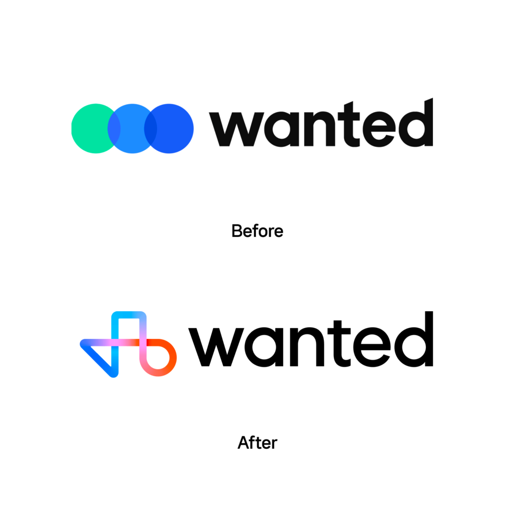
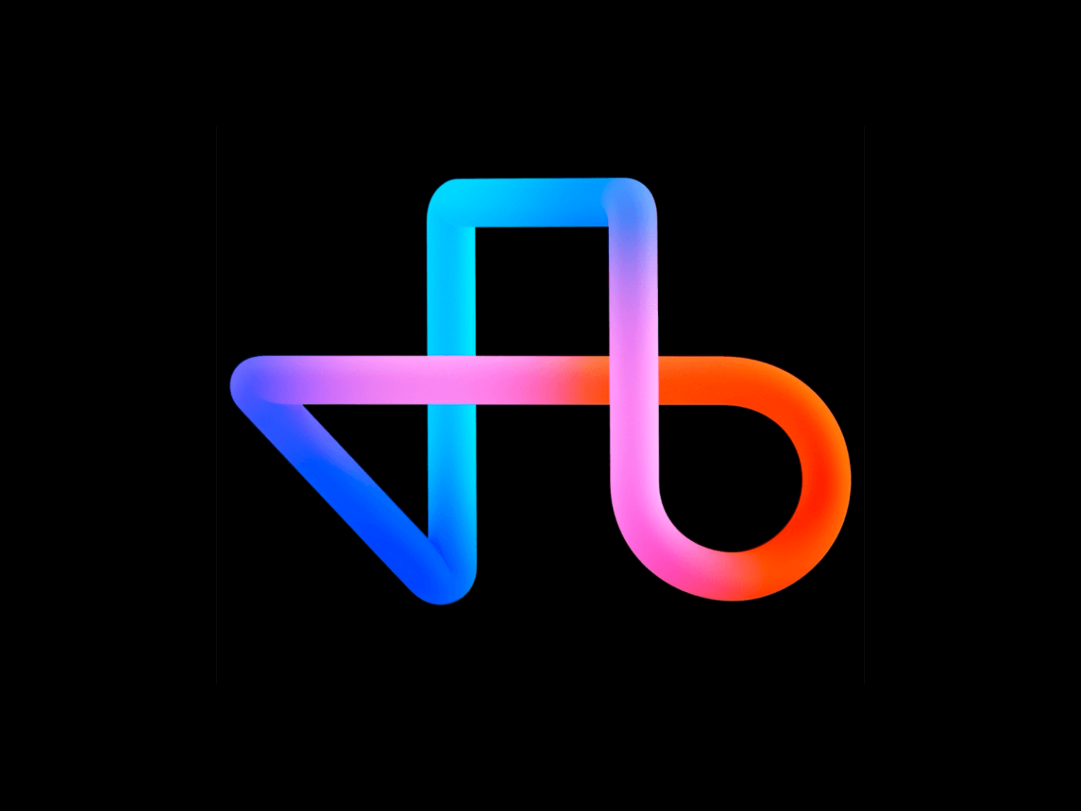
The new symbol expresses diversity, connection and possibility. People with various personalities are expressed using the basic shapes of triangles, squares, and circles. The shapes are connected to express human connections and career journeys, and the anticipated future possibilities are expressed with a smooth gradient. Wanted Sans, which matches the wordmark, was also created as an open source font. It is said that it will be introduced through the renewed brand center.
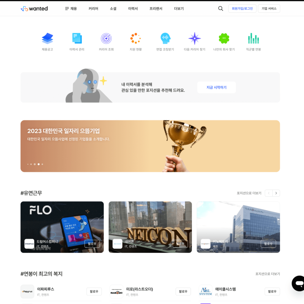
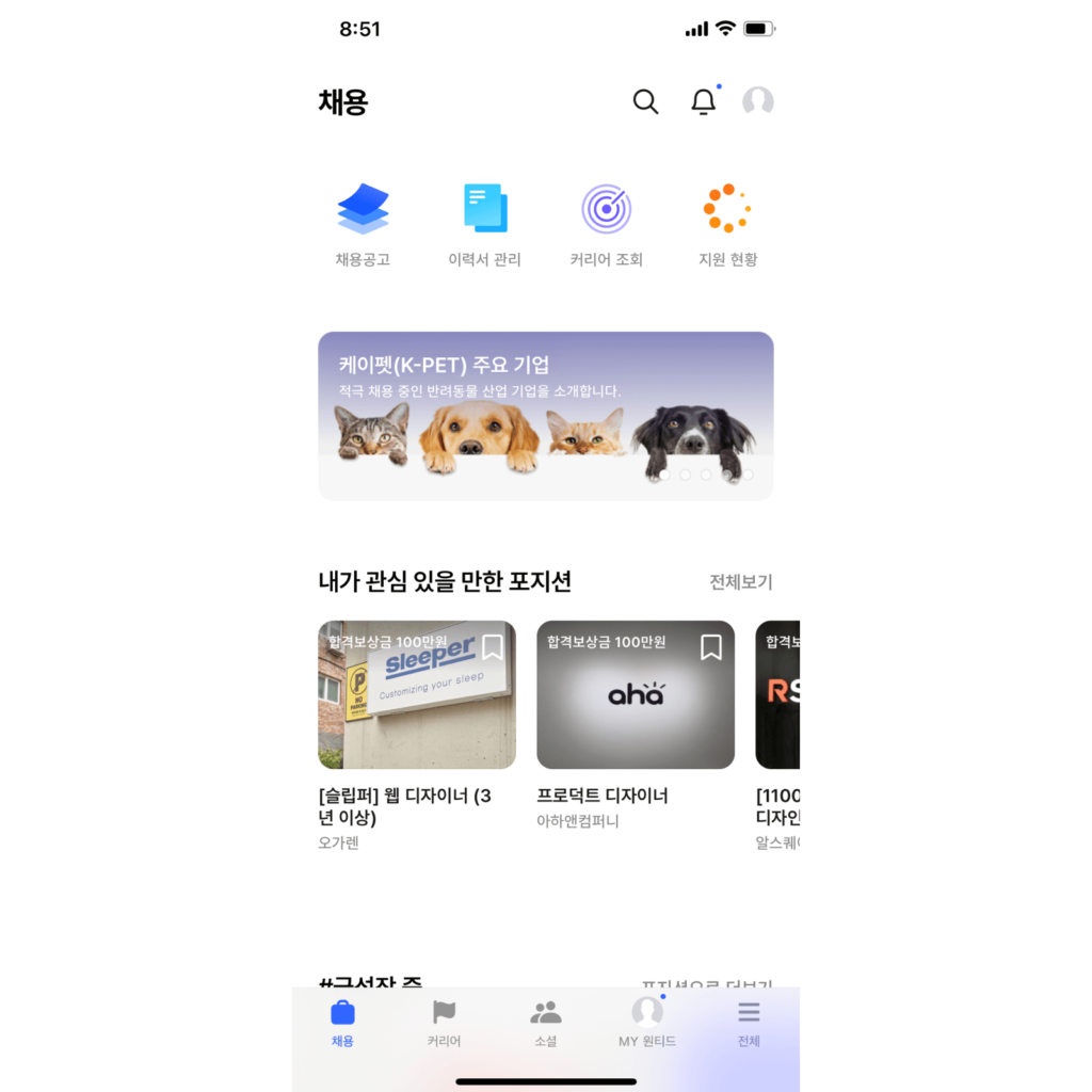
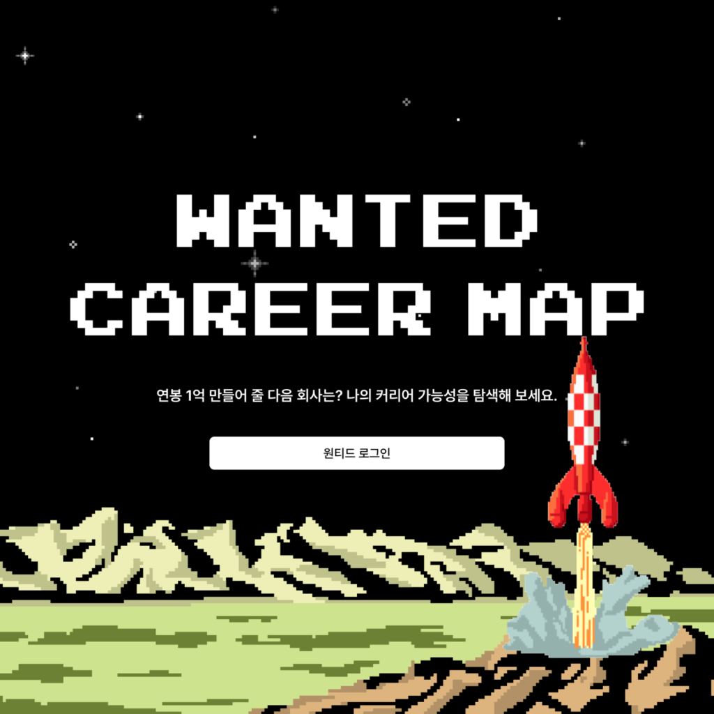
As a career super app, it represents the activities you are currently doing and also contains your future aspirations. The completely revamped digital product provides everything related to ‘work’, including recruitment, education, social, and freelance. It also provides various convenient functions necessary for work, such as AI interview coaching, career map, and wanted insights.
Brand films deliver stronger messages that are not contained in visual identity. The slogan ‘Wanted for the Age of Superpowers’ expresses the process of discovering my potential and possibilities. The unique tone and manner and 3D typography are attractive.
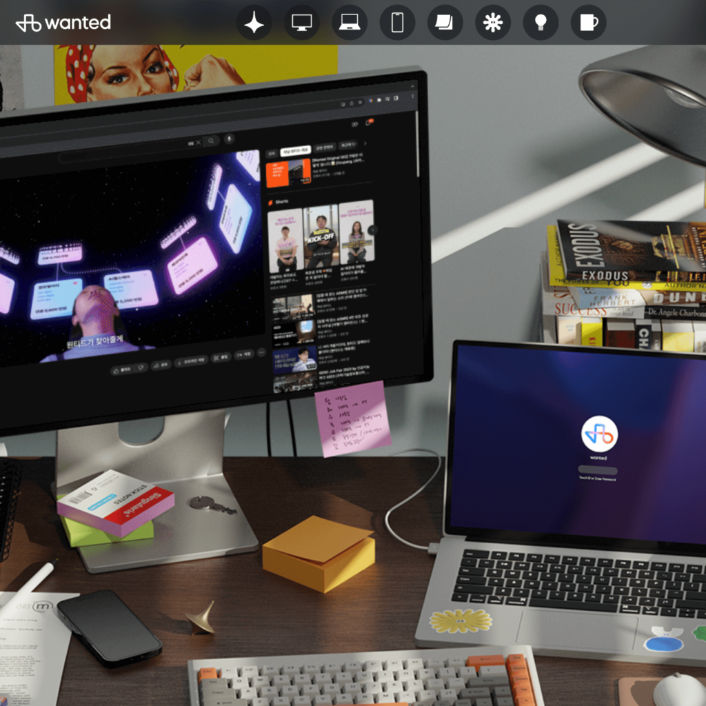
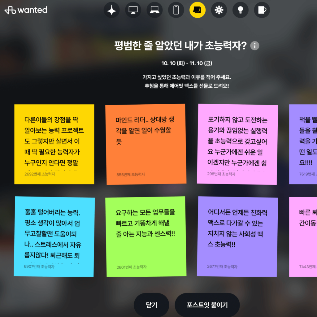
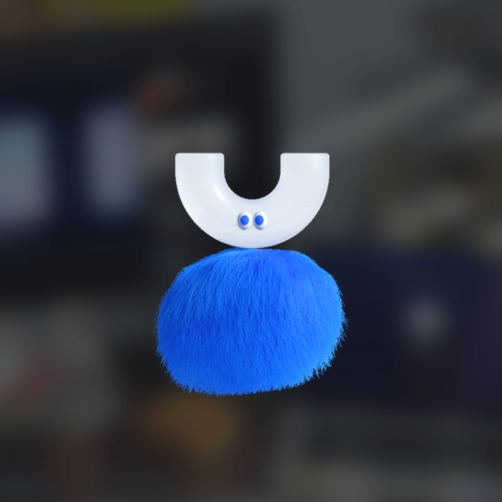
We've also created a website where you can check out what's changed about Wanted. You can press various objects on the screen, like an office worker's desk. If you press the monitor, you can view the brand film this time. You can also take a look at post-it notes to see what people are thinking about this rebranding. There are also hidden characters that were used in my previous propensity test, which is nice to see.
The visual identity that expresses a brand should always pursue ‘difference’. However, it shouldn't just be different; it should be memorable while saying what the brand wants to say. This change in Wanted appears to be an effort to convey this difference.
Changes in brands are always met with backlash, but Wanted's changes this time seem to visually reflect its future direction while maintaining the value it originally delivered to customers.