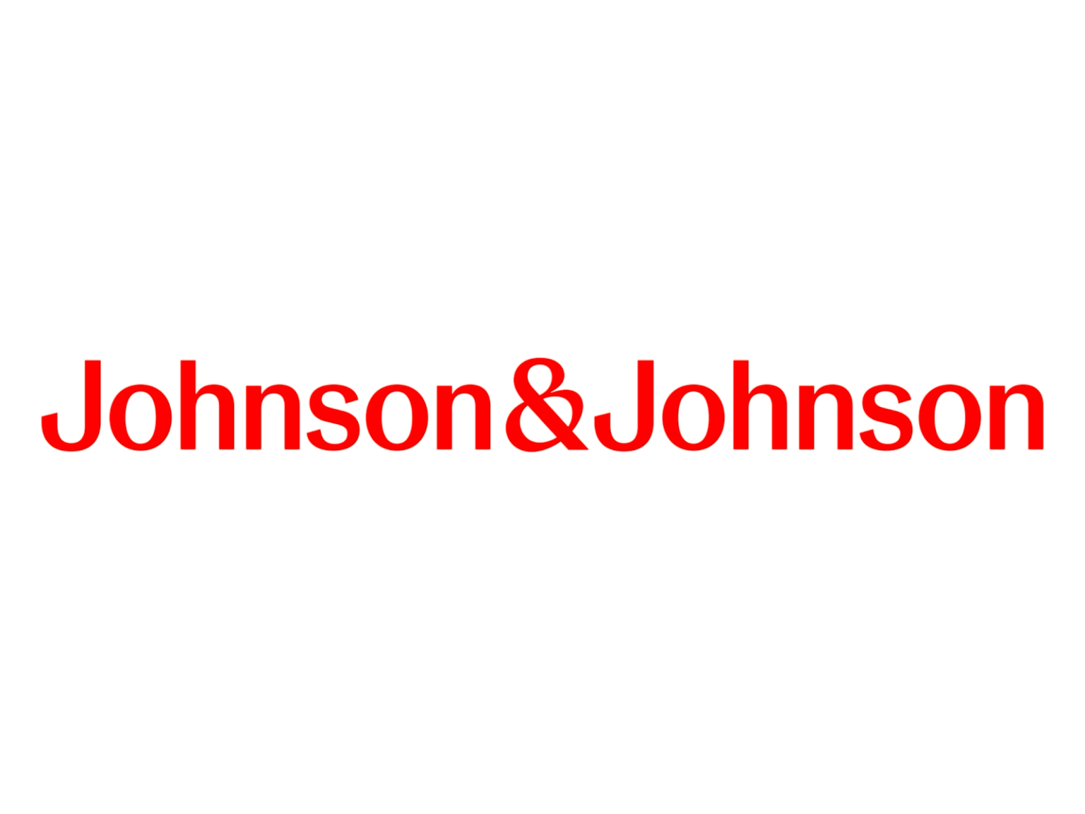

Johnson & Johnson, one of the world's largest healthcare companies, has rebranded. Used for over 130 years starting in 1887, co-founder James Wood Johnson's signature is slowly disappearing. They will continue to be seen in consumer products such as Kenvue's baby shampoo, Band-Aids, and Tylenol, but are predicted to disappear after stocks last.
Janssen, the pharmaceutical division of Johnson & Johnson, will become Johnson & Johnson Innovative Medicine. The brand will integrate the medical technology division of Johnson & Johnson MedTech. The consumer division was spun off earlier this year under the name Kenvue.
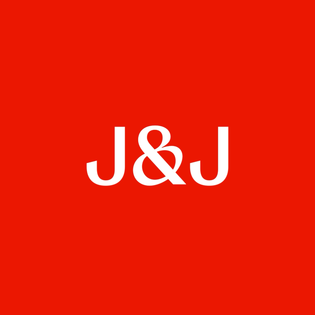
Global pharmaceutical companies have changed their visual identities to express brands that meet their goals. France's Sanofi had technical-sounding lowercase text, and Britain's GSK had certain parts of its wordmark cut out. J&J deleted the wordmark it had used for 135 years and replaced it with a modern, single-stroke font. Johnson & Johnson, which represents a company that provides consumer goods, appears to want to become a brand that caters to pharmaceuticals and medical devices.
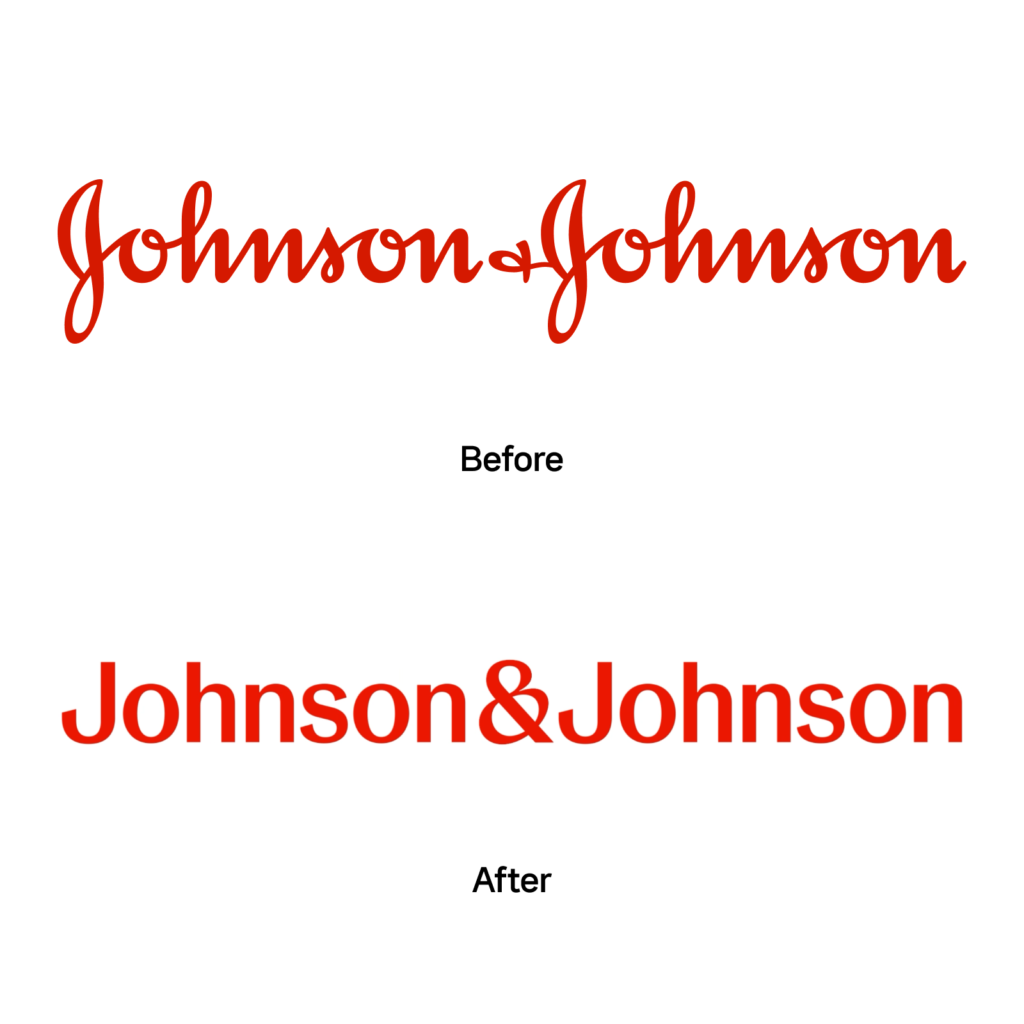
A sans-serif, modern font with thin horizontal strokes and a slight bevel at the ends of the strokes. It is a font that gives the impression that it was written with a wide brush. We considered a logo that would be suitable for a digital-centric environment and one that does not involve learning cursive. They announced that they would reduce the display of the entire wordmark as much as possible and use the abbreviation J&J more often.
The character &, which represents and, is also an old expression, but it is said to have been designed to capture 'caring and human nature.'


I wonder if it is the best choice. It seems like Coca-Cola has ditched its sans-serif logo. It can also be read as a message of denying the consumer goods that created Johnson & Johnson and focusing on new markets. Rather than giving the impression of taking a leap to a new future, it gives the impression of kicking down a ladder. It may be related to the recent review of baby powder products to determine whether they contain carcinogens.
The more abstract and intangible an element is, the more its value is determined by how meaning is given to it. If you don't value your brand, no one will value it. I feel regretful about the direction in which the legacy of the existing brand was to be inherited.
