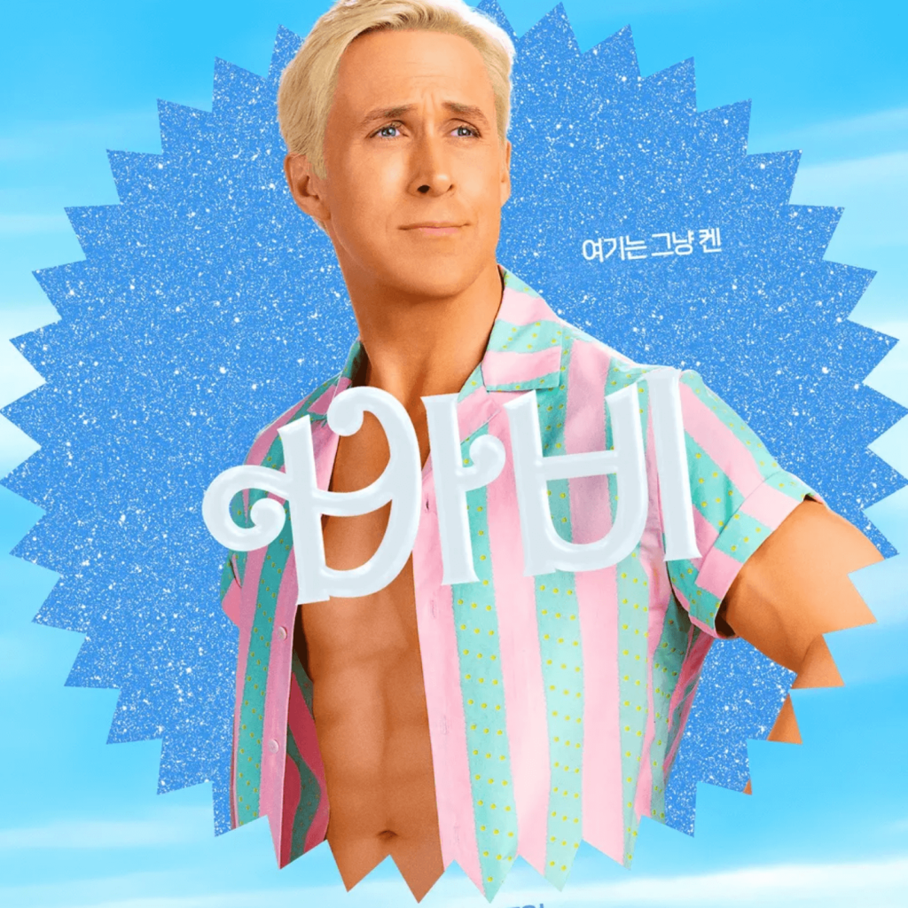
The movie 'Barbie' based on Mattel's toy Barbie has been released. It is a story that unfolds as 'Barbie', who lived in 'Bobby Land', where she can become anything she wants, goes on a journey with 'Ken' to discover and solve the crack in the portal that led to the real world. Directed by Greta Gerwig, who created 'Francis Ha'.
It was the highest opening score ever. It is said to have earned $337 million (about 430 billion won) at the worldwide box office in its first weekend. There is a comment that the concept is the main character rather than the story, but the visual design that expresses the concept of Barbie to that extent is fantastic.
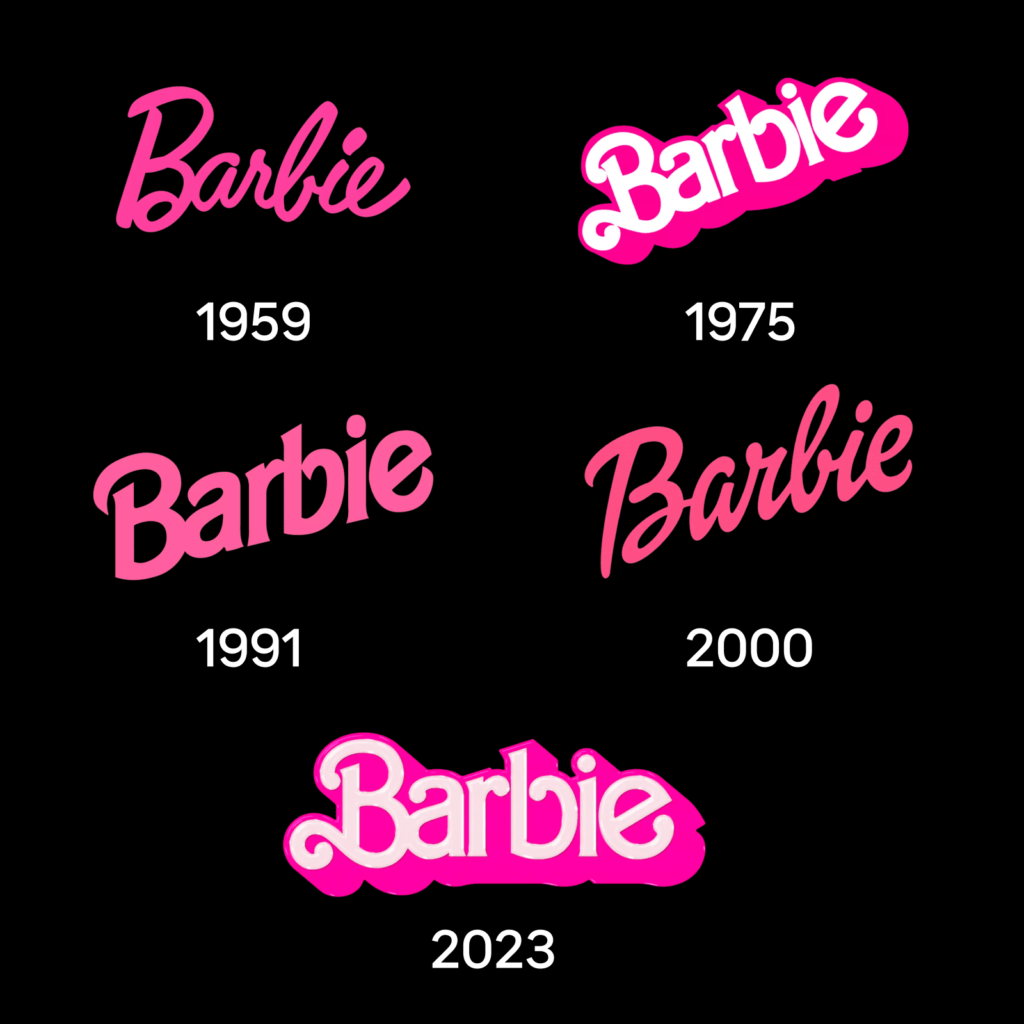
Barbie is known for her striking slanted cursive logo. From scrawled typefaces to bold, angular typefaces, the handwritten feel was maintained. In order to give a plump and bouncy feeling, the height and angle of the typeface were transformed and expressed.
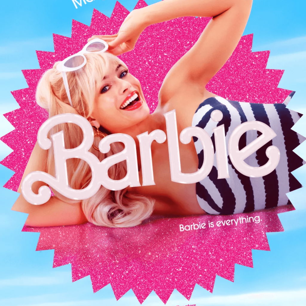
The logo for the film released this time is similar to the Barbie logo used from 1975 to 1991. Added a plastic-like sheen and the words The Movie. Large shadows emphasize the cinematic sense of space. It seems to be a choice to evoke nostalgia for the 1980s in the audience. The text uses a slightly modified avant-garde typeface. It appears to be based on ITC Avant Garde Gothic.
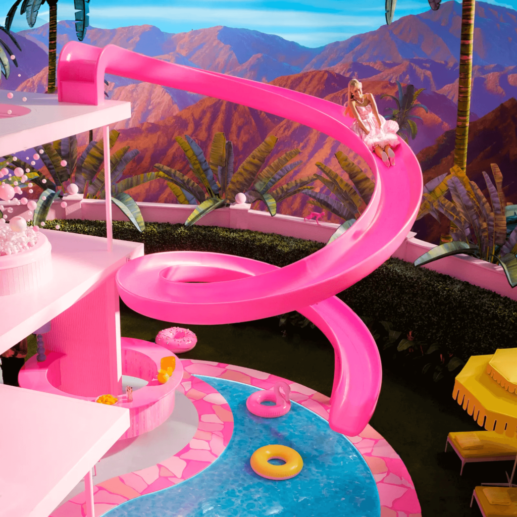
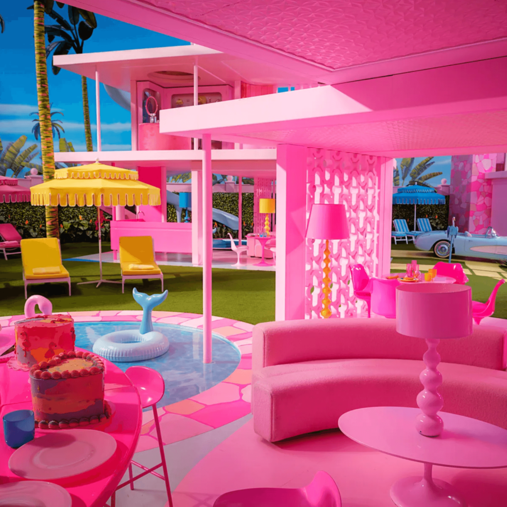
The Barbie set is so full of 'pink' that it is said that the pink paint in the world has been used up. No, it's not just a description, it is said that he actually used all the pink paint of the paint company Rosco.
It expresses a world of fantasy with colors and textures that are hard to find in the world, and it does not feel clumsy by persistently using the details of the real space and props. It is pleasing to the eye by using pink as the base and sky blue and yellow as the accent color. The glitter of the plastic world is delivered effortlessly. The contrast between the fantasy world and the real world is also impressive. If Barbie and Ken appeared in the world, it would look like this.
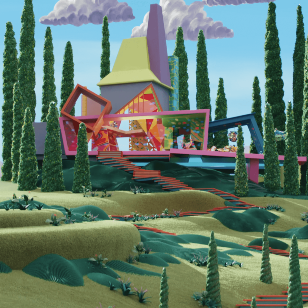
This movie reminds me of Michel Gondry or Wes Anderson. This is a movie that shows what kind of results you can get when you push a strong concept to the end. When making live-action animations or IPs, there are many cases where they become too live-action or too dramatized and end up not even good, but this Barbie movie showed an amazing achievement from a visualization perspective. It seems like a good example of the value that only movies can have in the short-form era.