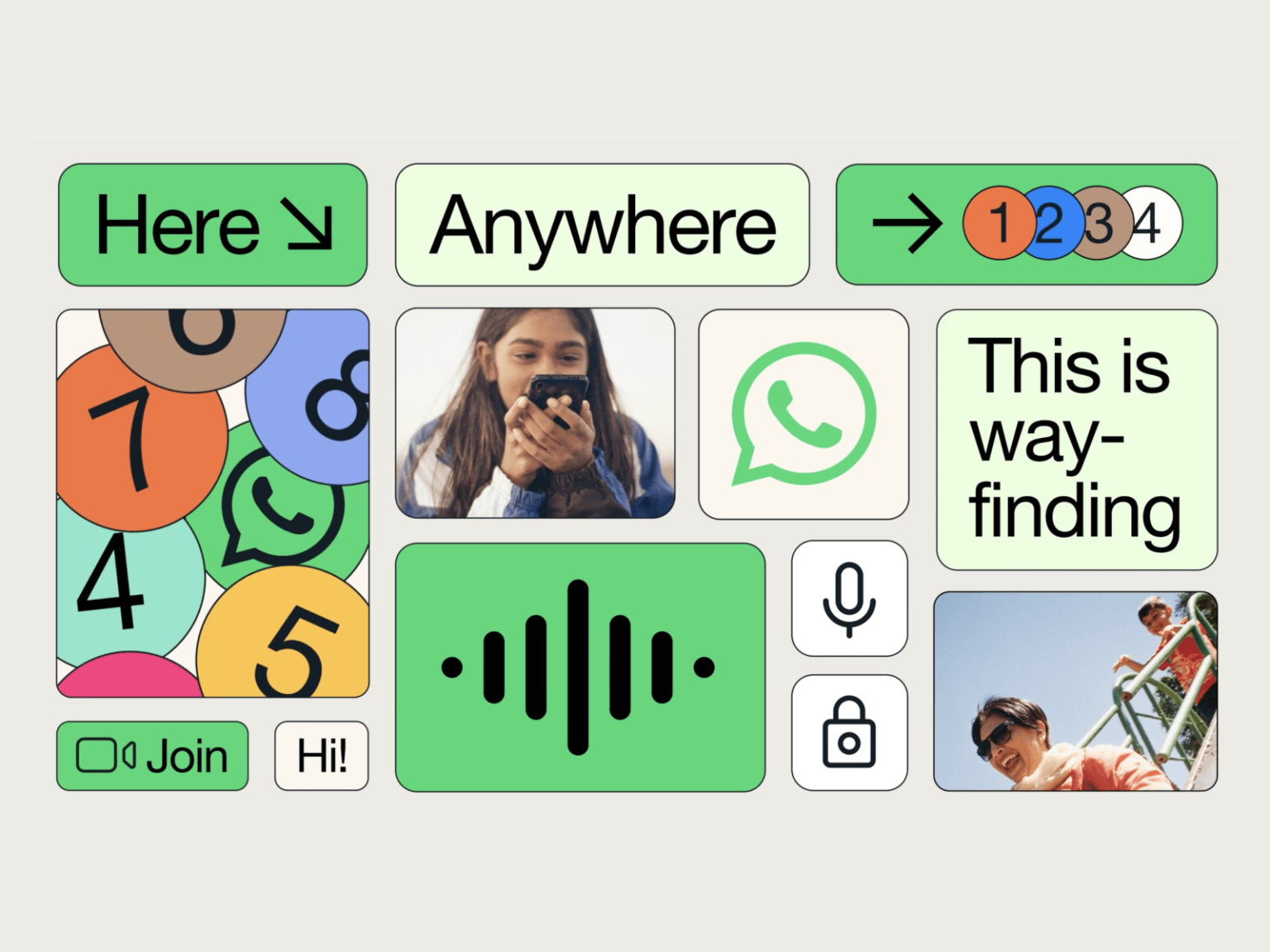

With over 2 billion users in over 180 countries, 'Whatsapp' is one of the most popular messaging apps. Recently, while looking at brand campaigns in various countries, we found a big difference between the visual language of outdoor exposure and the visual language of digital products. Why is WhatsApp so different in its visual language?
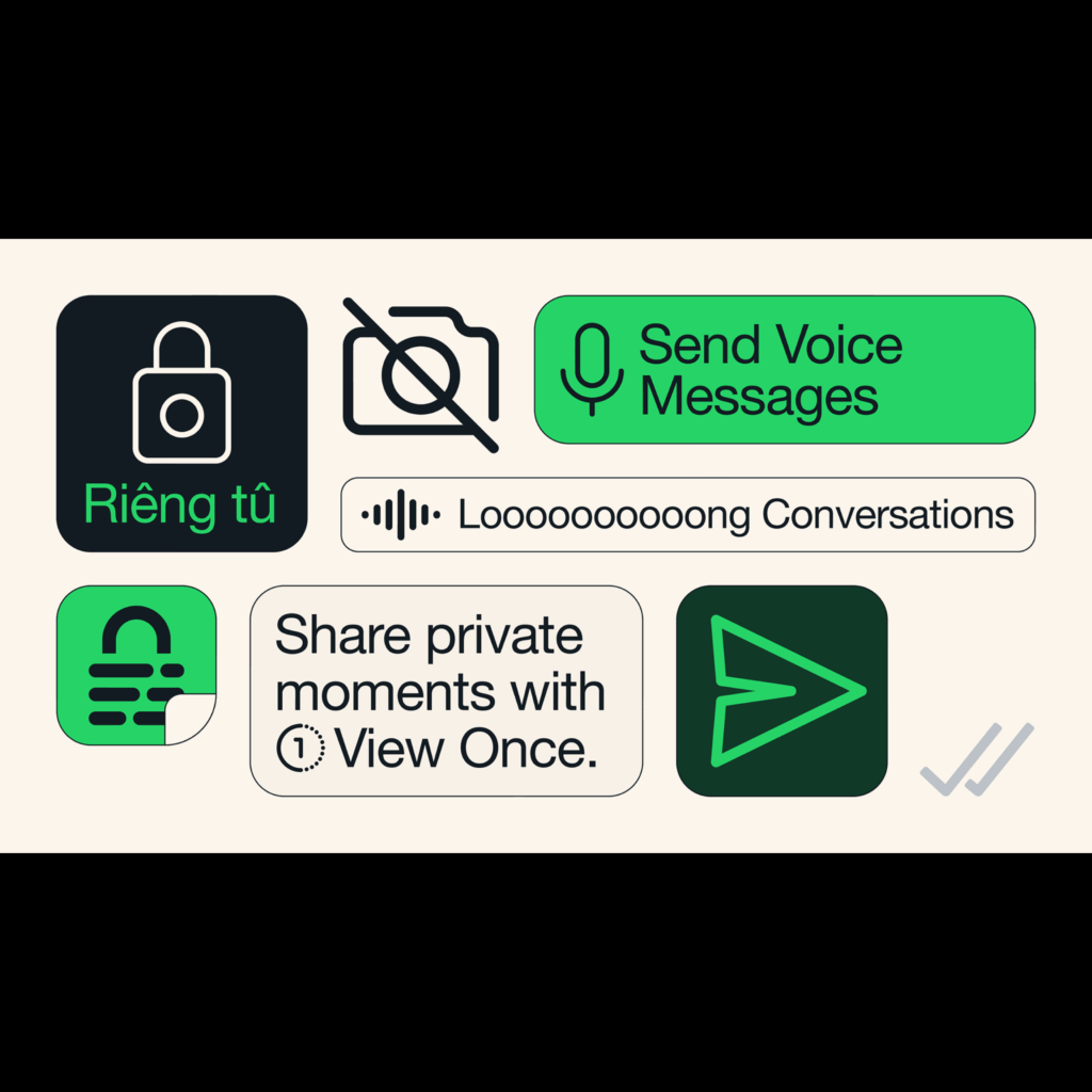
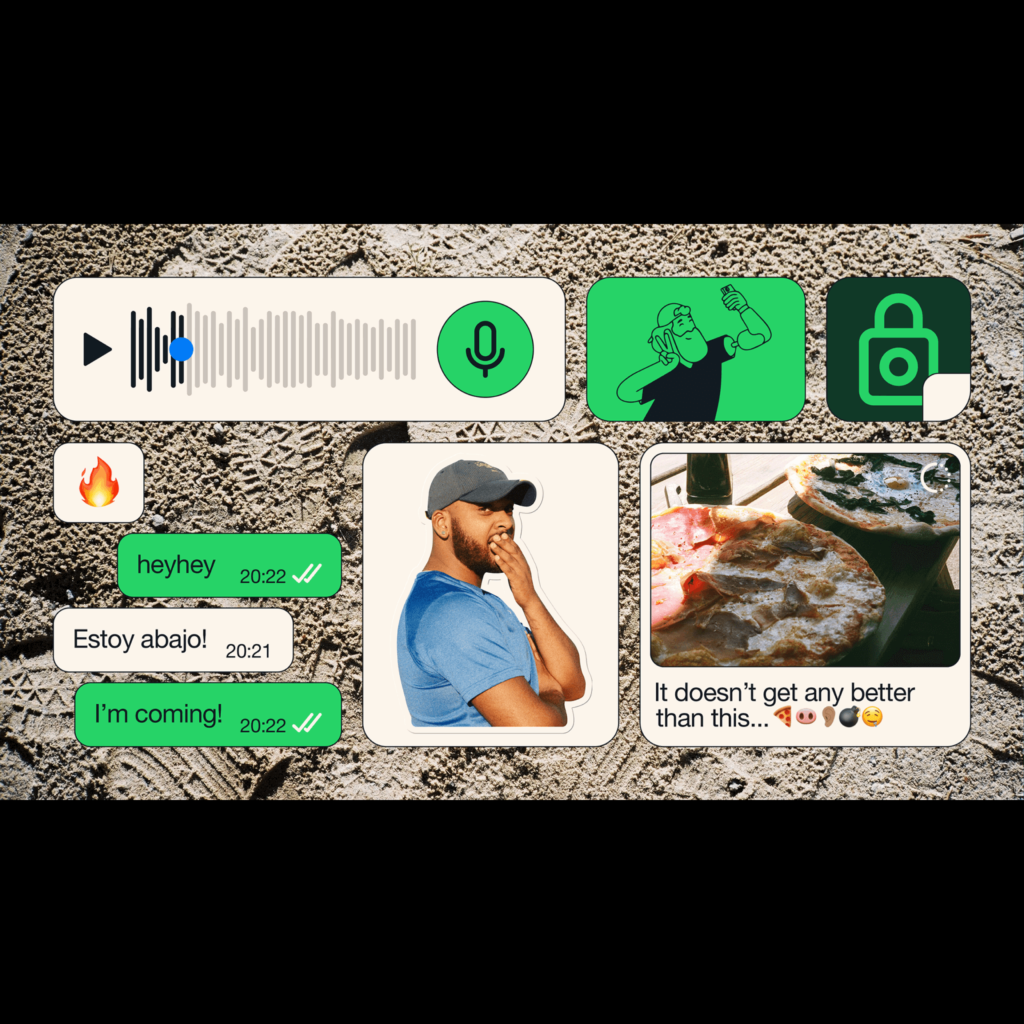
Mehta designed the design system with WhatsApp's Koto earlier this year. The palette was built so that a consistent visual language can be applied in various environments while highlighting the intense green that symbolizes WhatsApp. Helvetica, a universal typeface, was used, and decorative elements were rounded and squared with lines to make them easier to identify. This syntax has been used prominently in brand campaigns.
By comparison, the product was extremely free of visual effects. Except for the window that sends and receives messages, almost all components provided by the OS were used. Both iOS and Android are designed following the design syntax of the OS released years ago. Android still maintains the structure and patterns of Material Design when it first came out, and iOS uses the default blue color and UI components instead of the unique green color.

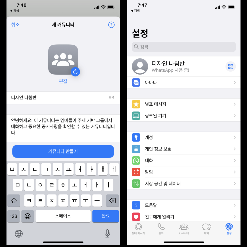
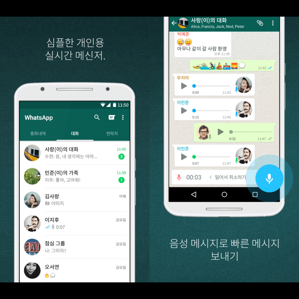
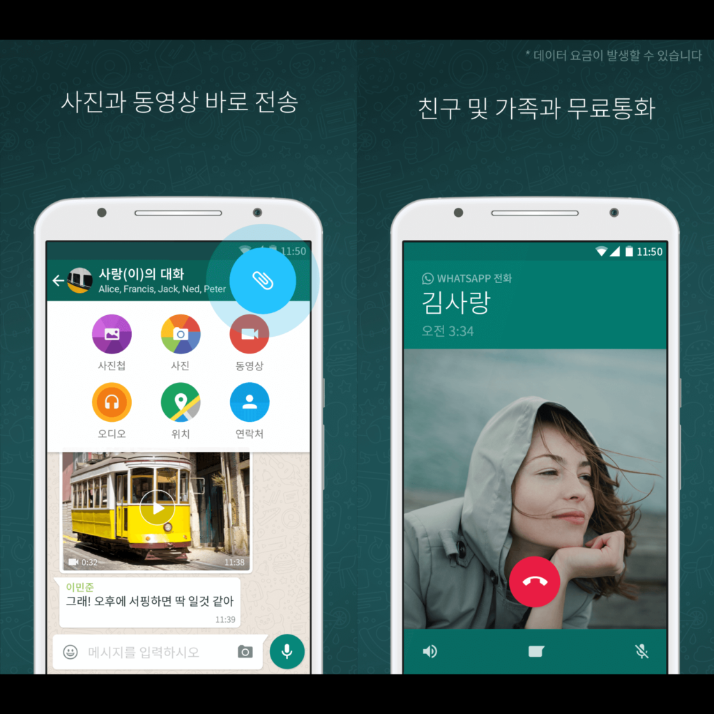
I thought that the way to use the tool called design is different depending on the context and situation. It is read as a design strategy to make entry as easy as possible in a wide area, rather than competing in a narrow area. In order for anyone to use it regardless of age, location, accessibility, bandwidth, or literacy, I think it may be more advantageous to follow the usability of the OS as much as possible rather than having users learn a new app.
It is a design that makes you think about what universal design is. I thought that the design for over 100 million users around the world is also different.
I've heard that data transmission is minimized so that messages can be sent and received in any situation, but the extreme simplification is surprising. When it comes to global reach, I feel like it's a choice that anyone can use, regardless of age, location, accessibility, bandwidth, or literacy.