Sansuin – Natural wine bar in Samcheong-dong with Korean food

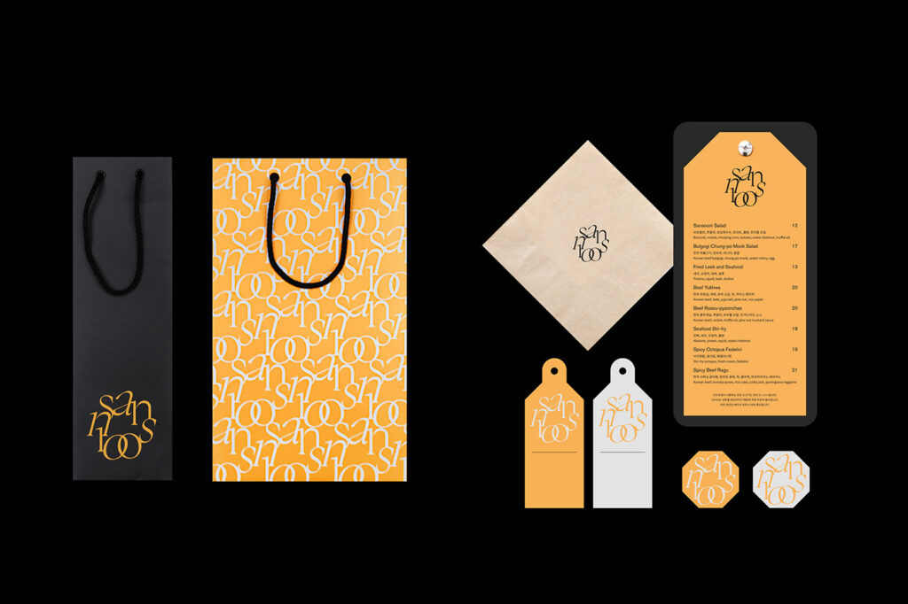
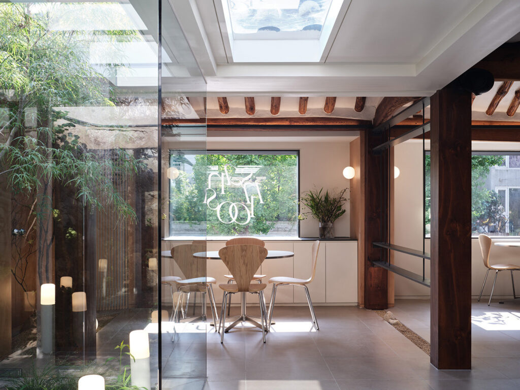
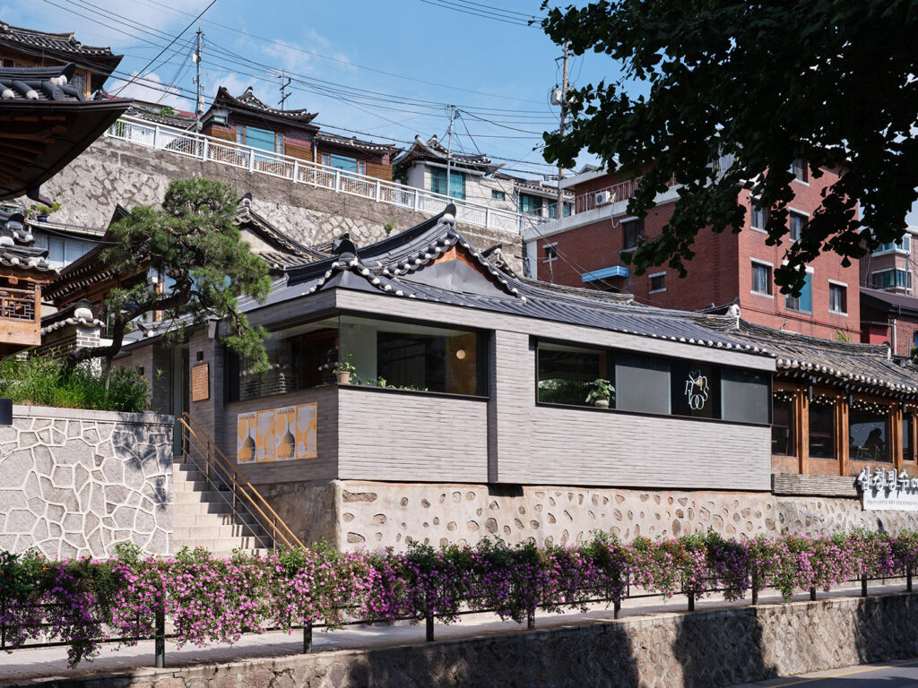
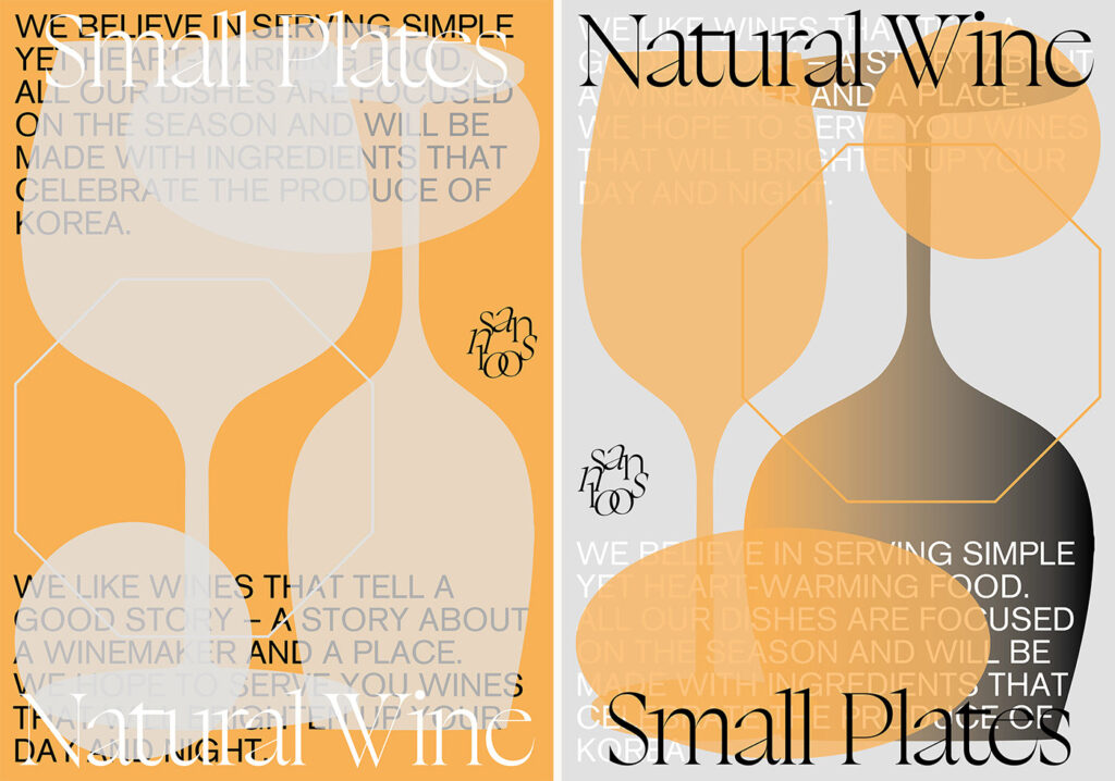
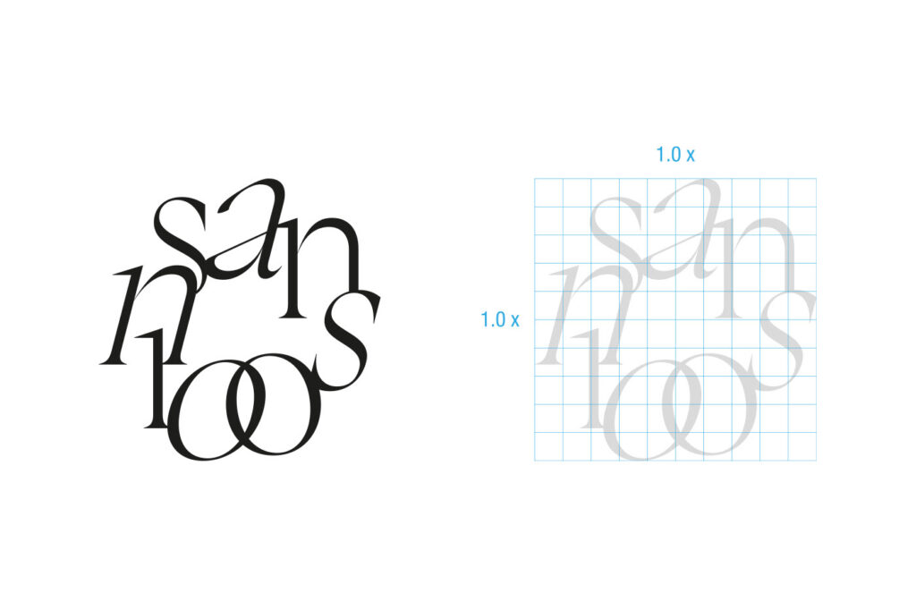
The font of the identity logo is distorted, slanted, and even the angles do not match each other, but when they are combined into one, the subtle sense of balance is attractive. Refreshing yellow is mainly used to convey the not-too-heavy feeling of natural wine. It is a bouncing identity in a neat hanok-style building. @triangle_studio I was in charge of branding.
  • Identity&Application: Kisung Jang (TRIANGLE-STUDIO)
  • Space: Studio stof
  • Construction: Space core
  • Gardening: greensalad flower
  • Photo: Kim Donggyu

https://www.behance.net/gallery/136906243/SANSOOIN-Identity-Application?tracking_source=best_of_behance

Catch Design Trends
Every Morning

Get the newsletter trusted by 13,000 creators.

Latest news

Catch Design Trends
Every Morning

Get the newsletter trusted by 13,000 creators.

Design for Business