
Verge가 새로운 브랜드 아이텐티티를 공개했습니다. ‘Revolutionizing the media with blog posts’ 블로그 포스트로 미디어를 혁신하겠다는 담대한 문구를 내세웁니다. 뉴미디어를 대표하는 Voxmedia에서는 음식 매체 Eater, 부동산 매체 Curbed, 스타일 매체 Racked, 스포츠 매체 SB Nation, 게임 매체 Polygon 등을 운영하는데 IT 매체인 The Verge가 가장 강력한 영향력을 발휘하고 있다고 합니다. 블로그 중심으로 독자와의 관계를 재설계하기 위해 무려 2년이나 리브랜딩을 진행했다고 밝혔습니다.
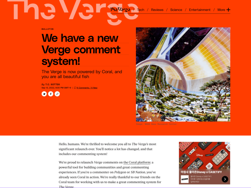
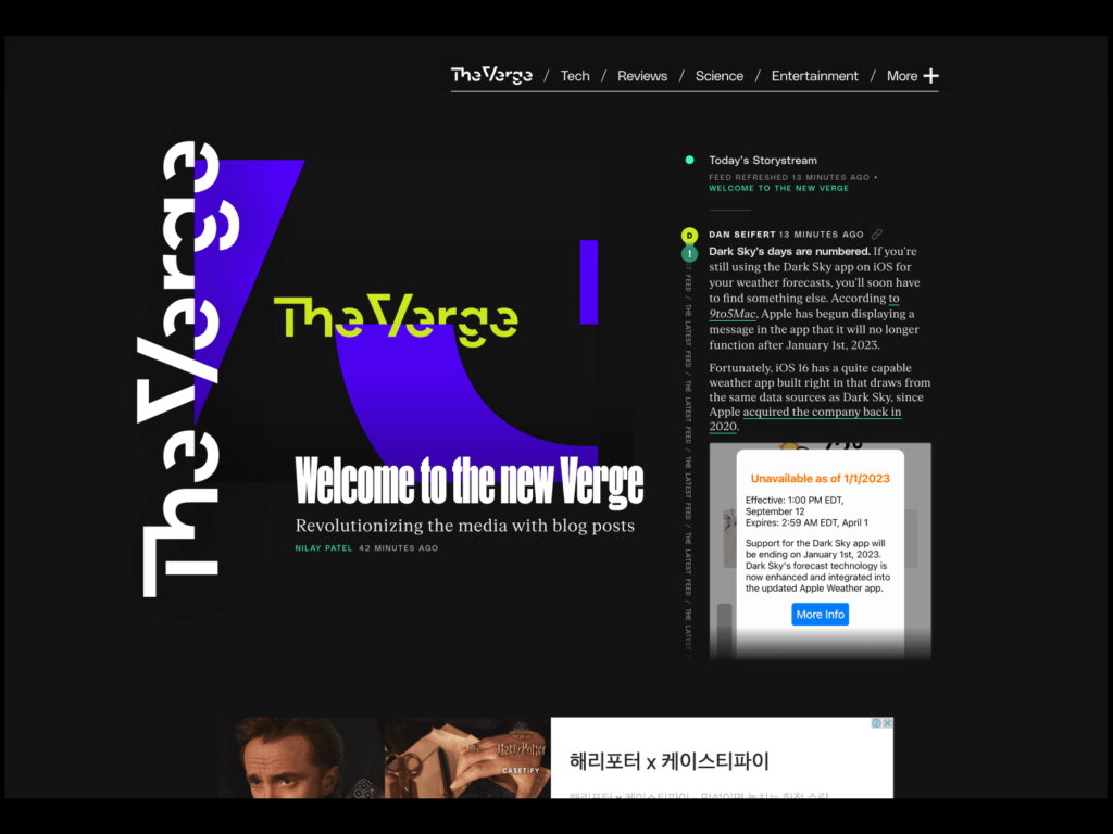
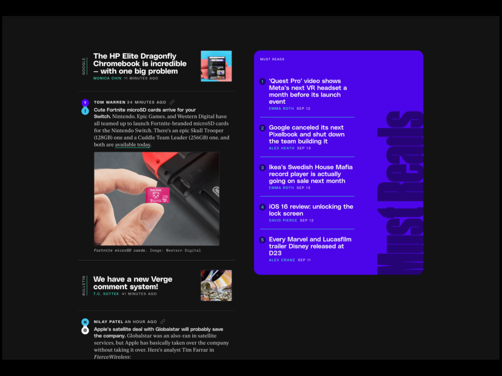
워드마크의 끊긴 표현이 독특합니다. 글을 많이 노출하는 미디어답게 개성 넘치는 3가지 서체 Poly Sans, Manuka, FK Roman를 만들었습니다. 주인공이라 할 수 있는 Poly Sans는 단단하면서 특이한 인상입니다. 글자 중간중간 잉크가 자연스럽게 번지게 만드는 잉크 트랩을 디지털 환경에서 묘사한 것이 개성적입니다. 이전의 어두운 배경에 붉은 하이라이트에서 벗어나 밝고 새로운 색상 팔레트를 제공합니다. 웹사이트의 레이아웃이 크리에이티브합니다. 이전에 단순하면서도 신선한 구조로 새로운 정보를 탐색하는 즐거움이 더해집니다.
더 보기 및 출처
최근 Cnet의 리브랜딩과 비교해봐도 재밌을 것 같습니다.


