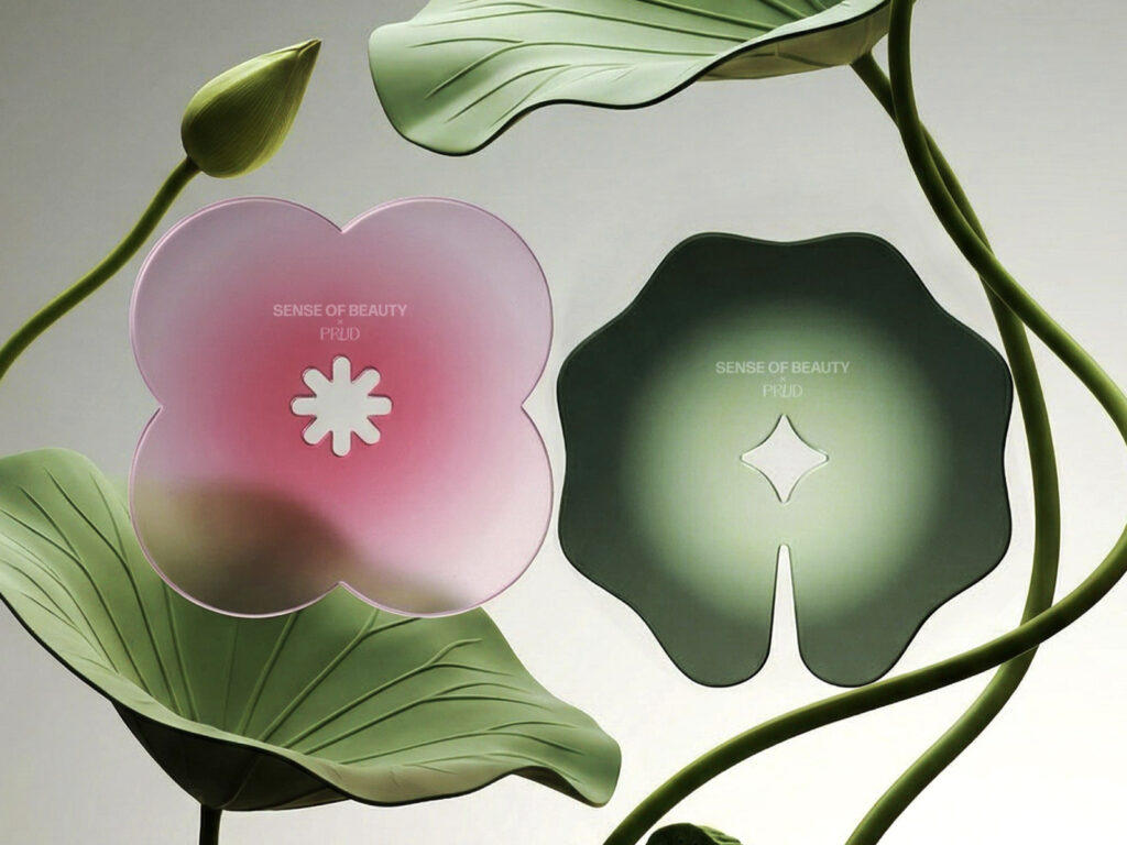
SENSE OF BEAUTY와 PRUD의 팝업 프로젝트입니다. 주제는 빛, 고요, 영감으로 클로드 모네에 관한 강의와 협업 아이템을 함께 소개하는 형식으로 구성됐습니다. 이번 협업의 중심에는 ‘연못’이 있습니다. 빠르게 움직이는 도시 안에서 잠시 속도를 늦추는 감각을 제안합니다. SENSE OF BEAUTY는 “모든 것이 급한 도시에서 우리는 속도를 늦추기 위해 준비하고 있다”고 설명했습니다. 화려한 여름이 오기 전, 물 가까이에서 서로 […]
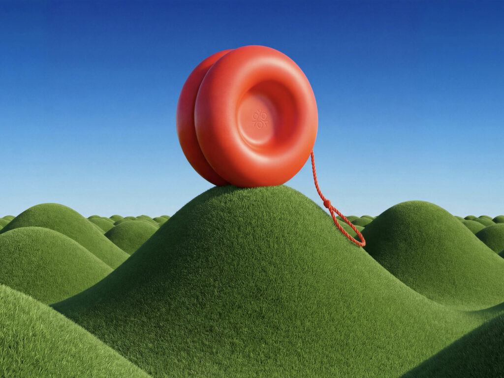
YOYOYO는 구글 딥마인드와 PORTO ROCHA가 함께 만든 가상의 브랜드이자 제품 콘셉트입니다. 이 프로젝트는 Nano Banana Pro 모델이 실제 크리에이티브 워크플로에서 어디까지 활용될 수 있는지 실험하기 위해 진행됐습니다. 단순히 이미지를 생성하는 수준이 아니라, 제품 디자인부터 브랜딩, 패키지, 사진, 영상, 공간까지 하나의 브랜드를 전방위로 만드는 과정에 AI를 투입했습니다. 출발점은 요요라는 제품 자체였습니다. 팀은 Nano Banana Pro를 활용해 […]
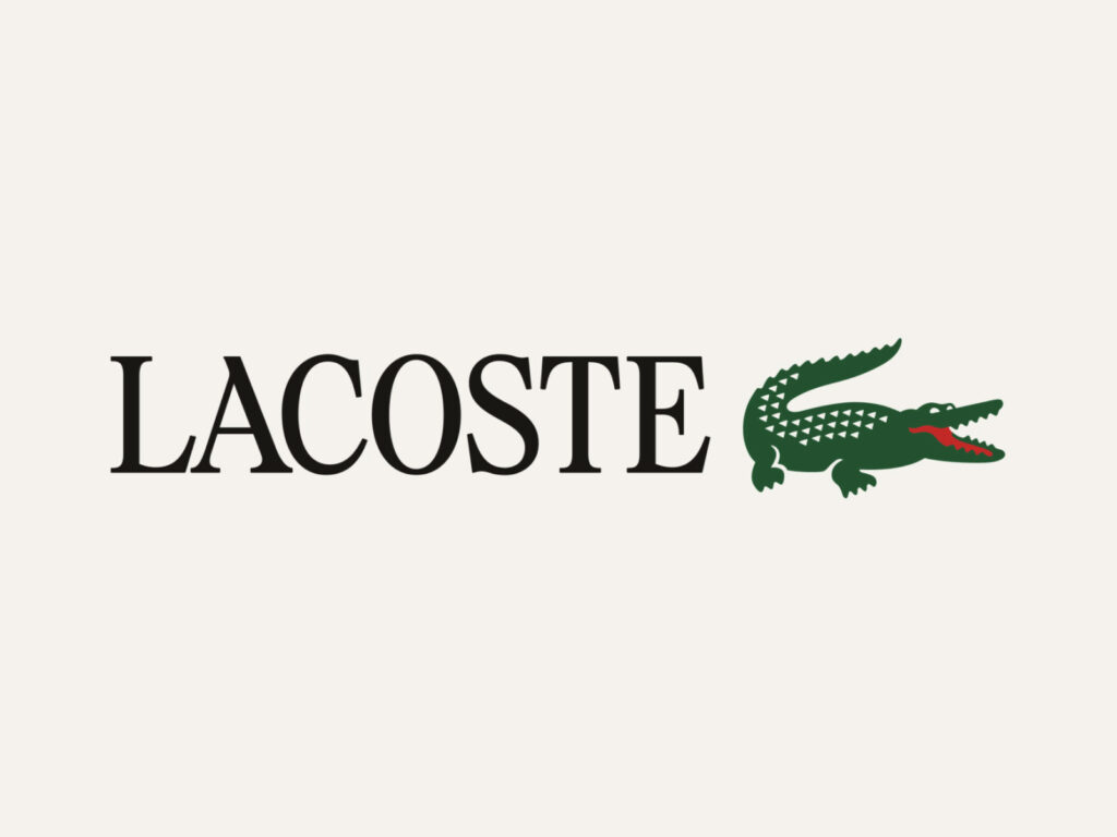
라코스테의 브랜드 디자인입니다. Commission Studio와 협업했습니다. 가장 눈에 띄는 변화는 로고입니다. 라코스테는 로고에 더 뚜렷한 세리프 형태를 다시 도입했습니다. 브랜드는 새 로고가 비율, 리듬, 자간을 세밀하게 조정한 맞춤형 디자인이라고 설명했습니다. 방향은 완전한 단절보다 ‘유산의 현대적 재구성’에 가깝습니다. 1933년 르네 라코스트와 앙드레 질리에가 처음 브랜드를 세웠을 때의 이름인 ‘La Chemise Lacoste’, 그리고 브랜드의 상징이 된 피케 […]
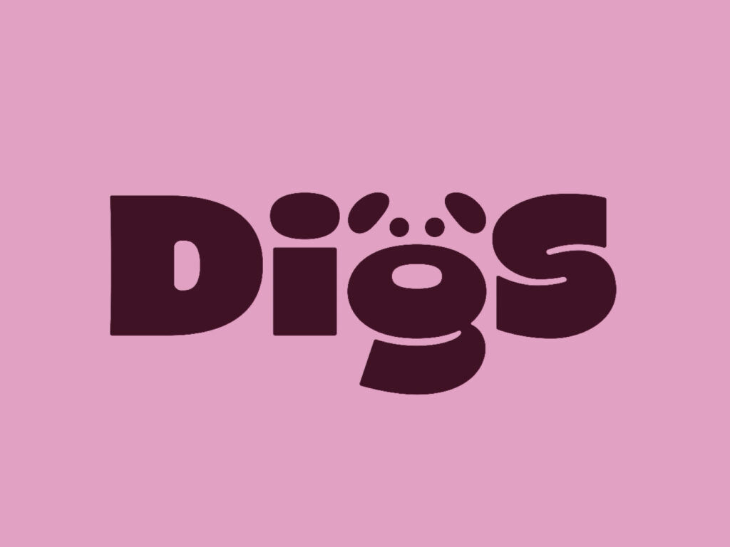
Digs는 반려견 케어 서비스를 새롭게 정의하려는 현대적인 플랫폼입니다. 반려견 보호자뿐 아니라 사업 운영자까지 함께 고려한 브랜드로, 안전, 청결, 신뢰, 정서적 연결을 핵심 가치로 삼았습니다. 이 프로젝트에서 Saint-Urbain은 네이밍, 브랜드 전략, 보이스, 시각 아이덴티티 전반을 처음부터 구축했습니다. 브랜드명인 Digs는 ‘자기에게 잘 맞는 공간을 찾는다’는 표현에서 출발했고, 들어서는 순간 편안하고 잘 돌봐진다고 느껴지는 장소의 감각을 담았습니다. 브랜드 […]
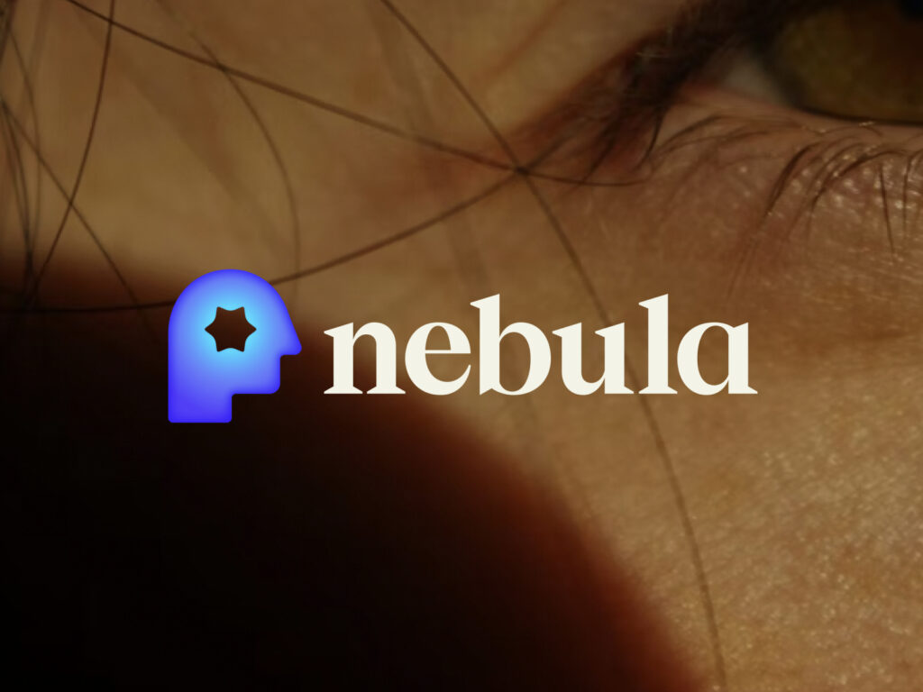
점성술 앱 네뷸라의 브랜드 디자인입니다. 점성술 앱에서 더 넓은 자기 탐색 플랫폼으로 확장했습니다. 기존 네뷸라는 출생 차트, 운세 같은 점성술 기능으로 알려졌지만, 타로·리추얼·영적 가이드까지 서비스가 넓어지면서 더 큰 방향성을 담을 브랜드가 필요했습니다. 디자인 스튜디오 무빙브랜드는 이 프로젝트에서 네뷸라를 ‘우주를 보는 서비스’가 아니라 ‘내면을 탐색하는 공간’으로 전환했습니다. 그래서 전략도 “outer space”에서 “inner space”로 옮겨갔고, 사용자가 정답이나 […]
렙솔은 스페인을 대표하는 종합 에너지 기업입니다. 한때는 정유·석유 회사 이미지가 강했지만, 지금은 전기·가스·태양광까지 아우르는 ‘멀티 에너지 기업’으로 전환을 추진하고 있습니다. 프로젝트의 핵심 개념은 ‘Confluence(합류점)’입니다. 서로 다른 에너지원이 하나로 모이고 연결된다는 뜻으로, 렙솔이 다양한 에너지 솔루션을 제공하는 회사라는 메시지를 시각적으로 풀어냈습니다. 기존 상징은 유지하되 더 유기적이고 입체적인 형태로 재해석했고, 움직임과 그라데이션을 더해 살아있는 에너지처럼 보이도록 만들었습니다. […]

글로벌 생활용품 기업 락앤락이 1월 22일 새로운 기업 아이덴티티(CI)를 공개했습니다. 새로운 CI는 현대적이고 견고한 영문체에 알파벳 ‘L’자를 괄호 형태로 표현해 지속과 결속의 의미를 담았습니다. 메인 컬러는 신뢰와 안정성, 품질, 혁신적 기술력을 상징하는 파란색을 적용했습니다. 새로운 CI는 밀폐용기가 닫힐 때 나는 ‘찰칵(Snap)’ 소리의 감동에서 영감을 받아 디자인되었습니다. 함께 발표된 슬로건 ‘Lockin’ your moment’는 고객의 일상 속 […]

월마트가 약 20년 만에 로고를 새롭게 변경하며 브랜드 정체성을 전면 개편했습니다. 이번 리브랜딩은 월마트가 “사람 중심, 기술 기반의 옴니채널 소매업체”로 진화했음을 반영한다고 회사는 밝혔습니다. 새 로고는 설립자 샘 월튼의 트럭 운전사 모자에서 영감을 받은 글자체와 현대적인 맞춤형 서체를 특징으로 하며, 기존의 상징적 노란색 “스파크”는 소폭의 변화를 거쳤습니다. 브랜드 컬러는 기존의 하늘색보다 밝아졌으며 노란색도 보다 세련된 […]

Beauty platform ‘Hwahwae’ has been rebranded. This is a major change 11 years after the service was launched in 2013. Hwahae is a service that solves the problem of not knowing what ingredients were included when purchasing cosmetics. It is a service that has revolutionized the market by making it easy to find cosmetics information that was previously difficult to collect in one place. Bird View, the operator of Hwahae, has unveiled a new brand identity along with the ‘Hwahwa 2.0’ mission to take a leap toward the future. new [… ]
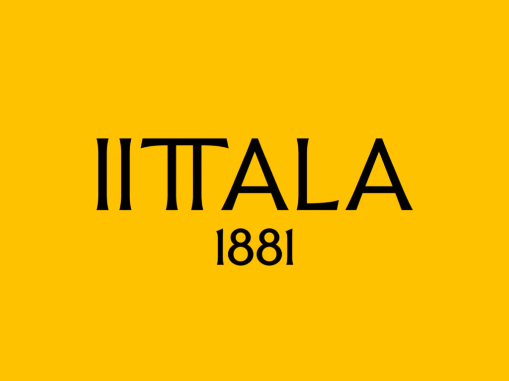
In early February, Finnish lifestyle brand Iittala unveiled its new brand identity at Stockholm Design Week. The logo and collection pay homage to the legacy of architects Alvar and Aino, who designed many of Iittala's iconic products. The new visual identity completely contradicts the original brand impression. Iittala, Finland's leading lifestyle brand, is a company with a 143-year history that started in 1881 in a glass factory in the village of Iittala. Architect Alvar Aalto and […] ]
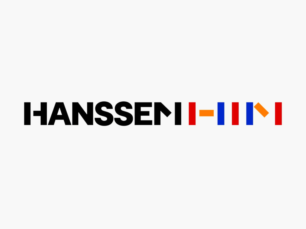
Hanssem collaborated with design studio CFC to rebrand for the first time in 32 years. We maintained a visual identity worthy of the name ‘Hanssem,’ which symbolizes endless growth. We combined 'Creative Block', a geometric shape faithful to the basic elements of design, with Hanssem's English name 'HANSSEM'. The simple yet powerful block shape of vertical, horizontal, and diagonal lines was even applied to the word mark. The 'three primary colors', another basic element of design, have become darker and clearer. The ‘H’ and ‘M’ in ‘HANSSEM’ refer to the visual characteristics of the block […] ]
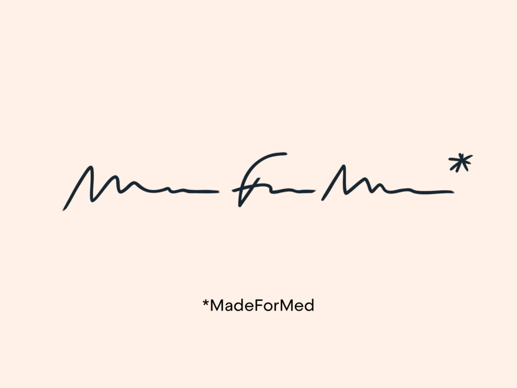
MadeForMed has rebranded. MadeForMed is a medical communications service co-founded by Dr. Julien Pourcel and his colleagues in 2014. Based in France, they are building a community with 20 colleagues. Their goal is to modernize family medicine by providing close patient care. With the number of doctors decreasing and health becoming a consumer good, MadeForMed aims to bring doctors and patients closer together. This rebranding highlights the unique mission of the service across various visual identities […]