
Carrot Market, a used goods trading service, has been rebranded as Carrot. The plan is to complete the hyperlocal business roadmap while transforming into a local living community. Carrot Market, which discovered close neighbors and felt the joy of sharing, announced that it is starting a journey to break away from 'market' and move to 'near you'. It was one of the candidates when the service was first created 8 years ago, but it was difficult for a starting company to use a common noun, so they added 'market'. From the beginning, we considered your neighborhood more important than the market […] ]
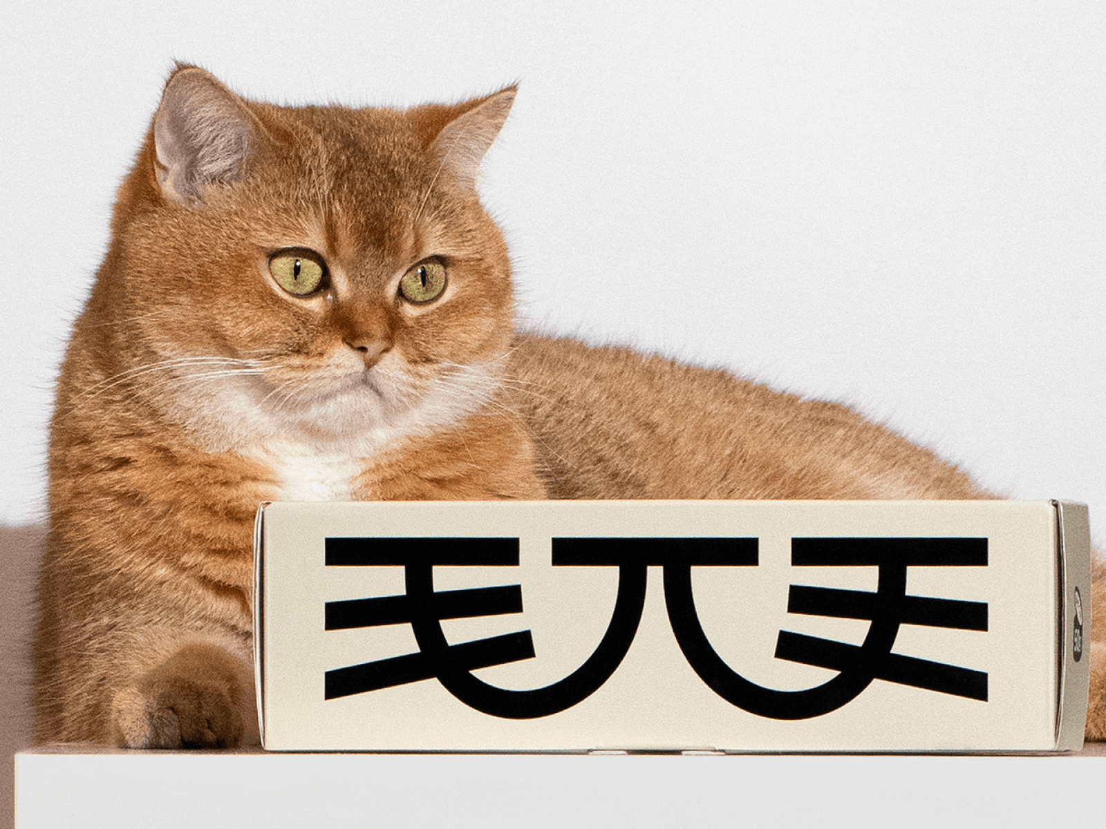
For cat food brand Maowoo, DXD Studio designed the brand experience. DXD Studio is a design studio based in Shenzhen, China. DXD partner Zhou Shengdian revealed that the goal was to combine a unique identity that could communicate with the younger generation of cat owners, with 'lifestyle aesthetics' and 'reliable scientific food'. “Intuitively, it looks more appetizing, takes the packaging design to the next level, and inside […] ]
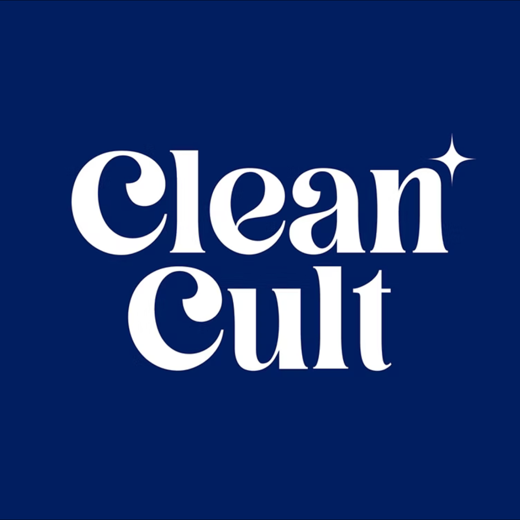
Cleancult has undergone a rebranding process in partnership with Robot Food. Founded in 2016, Cleancult is a Massachusetts-based eco-friendly startup. It's a brand of eco-friendly household cleaning refills made with FSC-certified, fully recyclable paper and free of harmful chemicals. They built their reputation through crowdfunding and focused on direct-to-consumer sales. Now, it's time for a fresh look to further expand their reach. The wordmark features sleek lettering and a star […]
To celebrate its 25th anniversary, CJ Olive Young opened a new store, "Olive Young N Seongsu," in Seongsu-dong, Seoul. Spanning five floors and approximately 4,500 square feet (1,400 pyeong), this five-story store is Olive Young's largest and aims to curate the latest K-beauty trends while maximizing the unique offline experience. The Olive Young Brand Creative Center, BI design studio CFC, and motion graphics studio cobb.tv collaborated to develop a variety of graphics. The "N" symbolizes New, Next, Nest, and Network, signifying infinite possibilities for expansion.
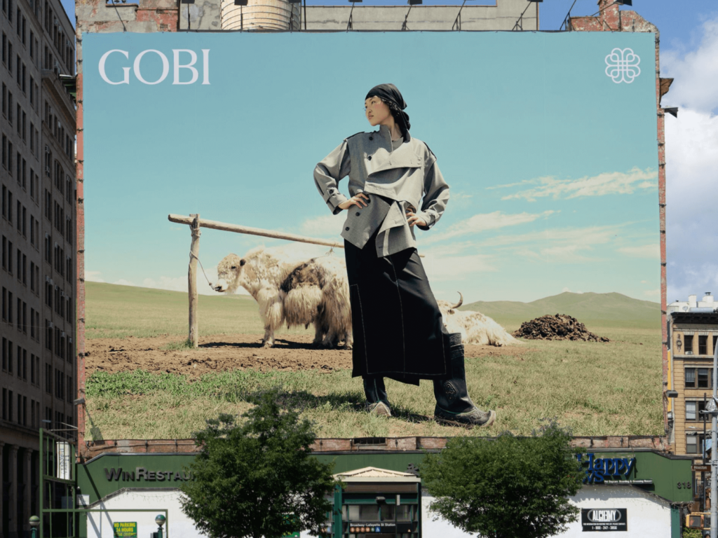
Cashmere brand Gobi rebranded with Mucho. Gobi is the largest cashmere brand in Mongolia, founded in 1981. All garments are produced in Mongolia by Mongolians. Everything from harvesting, processing, design, to distribution is done in Mongolia. The quality of Mongolian cashmere comes from the unique climate. In an environment where it is extremely hot in summer and extremely cold in winter, the goats shed their fur frequently and the fur is of high quality. After being privatized in 2007, official branches in Berlin and Düsseldorf […]

Kleenex has collaborated with Turner Duckworth for a rebrand. They have unveiled a new visual identity to celebrate their 100th anniversary. Kleenex has grown significantly as a household goods brand since its establishment in 1924. In Korea, it is widely known as 'Kleenex', which was created by Yuhan Kimberly, a joint venture between Yuhan Corporation and Kimberly-Clark in 1970. This rebrand will be applied to Kleenex in the US, and it has not been disclosed whether it will be applied to Korea. Kleenex has lost consistency for a long time due to different logos and colors. The wordmark has been transformed into various forms depending on the region. Accordingly, Kleenex […]
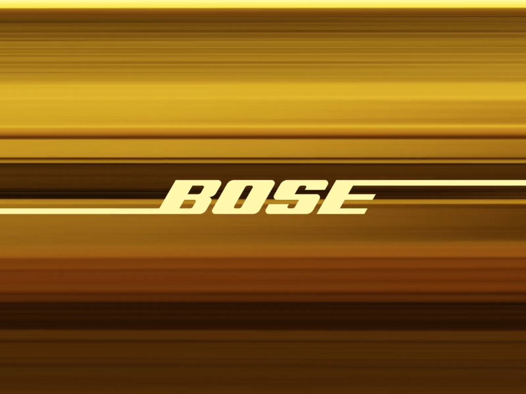
Audio brand Bose has rebranded in collaboration with Studio Collins in the US. Founded in 1964 by Amar Bose, Bose has been making great audio products that have won the hearts of listeners around the world. As Bose approaches its 60th anniversary, it has decided to tell a story that will satisfy its loyal fans and attract new ones. The new tagline is 'Sound is Power'. The iconic Bose logo will remain. The Warsaw-based independent type foundry […]
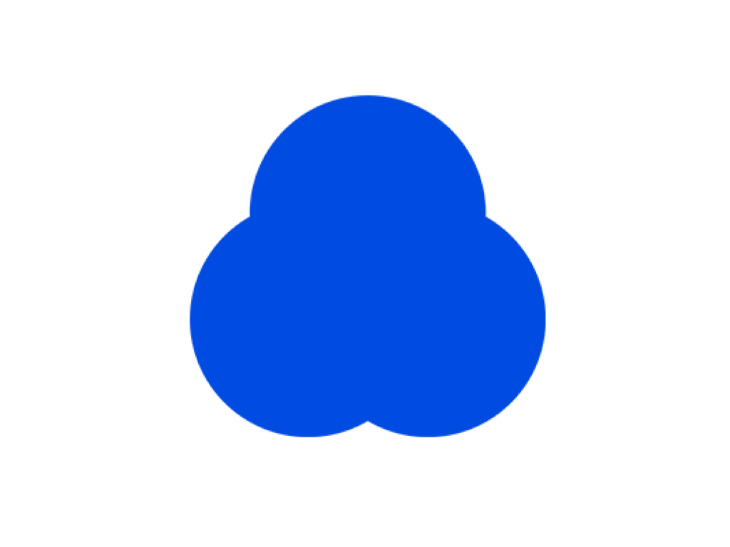
Cleantopia has rebranded. Cleantopia already carried out a major rebranding early last year to celebrate its 31st anniversary. Now, a little over a year later, the visual identity has completely changed to the point where the old brand is no longer recognizable. Based on the vision of ‘Cleantopia, the standard for laundry,’ the new logo symbolizes the best laundry service that you can trust in your daily life. The new symbol is a combination of three circles. Each circle represents ‘everyday,’ ‘trustworthy,’ […]
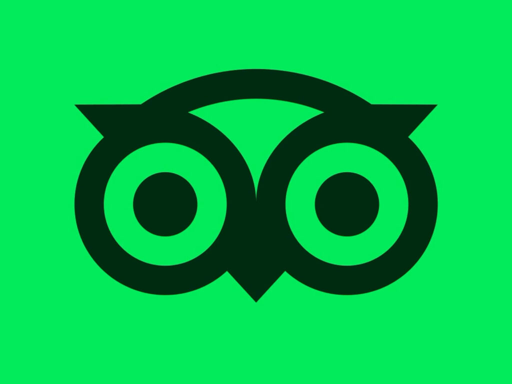
TripAdvisor, the world's largest travel platform, has completely revamped its brand identity to celebrate its 25th anniversary. This rebranding was carried out in collaboration with UK design agency Koto Studio. While TripAdvisor has long maintained its signature turquoise green, the new color palette has been transformed into a more vibrant lime green. Furthermore, the brand's mascot, Ollie the owl, has been given a more vibrant look, with animated eyes that move […]
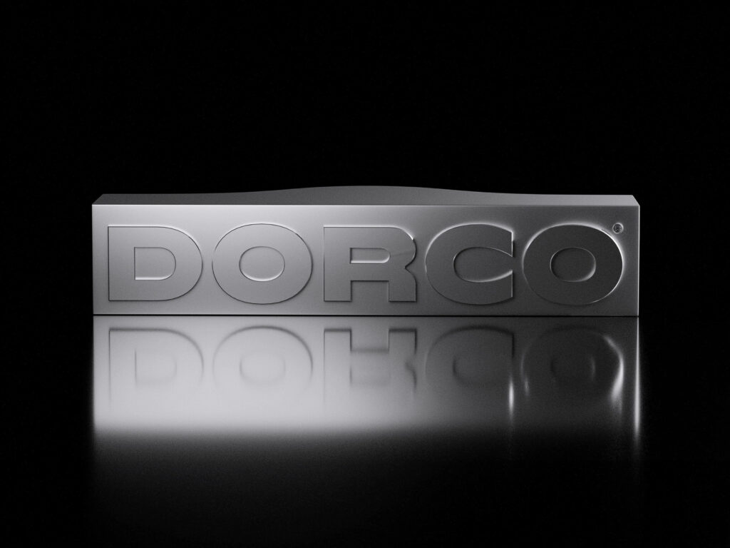
Dorco, Korea's leading razor brand, celebrated its 70th anniversary by collaborating with design agency Plus X to launch a brand refresh. This rebranding aims to strengthen its global identity, emphasizing technological prowess and precision, centered around a new brand core concept called "Leading Edge." Since its founding in Seoul in 1955, Dorco has consistently pioneered technological innovation in the razor market. In 2014, it created a significant stir in the industry by developing the world's first seven-blade razor. Currently […]

Amazon undertook a massive brand renewal project spanning 15 global markets and over 50 sub-brands over the course of 18 months. During its rapid expansion, Amazon's brand system became fragmented and inconsistent across teams and regions. To address this, the company partnered with design studio Koto to develop a new brand system. The core of this renewal was a modern reimagining of Amazon's iconic assets. The logo was revamped for the first time in 20 years. From the A of the previous logo, […]
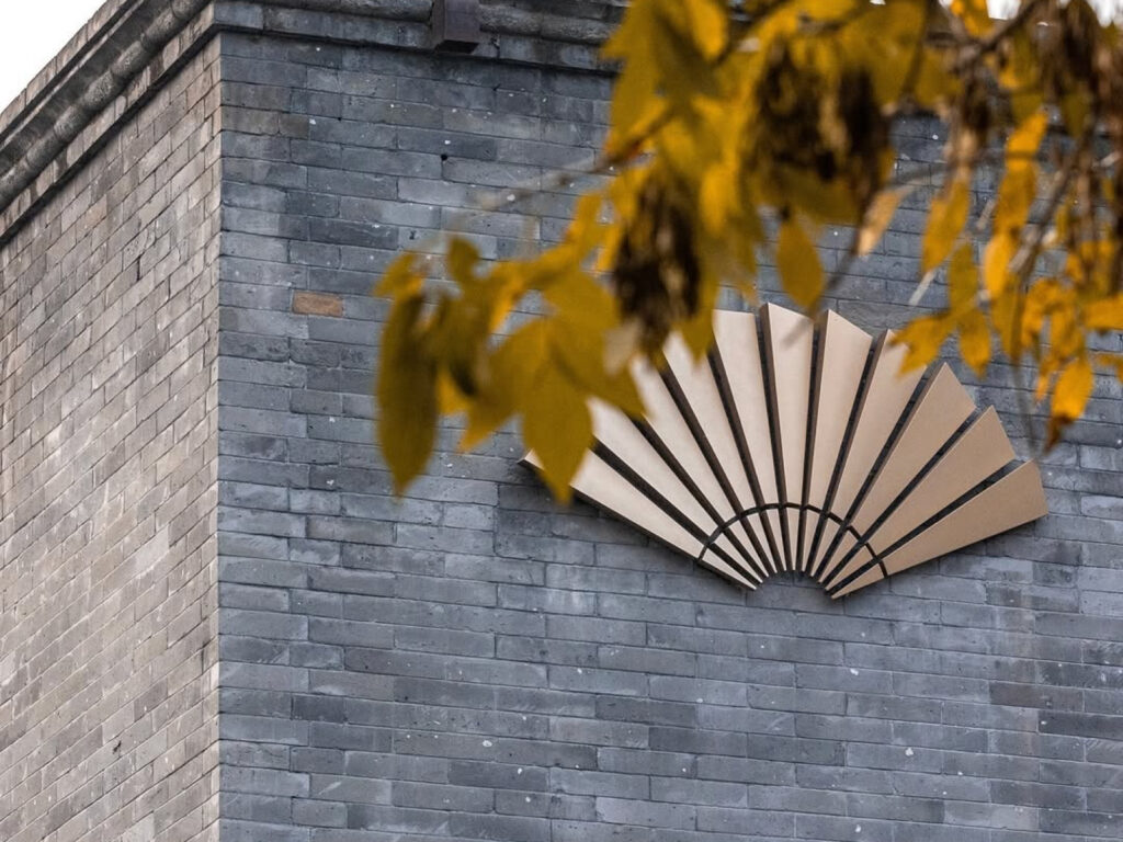
Mandarin Oriental Hotel Group, a symbol of luxury hospitality, has unveiled a new visual identity, a contemporary reinterpretation of its brand identity. The iconic fan logo, used since 1985, has been reimagined with a simple and sophisticated form. Originally a symbol of the union of the two hotels—The Mandarin in Hong Kong and The Oriental in Bangkok—the fan has become a symbol of the brand's exquisite hospitality and craftsmanship. The accompanying font, "MO Exceptional," draws inspiration from the geometric structure of the fan […]