Channel A has rebranded in collaboration with Plus X. Channel A was founded in 2011 by Dong-A Ilbo with the slogan “Canvas of Your Dreams” and has been producing various content for 13 years. Recently, with the emergence of new OTT platforms and intensifying media competition, it was necessary to present and communicate a new vision. This rebranding aims to transform from a broadcaster to a content platform. It has changed to focus on active viewers who actively choose and consume content. With Play as its core value […]
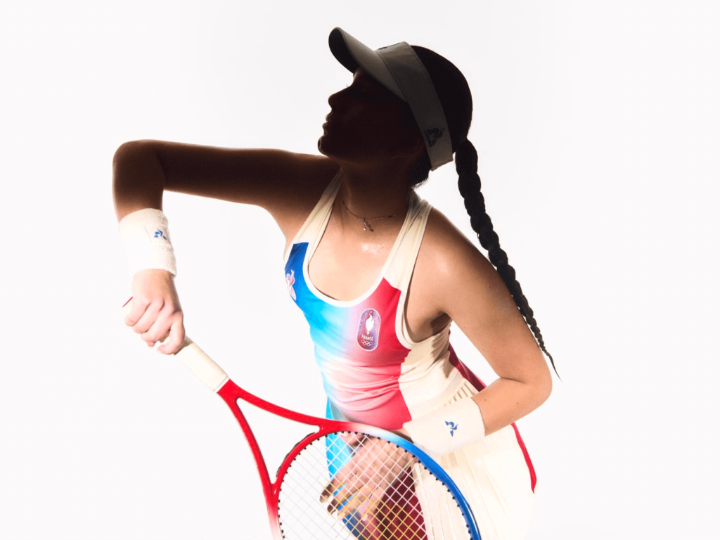
The uniforms for the 2024 Summer Olympics and Paralympics in Paris are being unveiled one by one. As befitting an event sponsored by luxury goods giant LVMH, the Olympics are undeniably committed to fashion. LVMH jewelry brand Chaumet designed the Olympic medals, and Louis Vuitton designed the trunks that will carry the medals and torch. A number of countries have also collaborated with leading fashion brands to design stylish uniforms. Here are some of the most impressive ones. Korea […]
Verizon, America’s largest telecommunications company, has rebranded after nine years. It has unveiled a new logo and brand system in collaboration with Turner Duckworth. Verizon is repositioning itself beyond a wireless infrastructure provider to include gaming, streaming, and the NFL. To give it the right entertainment feel, it has designed a new visual identity. The previous rebrand, done with Pentagram in 2015, featured an electric-inspired check mark. But new research has shown that the check […]
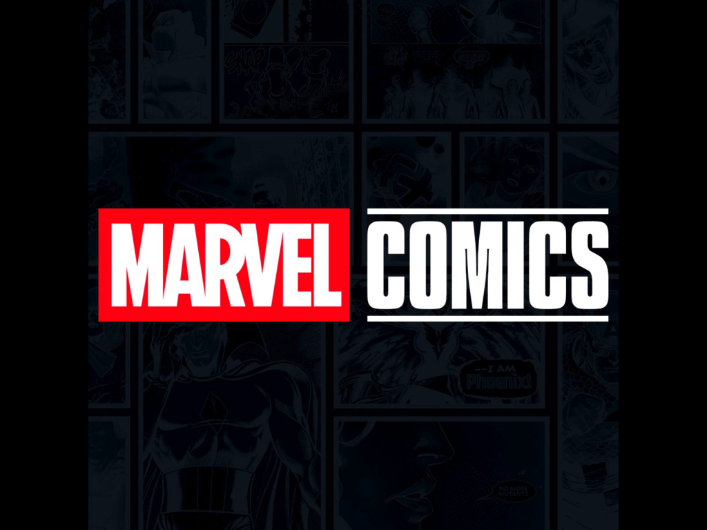
Marvel has unveiled a new Marvel Comics logo. It was unveiled as Marvel renames its Marvel Unlimited subscription service on X to MarvelComics. It is designed as a sub-brand centered around the red brick logo that was introduced in the 2000s. The logo for the new Marvel Animation for the retro X-Men animation X-Men '97 that was released on Disney+ in February was unveiled, and the new comics logo follows the same rules. 'Marvel' […]
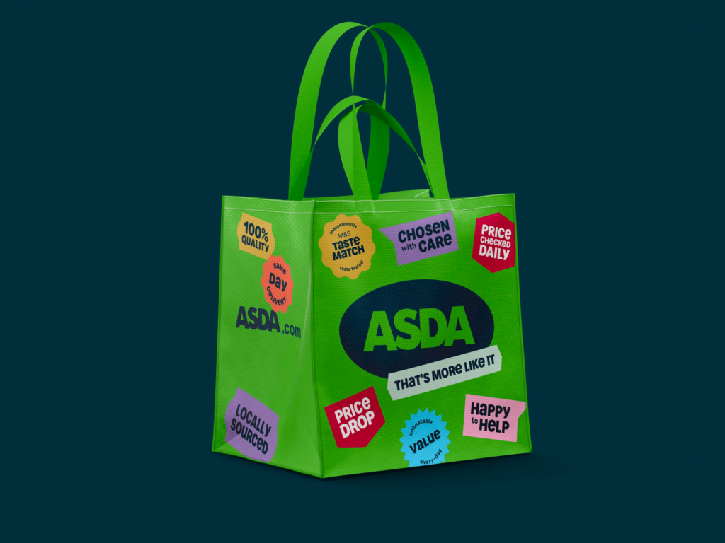
Britain's ASDA has rebranded in collaboration with advertising agency Havas London. Founded in Leeds, England in 1949, it is a large supermarket that provides a variety of services, including pharmacies, clothing, printing, mobile phones, and gas stations. It is a brand under Walmart and is the second largest supermarket after Tesco. Large brands that are closely related to our daily lives need to change carefully because even the slightest change can cause them to lose trust. This rebranding appears to have been successful. Rather than feeling integrated into a huge supermarket […] ]
Spotify has announced its exclusive font ‘Spotify Mix’. Created with Berlin-based font creation foundry Dinamo Typefaces. It replaces the Circular font in mobile/desktop app environments and is applied starting from all languages that use Latin character-based scripts, including Vietnamese. Variable fonts have been a hot topic in the brand design market recently, and Spotify, which is serious about design, has finally released a dedicated font. Spotify Mix captures the dynamic and evolving nature of music culture […] ]
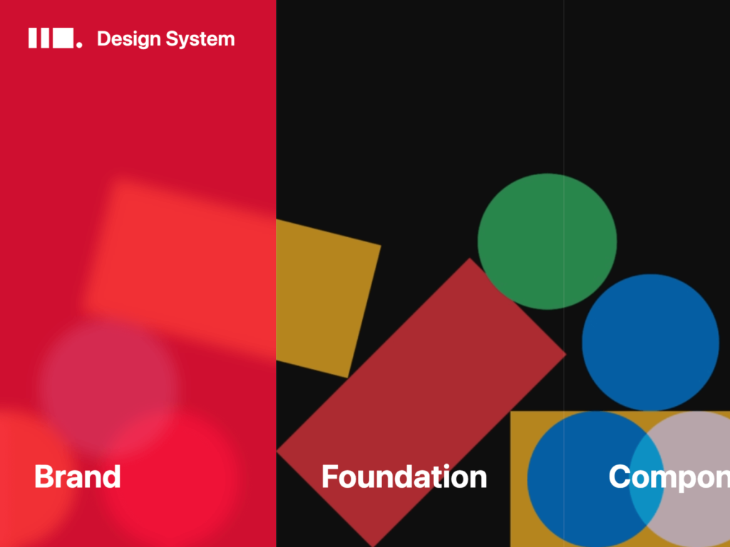
11st has released its design system website. The 11STREET Design System is a system that has been systematized and advanced since 2016. It is said that the design system site was established to widely publicize the design philosophy shared by designers, developers, and planners. The Design System logo has a simple form. It combines 11 rectangular pillar shapes with continuously changing circles, squares and triangles. At the end, I put a dot that feels like a firm conclusion. It feels like a combination of ‘11’ and ‘something’ […] ]
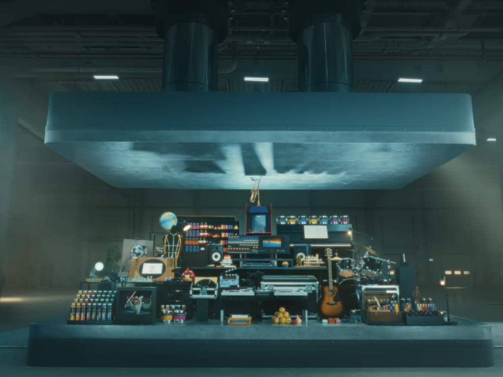
Apple released a video called 'Crush!' promoting the new M4 iPad Pro, which was unveiled last Tuesday. A variety of objects are placed in the dark, huge space, including a piano, record player, sculpture, paint, and television. A huge iron plate hovers uneasily above the objects. A hydraulic press slowly lowers the song 'All I ever need is you' by Sonny & Cher on the record player. The trumpet gets crushed and the paint can explodes, splattering everywhere. […] ]
The Canadian Armed Forces has unveiled a new logo and received harsh criticism. In the last three years, the Canadian Armed Forces has had more discharges than applicants. The death spiral had begun and a new attempt was needed. I think we need new branding to appeal to a new generation. Canada's Department of Defense is launching a new camouflage pattern, CADPAT MT (CAnadian Disruptive Pattern Multi-Terrain), and has decided to create a new, modern logo to go with it. The logo created by the Ministry of Defense’s internal design team […] ]
Bumble has rebranded with the launch of new features. Bumble, a dating app for women, was founded in 2014 and has grown into a strong competitor to Tinder based on support from women. Earlier this year, newly installed CEO Lydian Jones said online dating would increase and that it was an opportunity to focus on helping people make real connections. We redesigned the brand ourselves in our in-house creative studio. We created a new logo, font, palette and illustration. […] ]
Headspace has been rebranded. Headspace is a service that has been loved by many people with the keywords mindfulness and meditation since its founding 10 years ago. It has become a service used by over 100 million people around the world, collaborating with not only individuals but also numerous companies. The launch of a new service, Headspace Care, following a merger with mental health service Ginger in 2021 necessitated a brand redesign. The Headspace design team and design studio Italic Studio […] ]
The Portuguese government is returning to its old symbol. About five months ago, Portugal unveiled its new visual identity in collaboration with Studio Eduardo Aires, creator of the legendary Porto city branding. The complex symbols and typefaces of the past were designed to be more readable in the digital environment. One of the most talked-about symbols was a radical simplification of the Portuguese flag, which was created in 1910 when the Portuguese Republic was established following the revolution. The central […]