

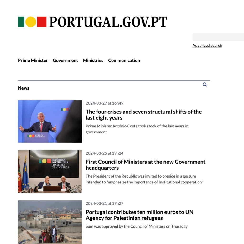
The Portuguese government returns to its previous symbol. About five months ago, Portugal announced a new visual identity for its government in collaboration with Studio Eduardo Aires, the creators of the legendary Porto city branding. We designed existing complex symbols and fonts to be easy to identify in the digital environment. What particularly became a hot topic was the extremely simplified symbol of the Portuguese flag.
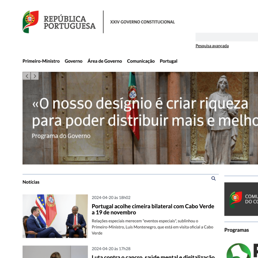
The Portuguese flag was created when the Portuguese Republic was established following the 1910 revolution. The central symbol consists of five blue shields symbolizing the Kingdom of Portugal, a shield with a fortress pattern surrounding it, and an armillary sphere symbolizing the Age of Exploration. It contains Portugal’s roots and proud history.

The new symbol replaces the flag's background color and central symbol with a yellow circle in a 2:3 ratio. On the right, ‘Republic of Portugal (República Portuguesa)’ is arranged in two lines in a tall serif font. At the time of its release, it was pointed out that while it was nice to simplify it for functional purposes, it didn't bring Portugal to mind. Among them, the thing that received the most criticism was the deletion of the emblem symbolizing history.


The redesign of Portugal's government symbols was a project commissioned by the Socialist government for practical purposes. General elections in early April brought the Conservative Party to power, and Montenegrin Prime Minister Luis Luis decided to return to the old national emblem. One critic criticized it as a nationalist throwback meant to convey a political message that pursues the past.

National symbols inevitably involve politics. Whenever the government changes, the design identity often changes. Maintaining consistent expression is not easy. This change seems like an example that makes us think about what it means to symbolize a country. The new visual identity has high formative perfection and is sophisticated. They are easy to identify and useful at any size. However, due to excessive visual simplification, the symbol and meaning became distant, and it became difficult to distinguish it from other flags based on color and shape alone. It is difficult to determine which value is more appropriate to pursue.
The unification of the government symbol of the Republic of Korea comes to mind. There were many rumors that there was some conspiracy behind the change to a new symbol due to a major incident that shook the country. It seems that there was no major backlash because the identity of Taegeukgi did not disappear. The white color added to Taegeuk symbolizes the 'white people' we are familiar with, and the result is clearly distinguishable from the symbols of surrounding countries, so it does not seem to be functionally bad.
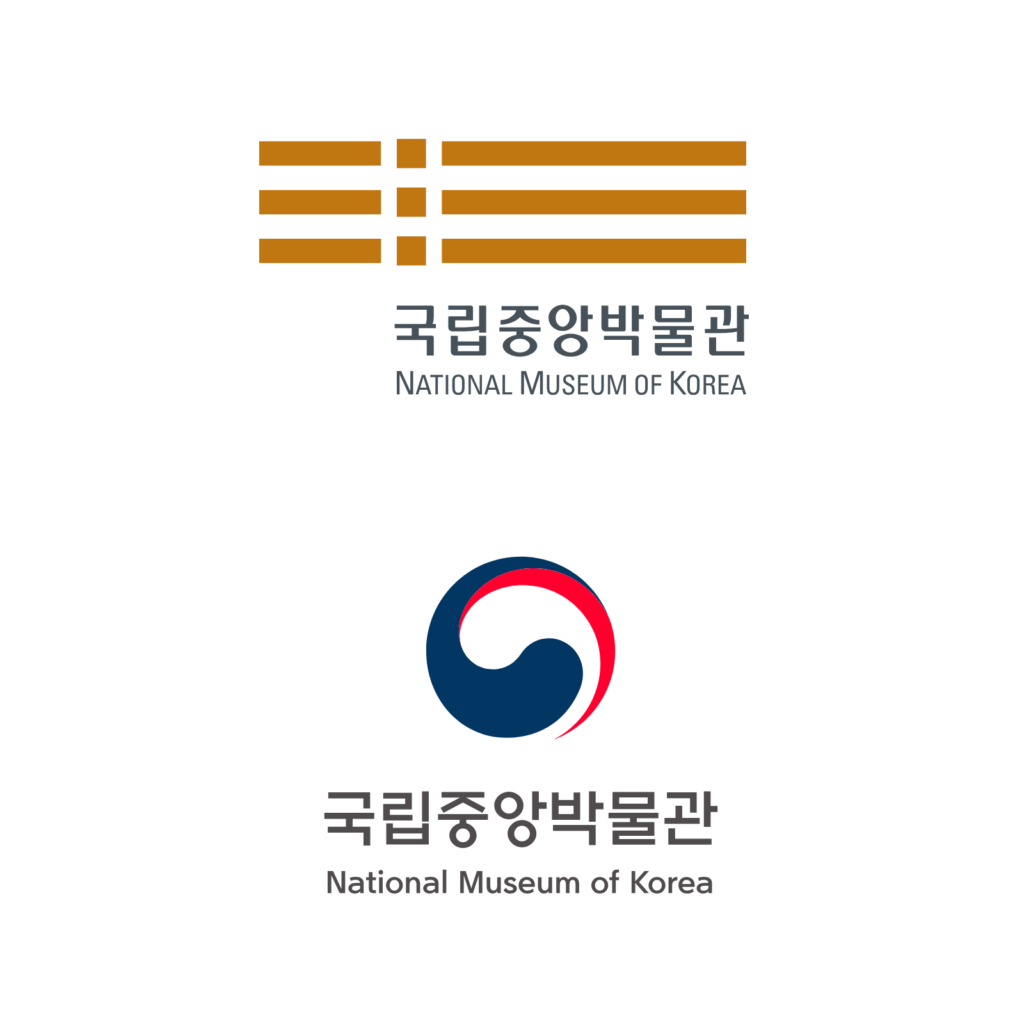
However, it has been pointed out that it has become difficult to distinguish what services are being provided. It was even more disappointing because there were many wonderful symbols such as the National Gugak Center, National Palace Museum, and National Museum of Korea. National symbols seem to be more difficult because they involve not only cultural but also political context.
