São Paulo-based studio Estúdio 017 designed the brand identity for Milan-based griffon label Valthera. Anoel Proença participated.
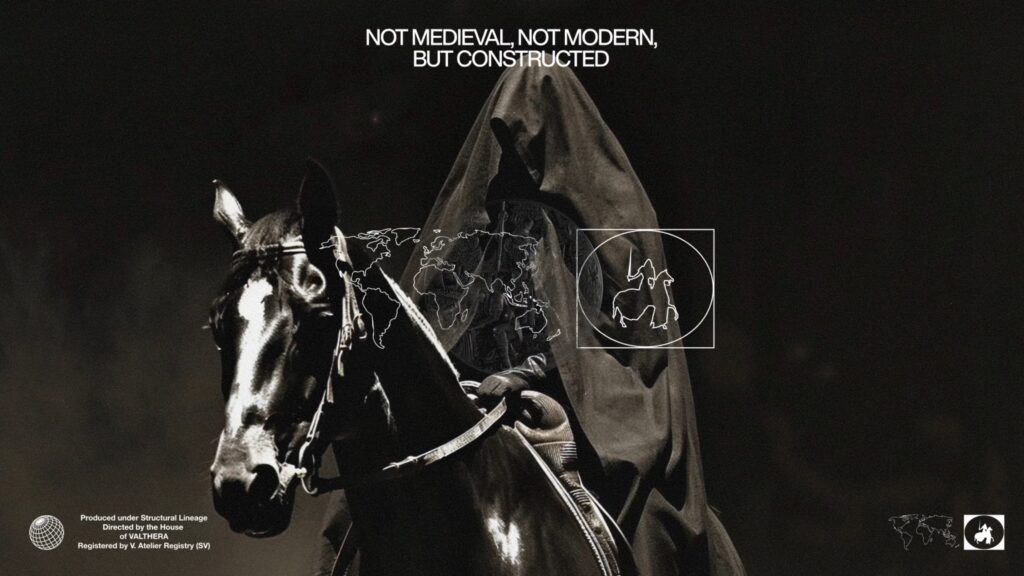
Valthera's identity stems from the concept of techno-feudalism. Techno-feudalism refers to a structure where a small number of technology companies own digital platforms, and people live within them. This perspective views it as resembling the way feudal lords owned land in the past.
Estúdio 017 translated this concept into the language of fashion. It interpreted clothing not merely as a means of wearing, but as a symbolic object that protects oneself from the outside world. Thus, images such as shields, keys, blades, and the silhouette of a castle are repeated within the brand system.
The logotype is at the center of the system. Valthera's wordmark features long and elongated proportions. It is a structure that can be modified to fit various combinations rather than having a fixed form. It was designed to be used flexibly in fashion labels, lookbooks, graphics, and videos.
Visual language does not remain confined to medieval symbols. It combines with hip-hop culture, jewelry, and modern fashion imagery. Symbols such as shields and blades evoke images of armor, yet simultaneously resemble the decorative language of streetwear and luxury fashion.
The typography utilizes Marjorie and Overused Grotesk. Marjorie creates a decorative and sharp impression, while Overused Grotesk serves to capture a modern information structure. The contrast between the two typefaces reinforces the brand's worldview.
Valthera's identity weaves together technological power, protection, fashion, and ornamentation into a single narrative. It is a project that interprets the act of dressing not as an expression of taste, but as the act of donning armor for the digital age.