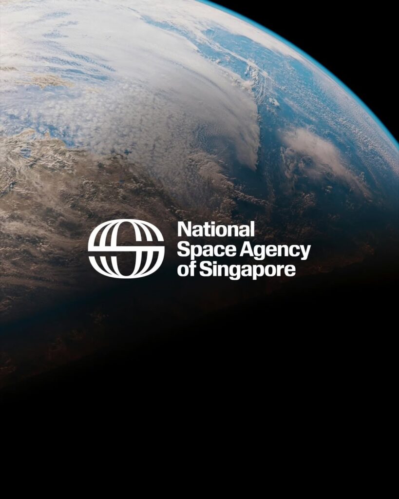

Singapore's National Space Agency (NSAS) has unveiled a new brand identity. The brand focuses on viewing space not as a distant concept, but as a technology already integrated into daily life. The design is also structured to intuitively convey this message.
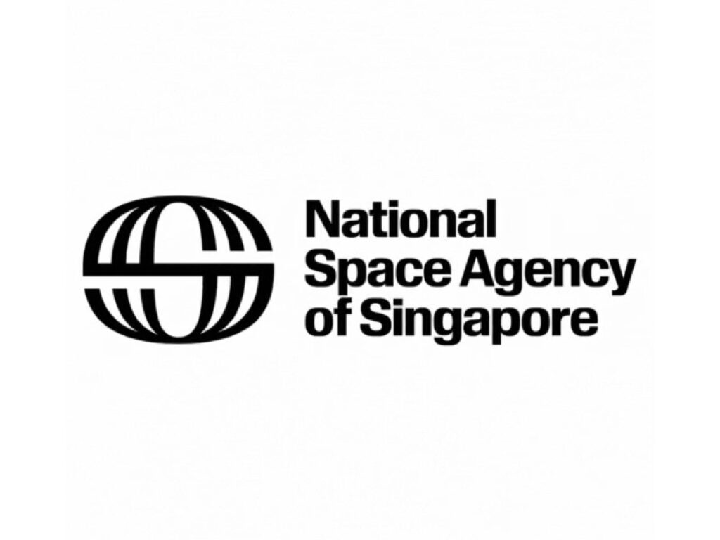
The logo originates from a single 'S' representing both Singapore and space. By designing this form to resemble a three-dimensional Earth structure, it unites the nation and the cosmos within a single symbol. Furthermore, linear structures reminiscent of the vertical movement of a sun-synchronous orbit and the horizontal flow of an equatorial orbit have been added to translate the concept of actual space orbits into a visual language.
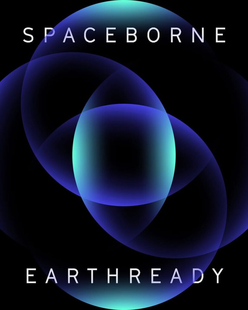
The overall visuals utilize intersecting forms, celestial light, and colors reminiscent of the atmosphere to create a sense of the universe and Earth meeting. The tagline 'Spaceborne, Earthready' also clearly demonstrates the direction of technology originating from orbit connecting with the reality of Earth. Rather than using abstract space imagery, this identity is closer to a structural translation of Singapore's role and technological potential.