This is the brand design for Leeum. We collaborated with Wolff Olins.
Opened in 2004, Leeum is an institution with a broad collection ranging from Korean ancient art to contemporary art and international collections; however, following the pandemic, it faced new questions regarding how cultural spaces could reconnect with people. In response, Leeum redefined its direction to become a more open space, a more modern and vibrant space, and a place where people, ideas, and culture can freely meet.
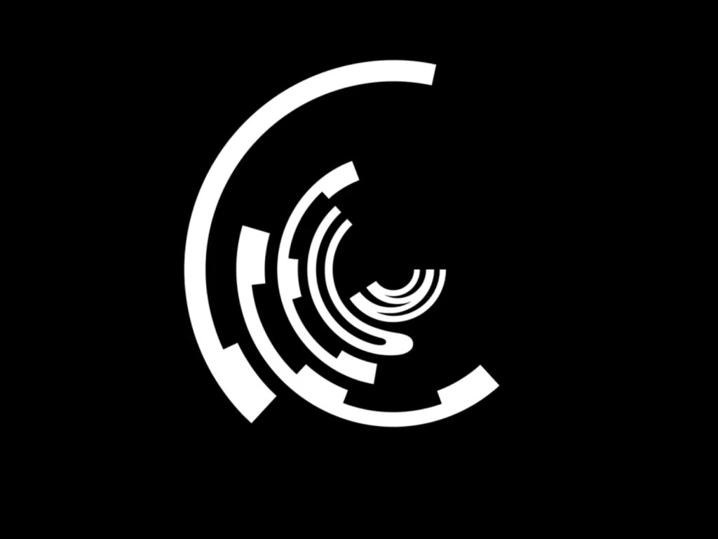
The logo was designed to serve as a wordmark that reads the name Leeum, while simultaneously appearing as a sculptural form. Reflecting the form of the architectural space and the nature of the museum's diverse collections, it was constructed as a structure capable of continuous variation rather than a fixed symbol. A dynamic identity was established through changes in size, arrangement, motion, and color expansion, reinforcing the perception that the museum is a place that constantly produces new exhibitions and perspectives.
We have expressed the essence of an art museum through brand language, where works from different eras, visitors from diverse backgrounds, and various interpretations and experiences meet in one space. Accordingly, the graphic system features a structure where elements collide, intersect, and connect, giving the impression of a dynamic cultural platform rather than a static museum image.