This is the rebranding of the British audio brand KISS. NOT Wieden + Kennedy London created the new identity.
KISS started as a pirate radio station in London in 1985. It became a legal broadcaster in 1990 and has since grown into a leading music radio brand in the UK. This rebranding is an effort to reorganize the pirate radio culture that was KISS's starting point to suit the current digital environment.
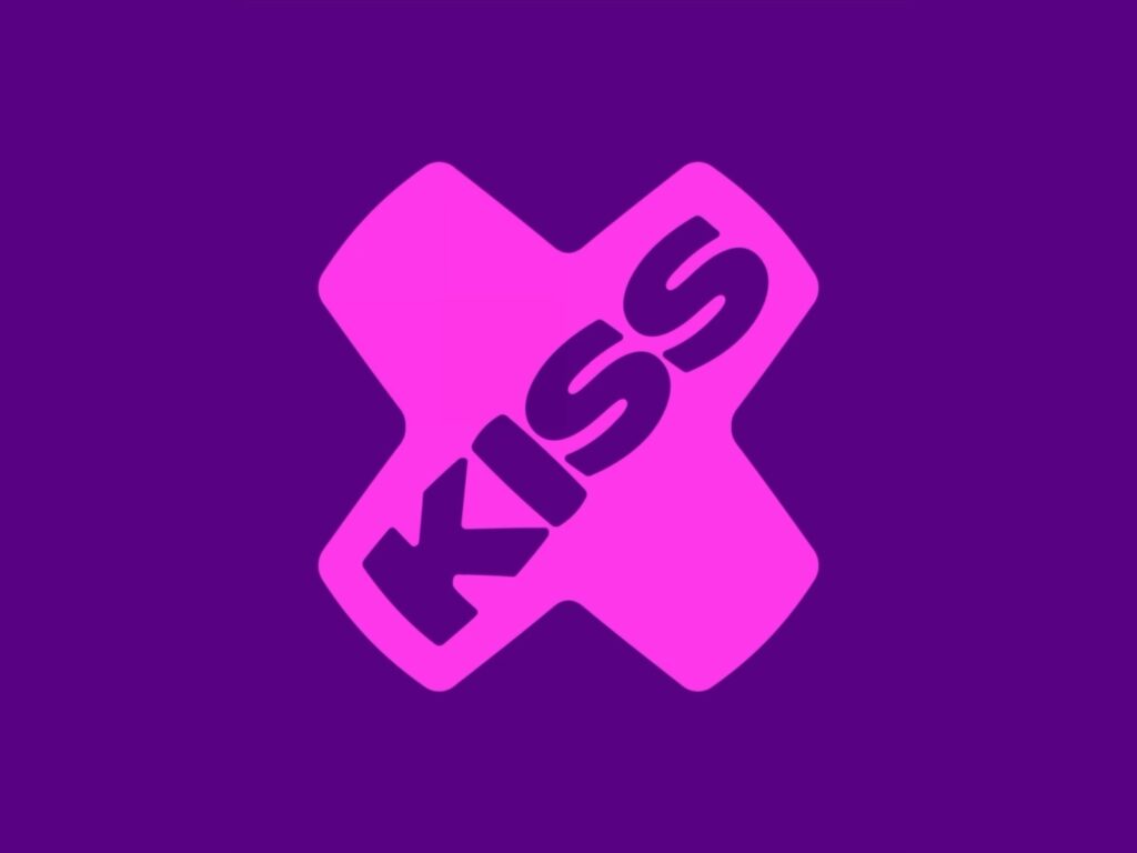
The new positioning is 'Mischief Amplified'. KISS has moved away from its existing block-style logo and adopted a more flexible visual language. The core graphic is the 'x'. The x, which is used in text messages for a kiss or a sign-off, has been adopted as the brand symbol.
The new logo features a shape resembling pursed lips and distorted typography. The 'x' is applied across various touchpoints, including the logo, motion, app icons, social content, and outdoor advertising. It is a method of extending the meaning of the name KISS into a graphic system.
This rebranding applies not only to the main KISS channel but also to sub-brands such as KISSTORY, KISS DANCE, and KISS XTRA. Each channel has a separate icon and color, but the entire system is connected by visual conventions such as the letter x.